
Your landing page’s weakest score is Information hierarchy.
How Salesforge ranks
- 1.
Artisan76
- 2.
AiSDR74
- 3.
Cohesive73
- 4.
Salesforge71
- 5.
11x70
- 6.
Regie.ai69
71Growth scoreupdated
category scores
category scoresShowHide
Information hierarchy
62FairDoes the design help or inhibit what the page is trying to say?
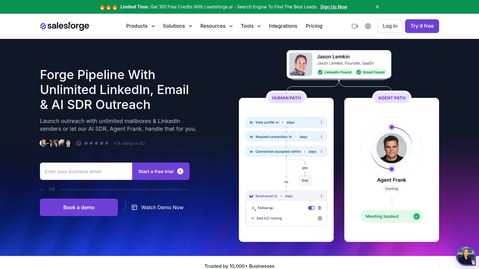 1234
- Three equal-weight CTAs — "Start a free trial", "Book a demo", and "Watch Demo Now" sit stacked at similar weight, splitting the visitor's single next action three ways.
- Leadsforge promo banner — The top banner's "Sign Up Now" link routes first-glance attention to a different product before the Salesforge value prop is read.
- Nav plus Try it free — Six dropdown nav items plus "Log in" and a fourth CTA "Try it free" create eight-plus exits before the hero form.
- Video widget bubble — The animated face bubble in the corner competes for peripheral attention against the email capture without adding to the argument.
Mobile web
62FairThe phone experience as a first-class citizen.
 123
- Six-line hero headline — Headline scales down too little, wrapping into six lines that push the CTA to the fold's bottom edge.
- Book a demo button — Secondary CTA sits below the first viewport, stacked after the trial button instead of beside it.
- Corner video bubble — Floating widget overlaps the Jason Lemkin proof card and sits near the thumb zone.
Value props
72FairTitle, subtitle, hero — do they sell the product's true value?
Salesforge’s headline
Forge Pipeline With Unlimited LinkedIn, Email & AI SDR Outreach
Launch outreach with unlimited mailboxes & LinkedIn senders or let our AI SDR, Agent Frank, handle that for you.
Working
Could improve
Trust
76FairProof that the product is real, competent, and safe to try.
How Salesforge compares
Trust read
CTA
84StrongCopy, size, verb, cost-feel — does the primary CTA earn the click?
How Salesforge compares
Recommended rewrites