
Your landing page’s weakest score is Information hierarchy.
How Rebuy ranks
74Growth scoreupdated
category scores
category scoresShowHide
Information hierarchy
72FairDoes the design help or inhibit what the page is trying to say?
 1234
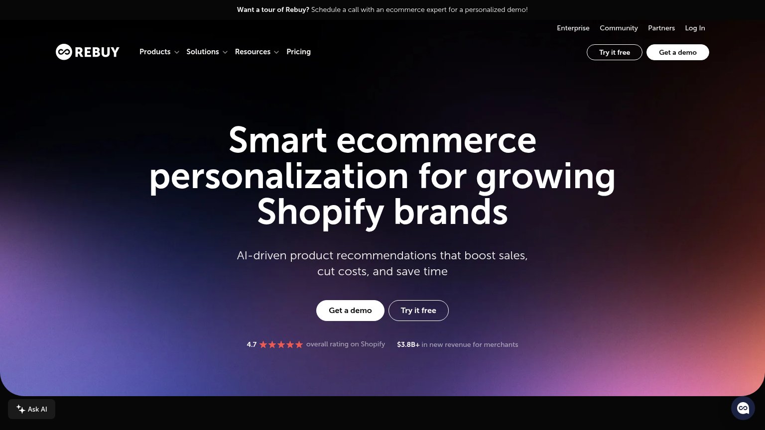
- Twin hero CTAs — "Get a demo" and "Try it free" sit side by side at near-equal weight, splitting the one action the fold asks for.
- Duplicate header buttons — "Try it free" and "Get a demo" repeat in the top-right nav, adding two more equal-weight exits before the hero pair.
- Top announcement banner — The demo-tour banner is a third demo prompt competing with the hero CTA and adding a clickable exit at the very top.
- Utility nav row — Enterprise, Community, Partners, Log In stack a second link row above the main nav, thickening exit density in the fold.
CTA
72FairCopy, size, verb, cost-feel — does the primary CTA earn the click?
Problems
- demo click feels costly
- free offer demoted to secondary
- no 'free' in primary despite free trial
Trust
72FairProof that the product is real, competent, and safe to try.
How Rebuy compares
Trust read
Mobile web
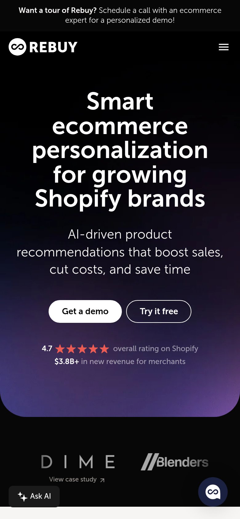
74FairThe phone experience as a first-class citizen.
What works
What to improve
Value props
82StrongTitle, subtitle, hero — do they sell the product's true value?
Rebuy’s headline
Smart ecommerce personalization for growing Shopify brands
AI-driven product recommendations that boost sales, cut costs, and save time
Working
Could improve