
Your landing page’s weakest score is Trust.
How Quindar ranks
Trust
44PoorProof that the product is real, competent, and safe to try.
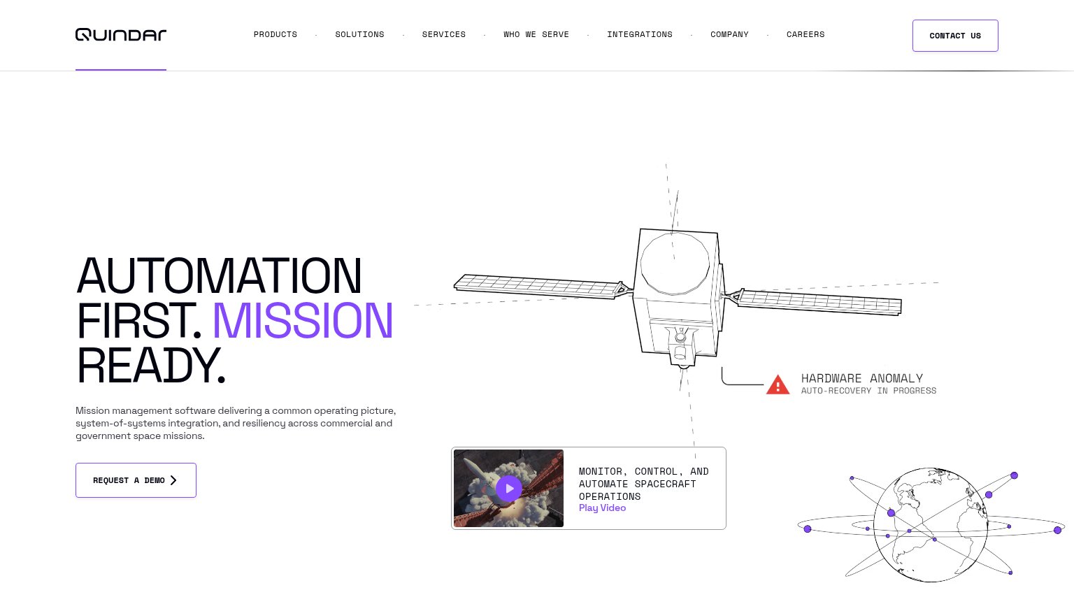
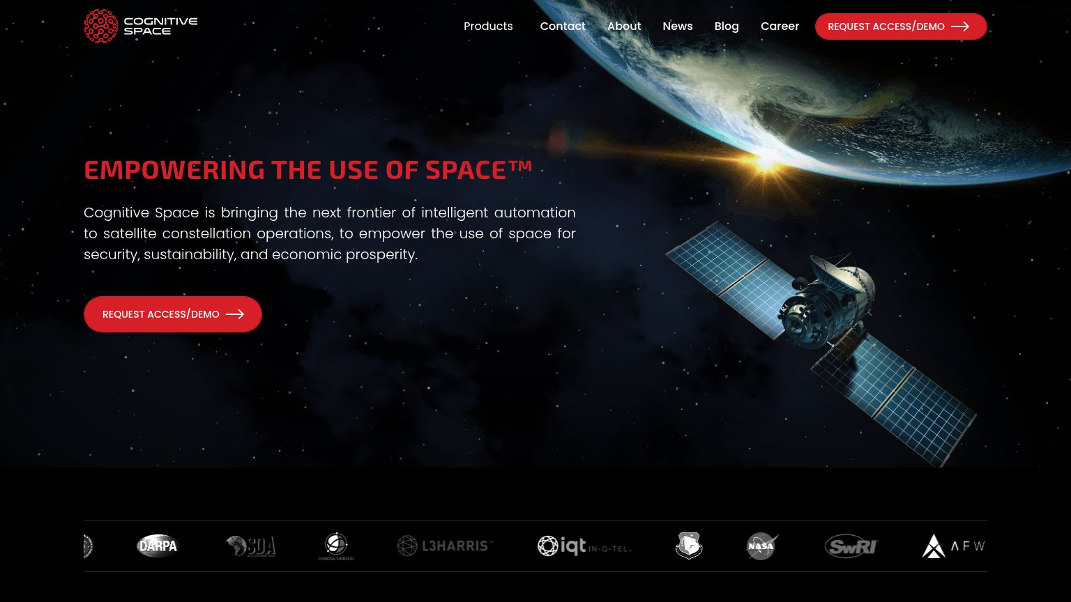
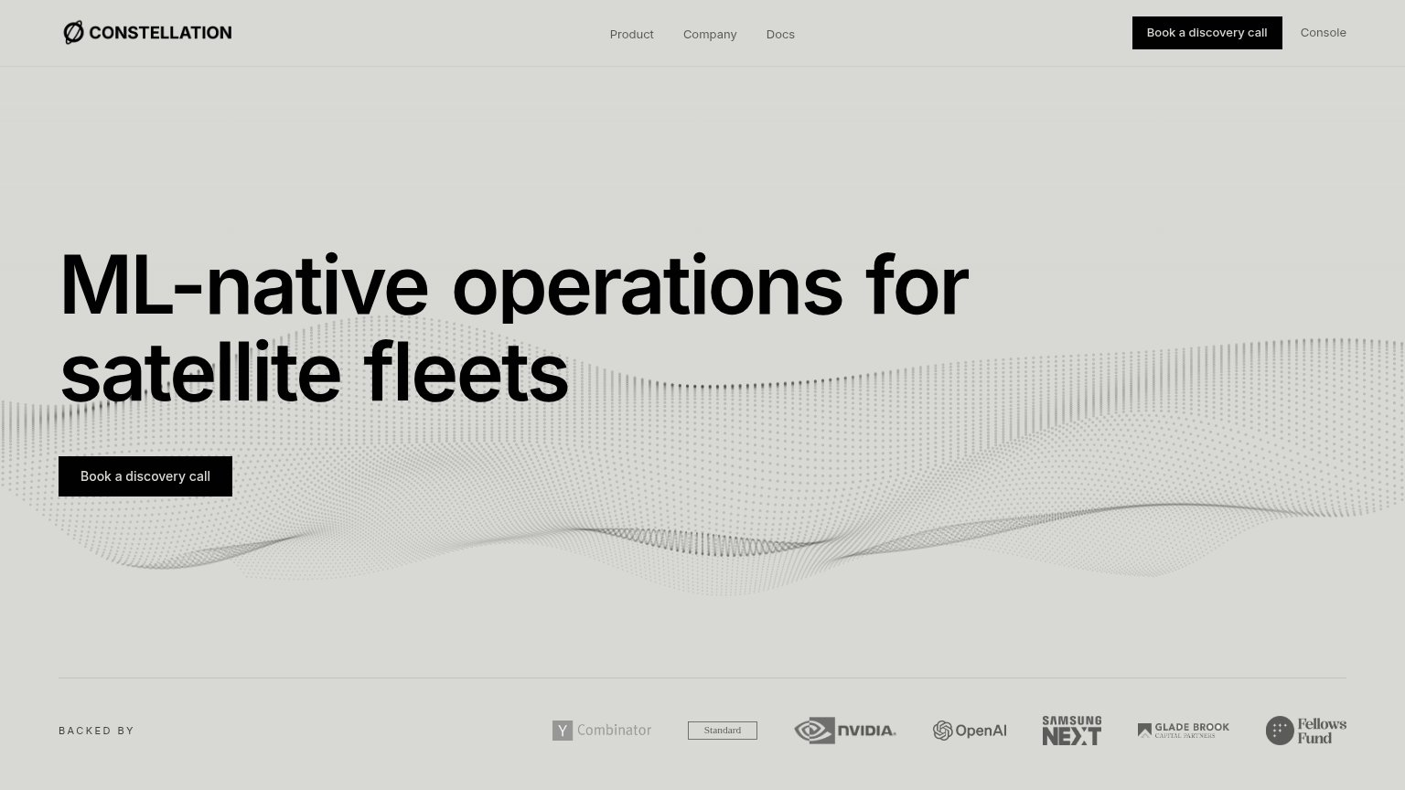
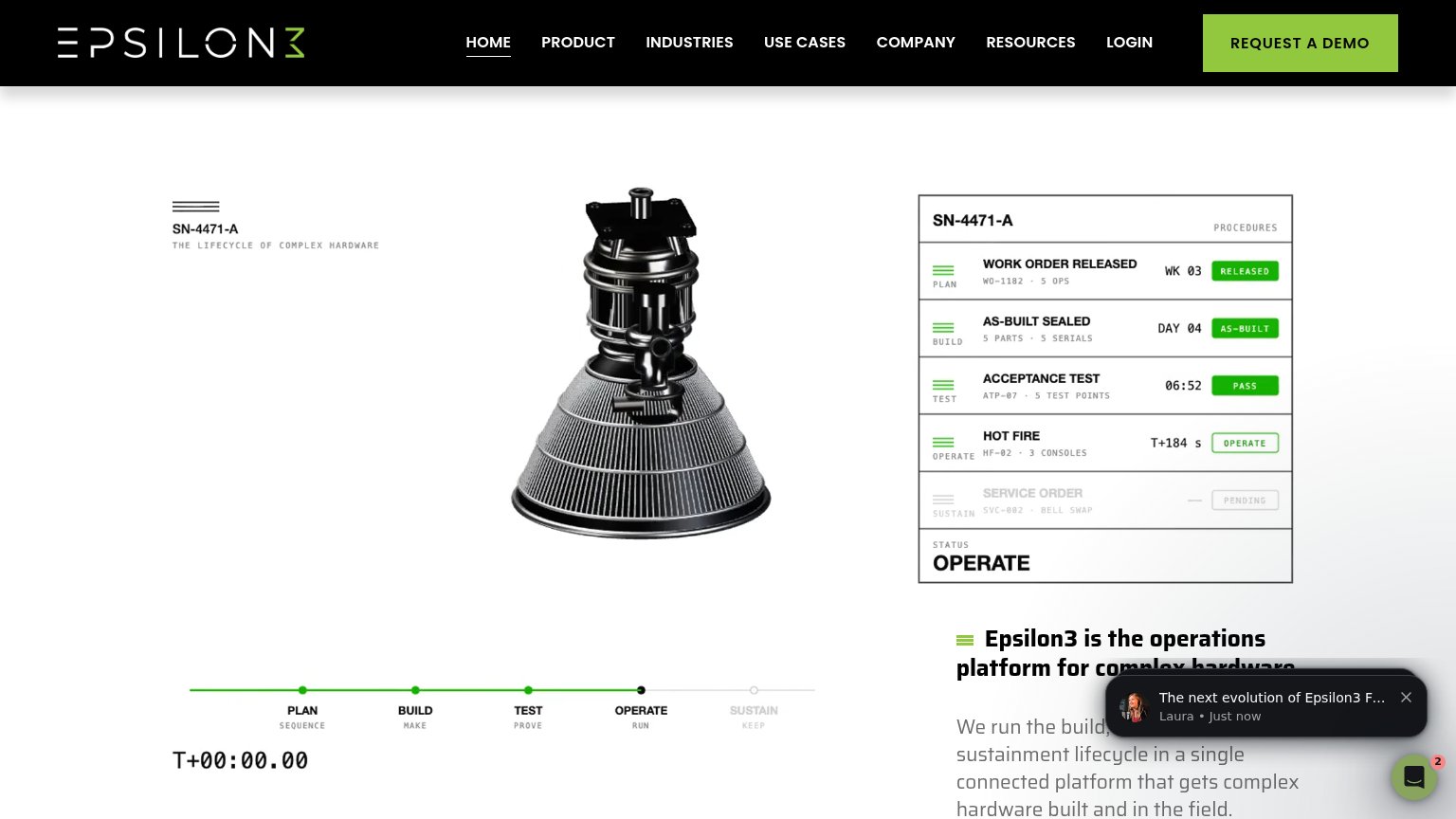
| Trust read | |
|---|---|
| Quindar | "Play Video" demo card captioned "MONITOR, CONTROL, AND AUTOMATE SPACECRAFT OPERATIONS" |
| "BACKED BY" investor logo strip (Y Combinator, NVIDIA, OpenAI, Samsung Next, Glade Brook, Fellows Fund) | |
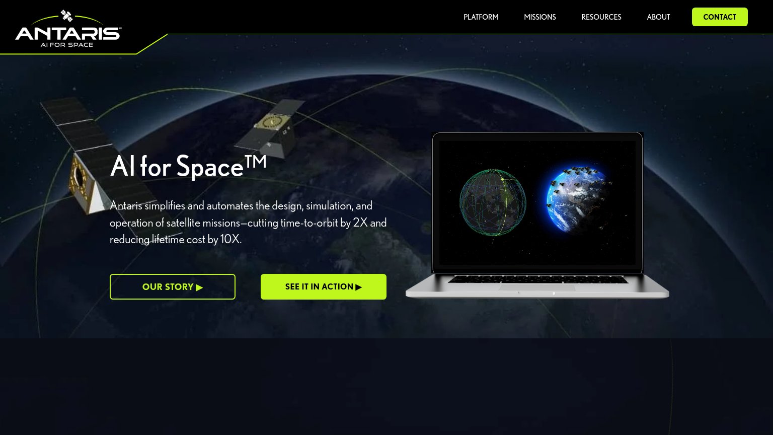
| Laptop screenshot showing Antaris's real mission-visualization UI with orbital constellation plots | |
| Announcement bar: "our new free-to-use spaceflight intelligence exchange: Satcat!" | |
| Logo bar with DARPA, SDA, L3Harris, In-Q-Tel, NASA, SwRI, and Terran Orbital | |
| SN-4471-A procedures panel showing work order, acceptance test, and hot fire lifecycle statuses |
Mobile web
58FairThe phone experience as a first-class citizen.
 123
- Headline below the fold — The value statement 'AUTOMATION FIRST. MISSION READY.' starts near the bottom of the first viewport, so most visitors see only illustrations before any message.
- Stacked hero illustrations — The satellite and orbiting-globe line drawings consume the top ~700px of the fold while carrying no message or action.
- Request a Demo button — The primary CTA sits far below the fold and stays desktop-proportioned instead of full-width and thumb-friendly.
Value props
62FairTitle, subtitle, hero — do they sell the product's true value?
Quindar’s headline
AUTOMATION FIRST. MISSION READY.
Mission management software delivering a common operating picture, system-of-systems integration, and resiliency across commercial and government space missions.
Working
Could improve
CTA
72FairCopy, size, verb, cost-feel — does the primary CTA earn the click?
How Quindar compares
Recommended rewrites
Information hierarchy
76FairDoes the design help or inhibit what the page is trying to say?
What works
What to improve