
Your landing page’s weakest score is Information hierarchy.
How Epsilon3 ranks
61Growth scoreupdated
category scores
category scoresShowHide
Information hierarchy
58FairDoes the design help or inhibit what the page is trying to say?
 1234
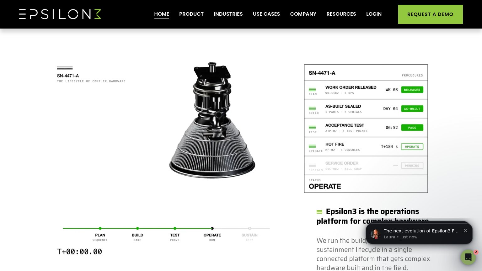
- Clipped headline block — The value proposition sits bottom-right and is cut mid-sentence by the fold, so the page's core message never lands.
- Chat notification popup — The Laura popup overlaps the headline text at load, covering the one line that explains what Epsilon3 is.
- Seven-link nav row — Product, Industries, Use Cases, Company, Resources, and Login all sit at equal weight, giving seven exits before any value prop is read.
- REQUEST A DEMO button — The only CTA lives in the nav corner, far from the headline and outside the scan path through the illustration.
Trust
58FairProof that the product is real, competent, and safe to try.
| Trust read | |
|---|---|
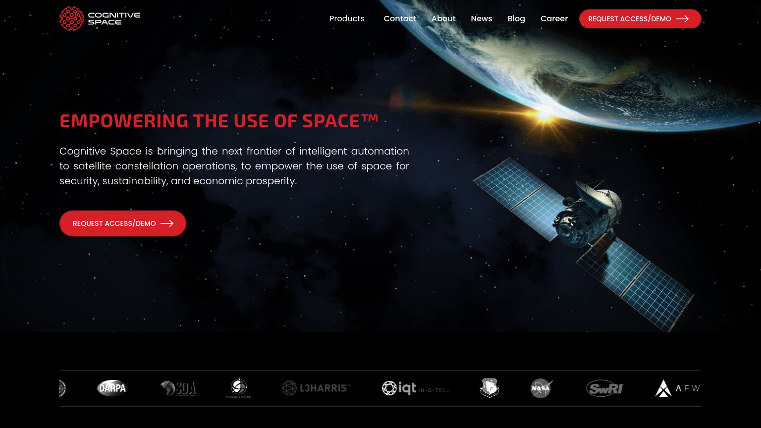
| Epsilon3 | SN-4471-A procedures panel showing work order, acceptance test, and hot fire lifecycle statuses |
| "BACKED BY" investor logo strip (Y Combinator, NVIDIA, OpenAI, Samsung Next, Glade Brook, Fellows Fund) | |
| Laptop screenshot showing Antaris's real mission-visualization UI with orbital constellation plots | |
| Announcement bar: "our new free-to-use spaceflight intelligence exchange: Satcat!" | |
| Logo bar with DARPA, SDA, L3Harris, In-Q-Tel, NASA, SwRI, and Terran Orbital | |
| "Play Video" demo card captioned "MONITOR, CONTROL, AND AUTOMATE SPACECRAFT OPERATIONS" |
Mobile web
58FairThe phone experience as a first-class citizen.
What works
What to improve
CTA
64FairCopy, size, verb, cost-feel — does the primary CTA earn the click?
How Epsilon3 compares
Recommended rewrites
Value props
68FairTitle, subtitle, hero — do they sell the product's true value?
Epsilon3’s headline
Epsilon3 is the operations platform for complex hardware.
We run the build, test, operations, and sustainment lifecycle in a single connected platform that gets complex hardware built and in the field.
Working
Could improve