
Your landing page’s weakest score is Mobile web.
How Prosper (Klym/other) — omitted ranks
- 1.
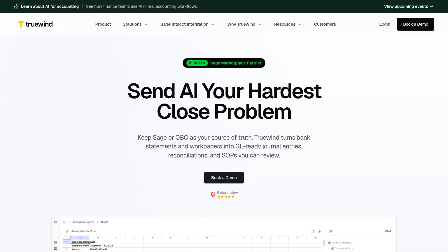
Truewind73
- 2.
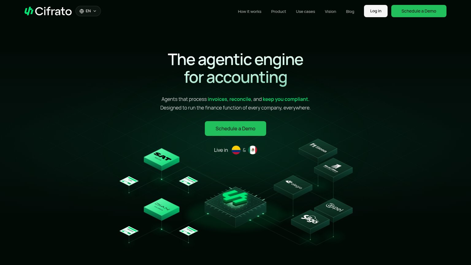
Cifrato71
- 3.
Nubceo66
- 4.
Prosper (Klym/other) — omitted62
- 5.
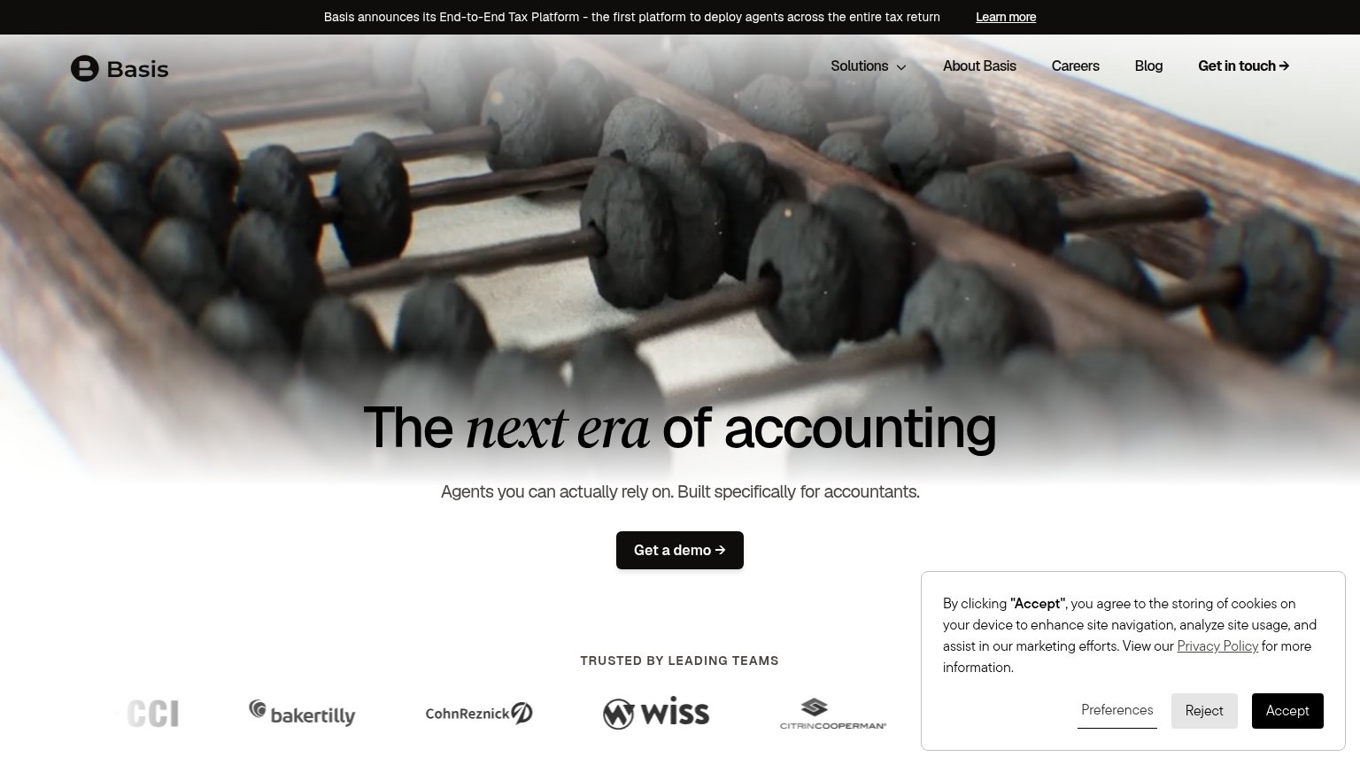
Zenvoice (Basis)60
- 6.
Simetrik56
Mobile web
38PoorThe phone experience as a first-class citizen.
 1234
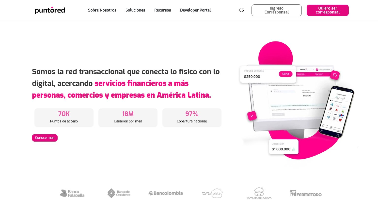
- Headline overlapped by widgets — Chat bubble and pink account icon sit directly on top of the pink headline text, making it unreadable.
- Oversized hero illustration — The product graphic consumes the entire first viewport, pushing the headline, stats, and 'Conoce más' CTA fully below the fold.
- Cramped headline wrap — Desktop-scale headline wraps into seven-plus lines and is cut off mid-sentence at the viewport edge.
- Floating account icon — A large pink circular icon floats mid-content with no clear purpose, colliding with the value proposition text.
CTA
56FairCopy, size, verb, cost-feel — does the primary CTA earn the click?

Problems
- no CTA visible in mobile fold
- hero CTA is vague 'Conoce más'
- no action verb, identity framing
- two competing magenta buttons
Information hierarchy
68FairDoes the design help or inhibit what the page is trying to say?
What works
What to improve
Value props
72FairTitle, subtitle, hero — do they sell the product's true value?
Prosper (Klym/other) — omitted’s headline
Somos la red transaccional que conecta lo físico con lo digital, acercando servicios financieros a más personas, comercios y empresas en América Latina.
Working
Could improve
Trust
78FairProof that the product is real, competent, and safe to try.
How Prosper (Klym/other) — omitted compares
Trust read