
Your landing page’s weakest score is Trust.
How Promaxo ranks
75Growth scoreupdated
category scores
category scoresShowHide
Trust
62FairProof that the product is real, competent, and safe to try.
| Trust read | |
|---|---|
| Promaxo | "FDA 510(K) CLEARED" eyebrow label in the hero |
| No visible trust signal identified. | |
| Real in-hospital photos of the Swoop portable MRI being operated by clinicians | |
| Photo of a real DMS-branded PET/CT mobile imaging trailer in the hero | |
| Hero photo of a real branded mobile imaging trailer labeled "DIGITAL PET/CT" on the highway | |
| "150+ freestanding imaging centers" stat tile alongside "Only provider with a National Quality Institute" |
Information hierarchy
76FairDoes the design help or inhibit what the page is trying to say?
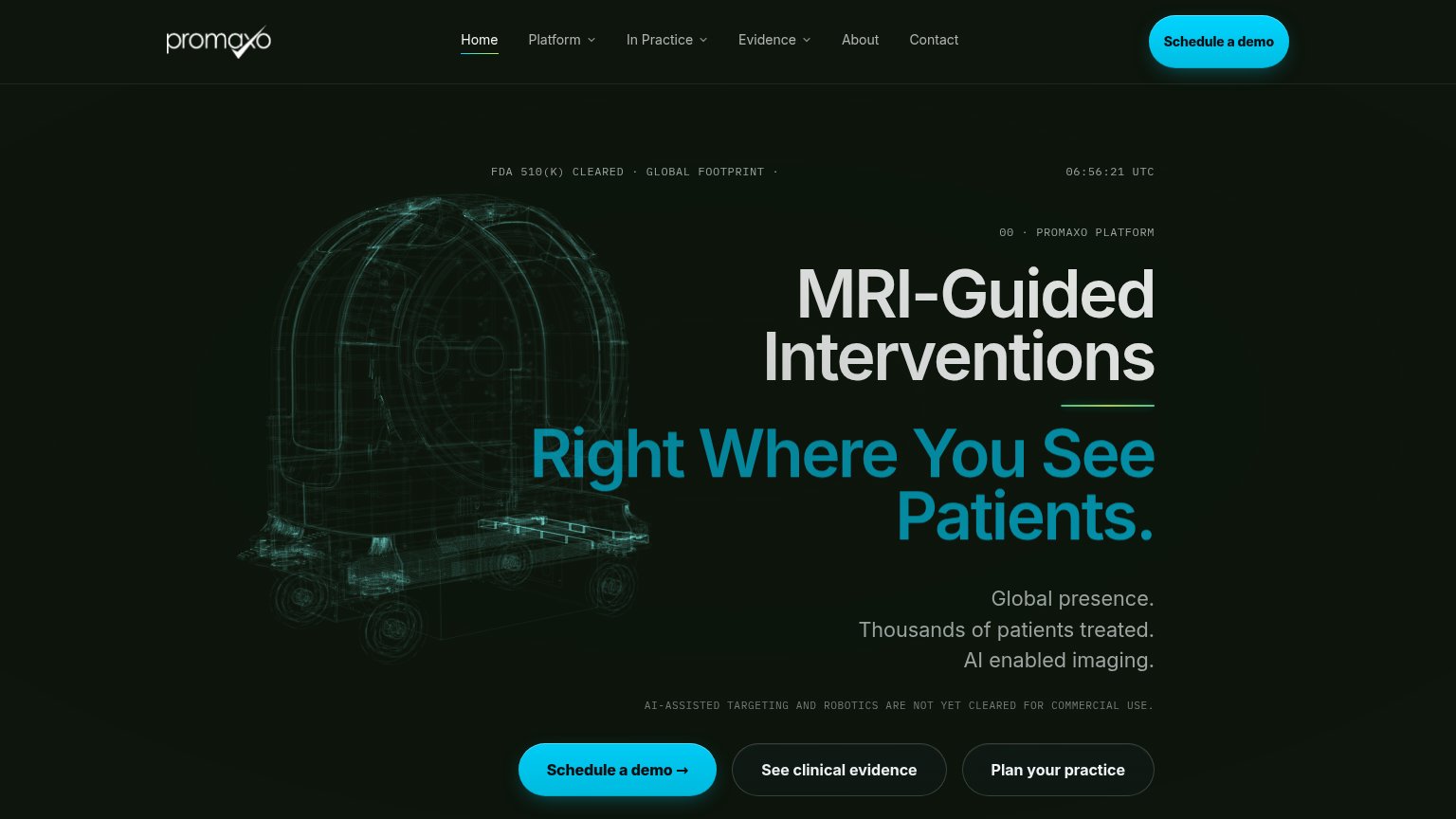 123
- Three-button CTA row — Secondary buttons 'See clinical evidence' and 'Plan Promaxo's practice' match the primary CTA's size and shape, splitting the click three ways.
- Six-item nav bar — Six links with three dropdowns offer exit paths at equal weight before the visitor reaches the hero argument.
- Regulatory disclaimer line — The all-caps 'NOT YET CLEARED' disclaimer sits directly above the CTA row, injecting doubt at the moment of action.
Mobile web
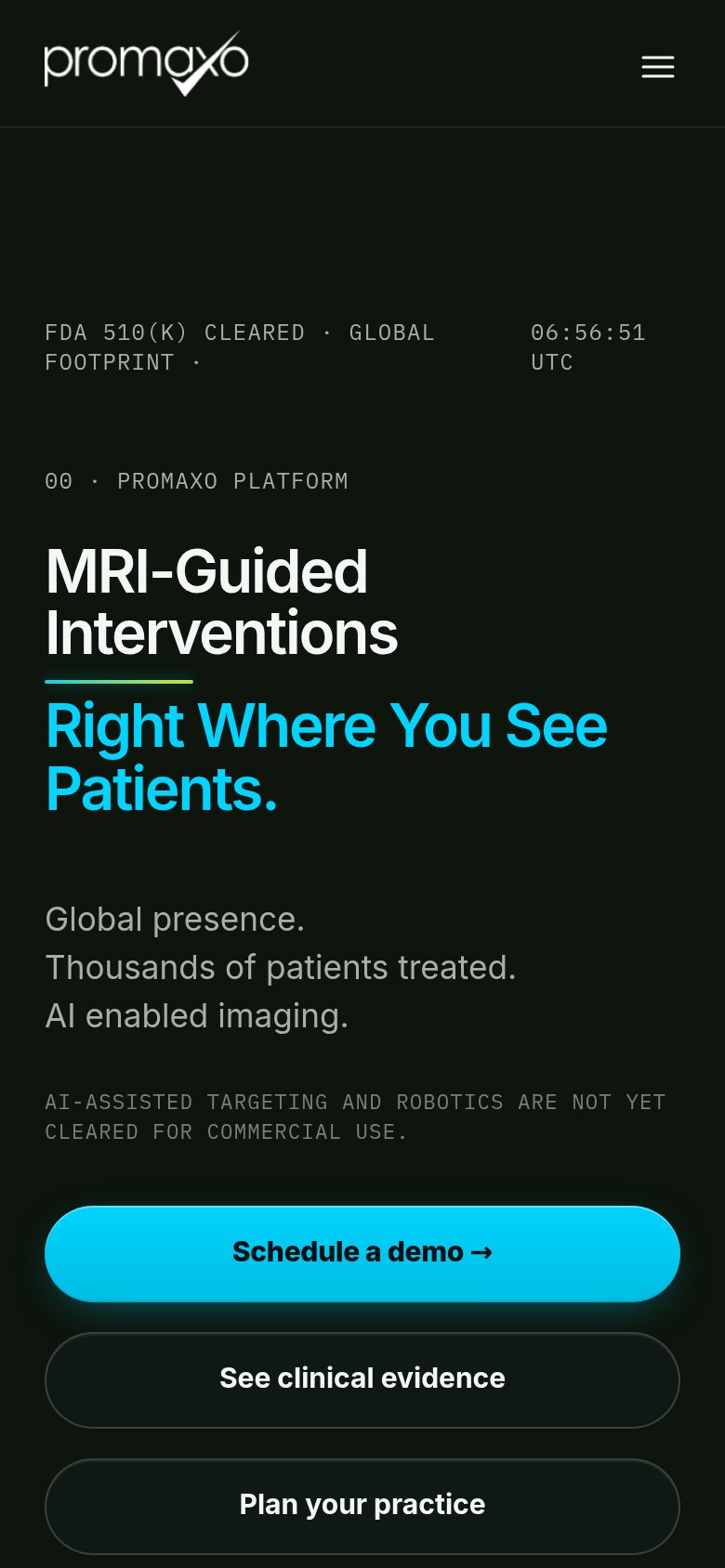
76FairThe phone experience as a first-class citizen.
What works
What to improve
CTA
80StrongCopy, size, verb, cost-feel — does the primary CTA earn the click?
How Promaxo compares
Recommended rewrites
Value props
82StrongTitle, subtitle, hero — do they sell the product's true value?
Promaxo’s headline
MRI-Guided Interventions Right Where You See Patients.
Global presence. Thousands of patients treated. AI enabled imaging.
Working
Could improve