
Your landing page’s weakest score is Mobile web.
How Praxim ranks
62Growth scoreupdated
category scores
category scoresShowHide
Mobile web
44PoorThe phone experience as a first-class citizen.
 1234
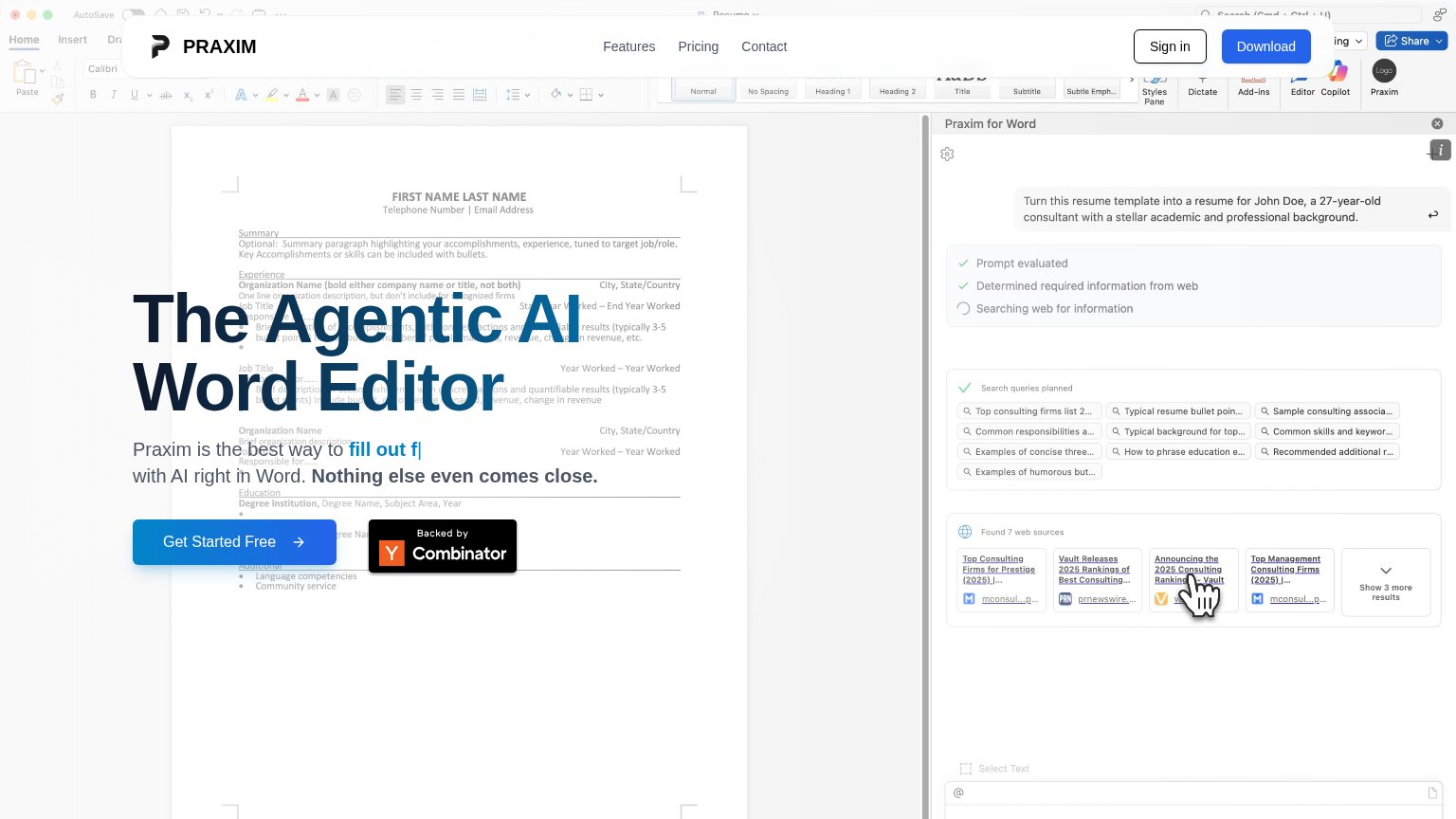
- Truncated headline text — The hero headline is cut off — only "Editor" and a clipped "fill out forms" fragment render, so the value proposition is unreadable.
- Desktop screenshot background — A desktop-density Word screenshot with microscopic text sits behind the hero copy, crowding the fold with illegible noise.
- Floating header card — The header renders as a detached floating card overlapping the hero copy instead of a clean top bar.
- Hero copy overlaps screenshot — "with AI right in Word" text sits directly on top of the busy screenshot, hurting contrast and readability.
Information hierarchy
58FairDoes the design help or inhibit what the page is trying to say?
 1234
- Headline over screenshot — "The Agentic AI Word Editor" sits directly on dense resume text, destroying legibility of both layers.
- Subheadline collision — "Praxim is the best way to fill out f..." is unreadable against the template's paragraph lines behind it.
- Header Download button — Filled blue button matches the primary CTA's weight and pulls clicks away from "Get Started Free".
- Word ribbon chrome — The full Office toolbar spans the top of the fold, adding dozens of icons that compete with the message.
Trust
58FairProof that the product is real, competent, and safe to try.
How Praxim compares
Trust read
Value props
68FairTitle, subtitle, hero — do they sell the product's true value?
Praxim’s headline
The Agentic AI Word Editor
Praxim is the best way to fill out forms with AI right in Word. Nothing else even comes close.
Working
Could improve
CTA
82StrongCopy, size, verb, cost-feel — does the primary CTA earn the click?
How Praxim compares
Recommended rewrites