
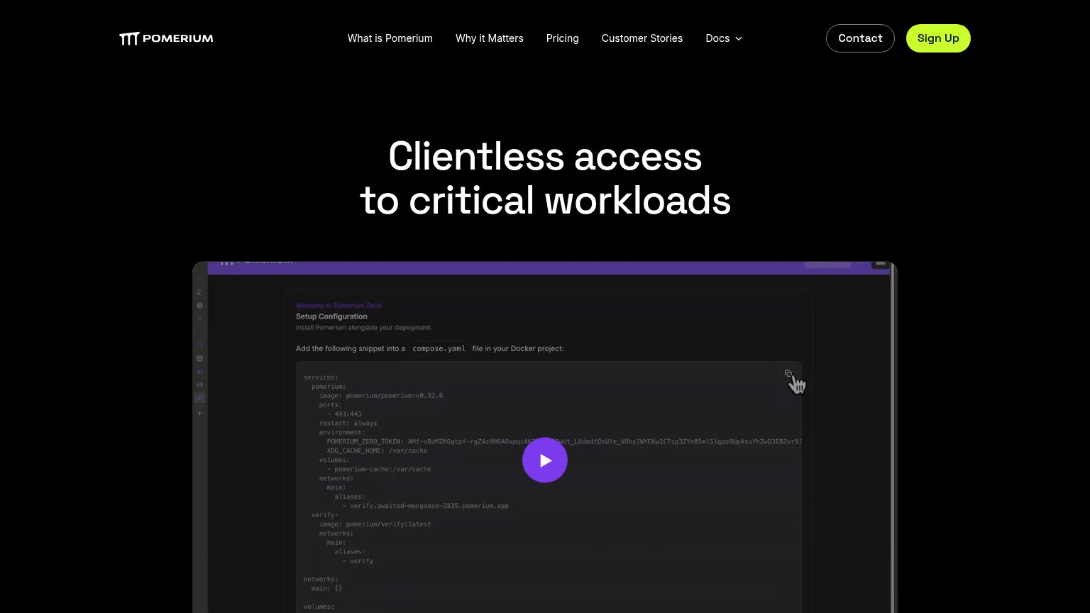
Your landing page’s weakest score is CTA.
How Pomerium ranks
63Growth scoreupdated
category scores
category scoresShowHide
CTA
58FairCopy, size, verb, cost-feel — does the primary CTA earn the click?
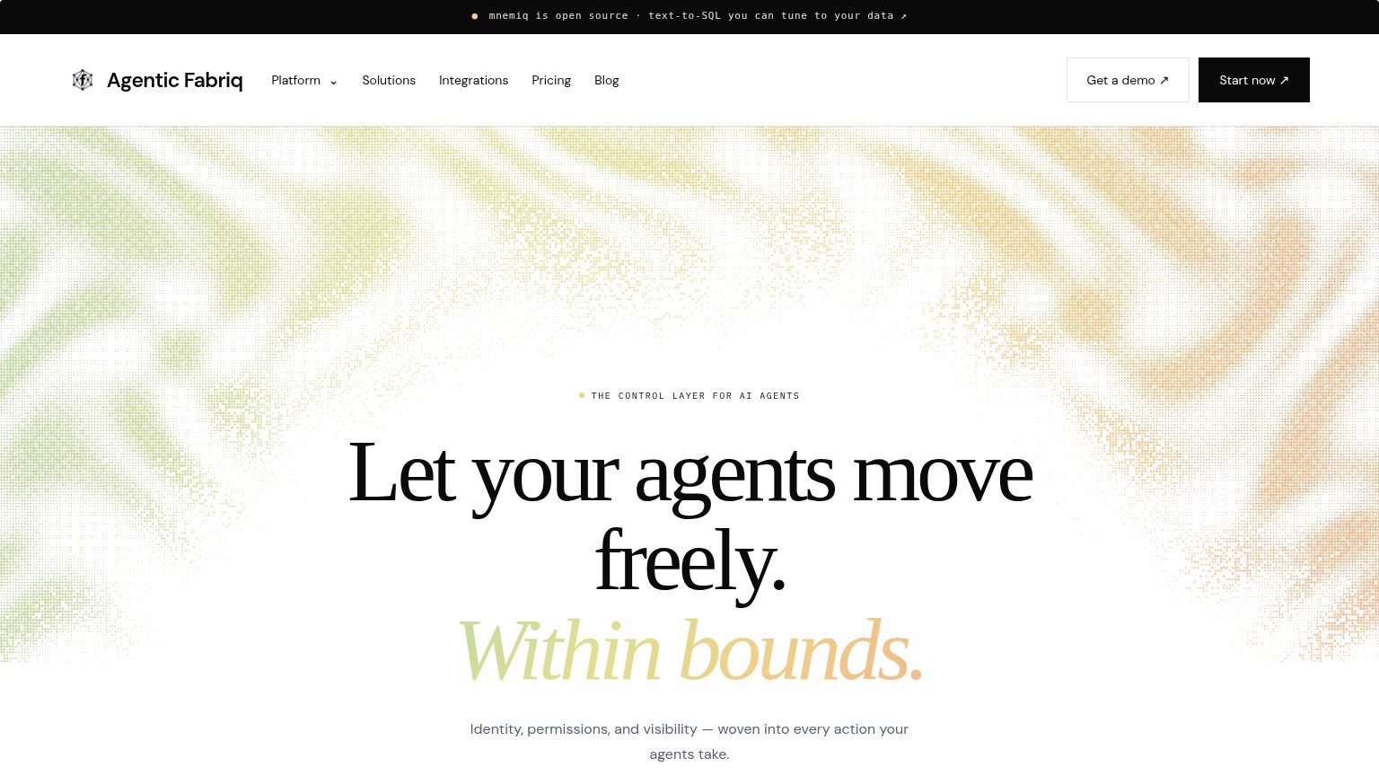
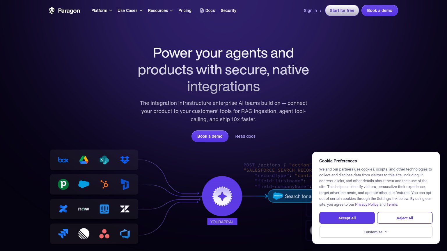
Problems
- 'Sign Up' feels like form-filling cost
- no hero CTA on desktop fold
- nav-pill size vs large headline
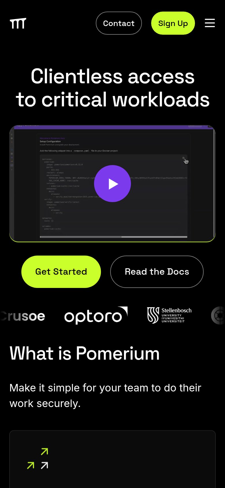
- label differs on mobile ('Get Started')
Information hierarchy
62FairDoes the design help or inhibit what the page is trying to say?
123- Sign Up corner pill — Primary CTA sits outside the center scan path at nav-link size, easy to miss in one second.
- Five-link nav row — What is Pomerium, Why it Matters, Pricing, Customer Stories, and Docs all leak attention at equal weight.
- Contact button — Styled at near-equal weight to Sign Up, splitting the click between two adjacent actions.
Value props
62FairTitle, subtitle, hero — do they sell the product's true value?
Pomerium’s headline
Clientless access to critical workloads
Working
Could improve
Trust
62FairProof that the product is real, competent, and safe to try.
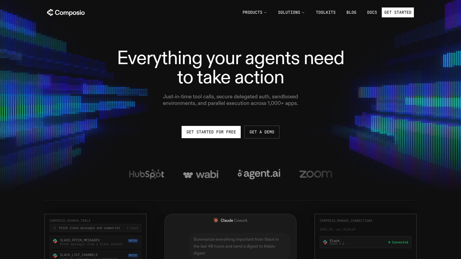
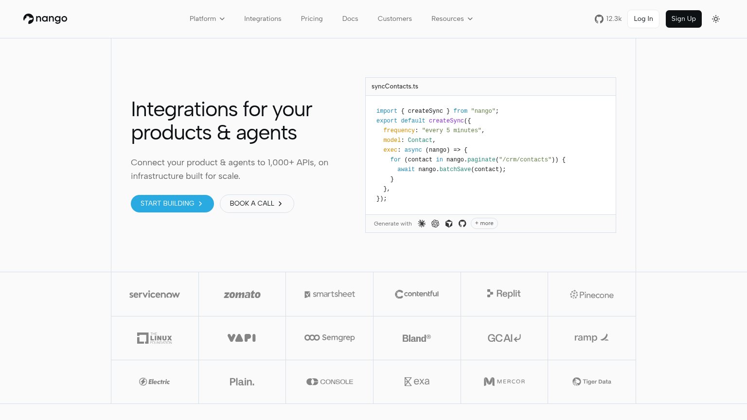
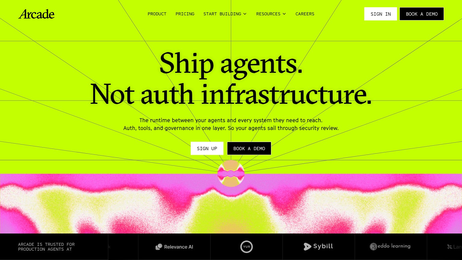
How Pomerium compares
Trust read
Mobile web
72FairThe phone experience as a first-class citizen.
What works
What to improve