
Your landing page’s weakest score is Trust.
How Photonmatrix ranks
- 1.
Tornyol71
- 2.
Bzigo58
- 3.
Photonmatrix18
Trust
15PoorProof that the product is real, competent, and safe to try.
| Trust read | |
|---|---|
| Photonmatrix | No visible trust signal identified. |
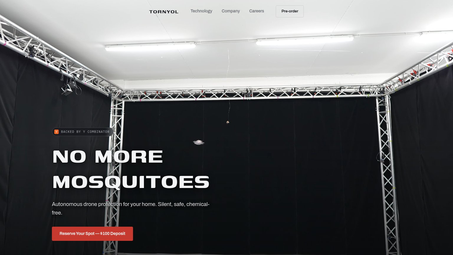
| BACKED BY Y COMBINATOR badge above the hero headline | |
| No visible trust signal identified. |
Mobile web
15PoorThe phone experience as a first-class citizen.
 1234
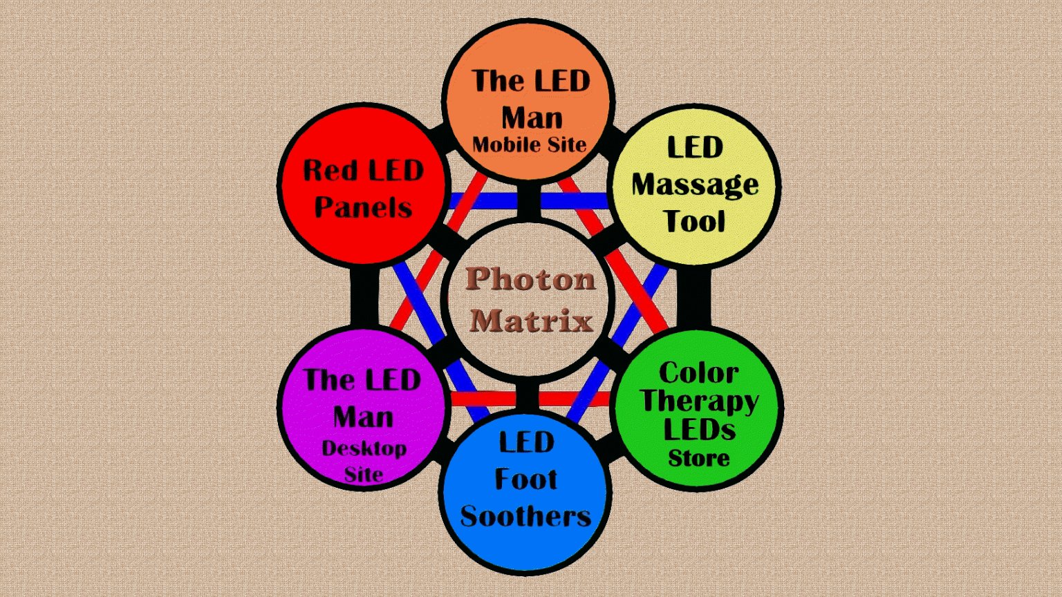
- Photon Matrix title — Central site title is cropped to "Pho / Mat" by the fixed-width layout, so the brand is unreadable.
- Mobile Site circle — The "The LED Man Mobile Site" node runs off the right edge with its label truncated to "Mobil".
- Foot Soothers circle — The "LED Foot Soothers" link circle is half off-screen, its text cut to "Soot" — same cropping hits the green store node entirely.
- Red LED Panels circle — Circles give no affordance they are links — no buttons, underlines, or tap targets sized for a thumb.
Value props
18PoorTitle, subtitle, hero — do they sell the product's true value?
Photonmatrix’s headline
Photon Matrix
Working
Could improve
Information hierarchy
22PoorDoes the design help or inhibit what the page is trying to say?
What works
What to improve
CTA
22PoorCopy, size, verb, cost-feel — does the primary CTA earn the click?
How Photonmatrix compares
Recommended rewrites