
Your landing page’s weakest score is Mobile web.
How Bzigo ranks
- 1.
Tornyol71
- 2.
Bzigo58
- 3.
Photonmatrix18
Mobile web
38PoorThe phone experience as a first-class citizen.
 123
- Cookie consent modal — Dead blocker covers over half the viewport and buries the 'Order Now' CTA with three green buttons that mimic conversion actions.
- Cropped headline text — The oversized headline wraps one word per line and the third line is cut off behind the consent modal, breaking the value statement.
- Accept and Reject buttons — Consent 'Accept' and 'Reject' use the same full-width green style as a primary CTA, hijacking the visual hierarchy of the fold.
Trust
44PoorProof that the product is real, competent, and safe to try.
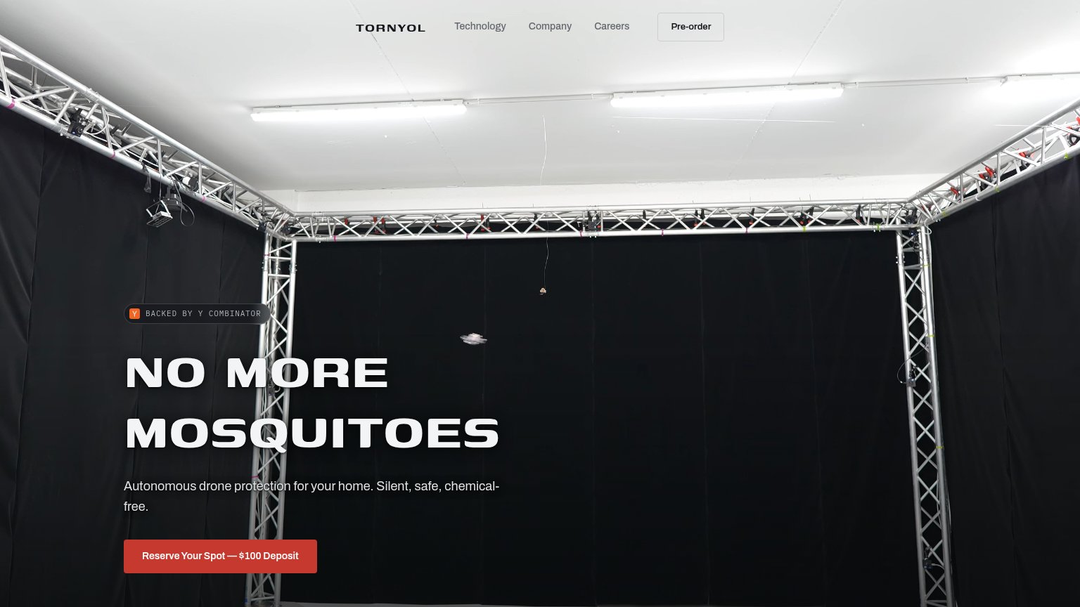
| Trust read | |
|---|---|
| Bzigo | No visible trust signal identified. |
| BACKED BY Y COMBINATOR badge above the hero headline | |
| No visible trust signal identified. |
Value props
62FairTitle, subtitle, hero — do they sell the product's true value?
Bzigo’s headline
Smart Protection, Mosquito Detection
Mosquitoes, you can fly but you can't hide!
Working
Could improve
Information hierarchy
72FairDoes the design help or inhibit what the page is trying to say?
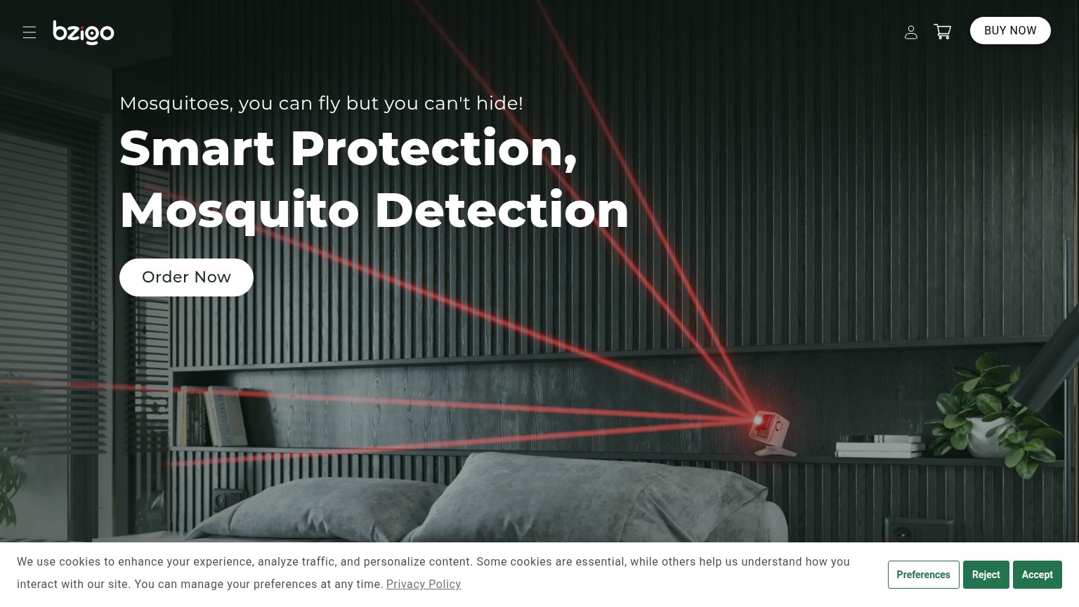
What works
What to improve
CTA
72FairCopy, size, verb, cost-feel — does the primary CTA earn the click?
How Bzigo compares
Recommended rewrites