
Your landing page’s weakest score is CTA.
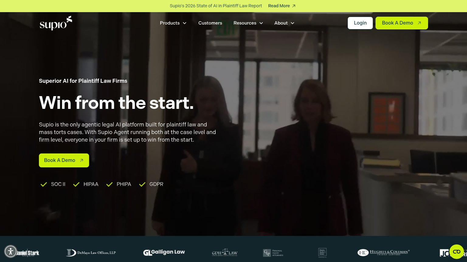
How Parrot ranks
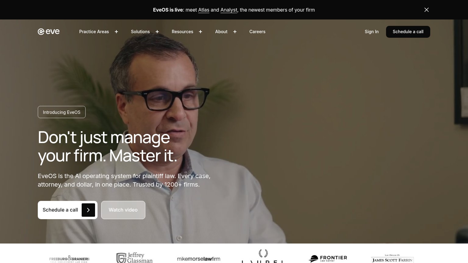
- 1.
Eve74
- 2.
Supio72
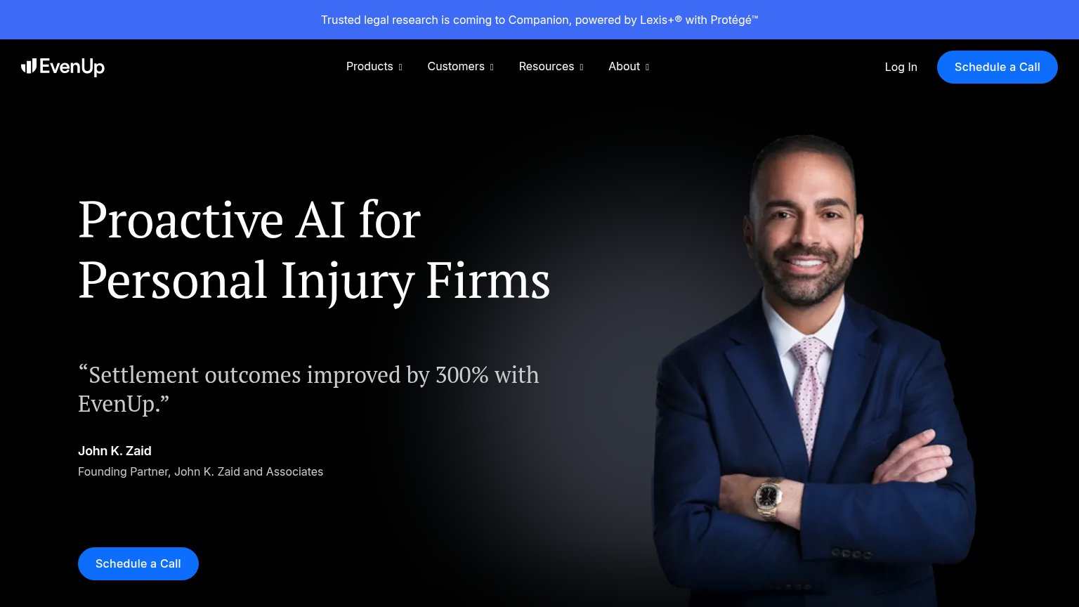
- 3.
EvenUp71
- 4.
Mimos69
- 5.
Parrot60
CTA
58FairCopy, size, verb, cost-feel — does the primary CTA earn the click?
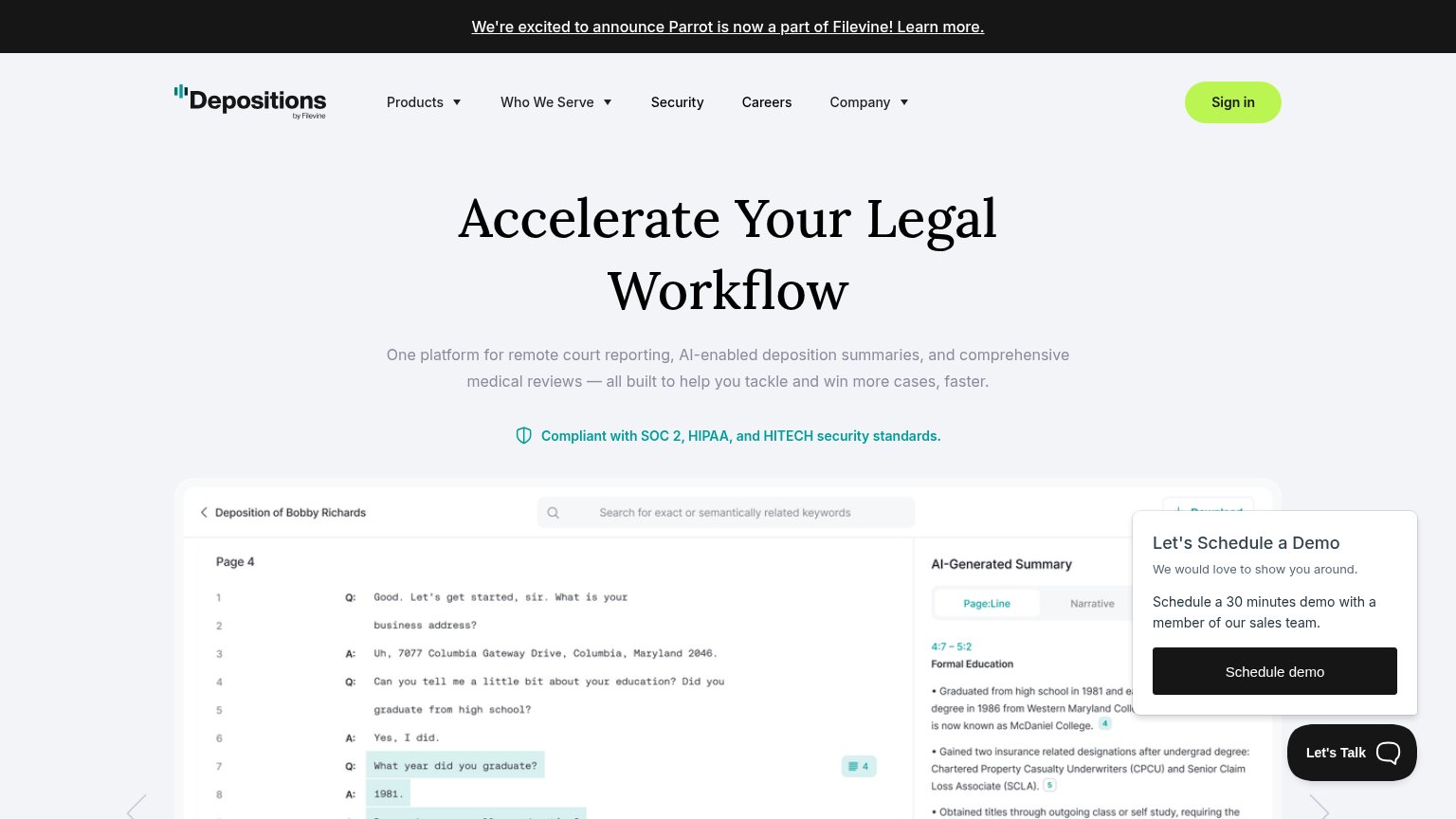

Problems
- no CTA in the hero itself
- lives in dismissible popup widget
- sales-call framing feels costly
- 'Sign in' outshines it in nav color
Mobile web
58FairThe phone experience as a first-class citizen.
 123
- Schedule demo overlay — Covers the bottom half of the first viewport and hides the product screenshot; it is the only tappable CTA on the fold.
- Announcement banner — Two wrapped lines of the Filevine acquisition news eat the top of the viewport before the value statement.
- Floating Close pill — Detached ✕ control hovers over the screenshot away from the overlay it dismisses, adding visual clutter.
Information hierarchy
62FairDoes the design help or inhibit what the page is trying to say?
What works
What to improve
Value props
62FairTitle, subtitle, hero — do they sell the product's true value?
Parrot’s headline
Accelerate Your Legal Workflow
One platform for remote court reporting, AI-enabled deposition summaries, and comprehensive medical reviews — all built to help you tackle and win more cases, faster.
Working
Could improve
Trust
62FairProof that the product is real, competent, and safe to try.
How Parrot compares
Trust read