
Your landing page’s weakest score is Mobile web.
How EvenUp ranks
- 1.
Eve74
- 2.
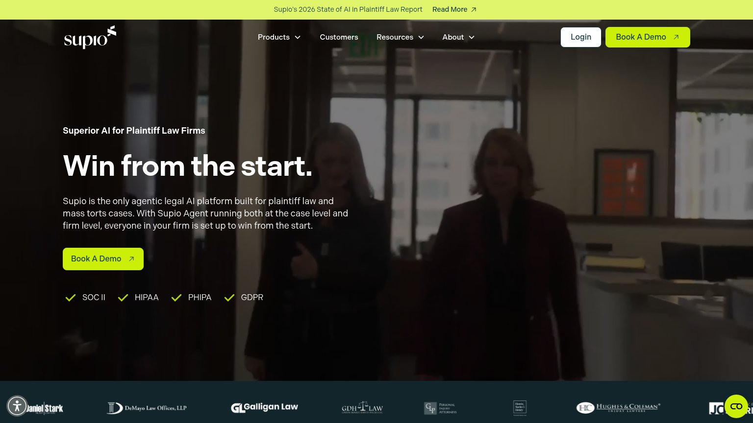
Supio72
- 3.
EvenUp71
- 4.
Mimos69
- 5.
Parrot60
Mobile web
64FairThe phone experience as a first-class citizen.
 123
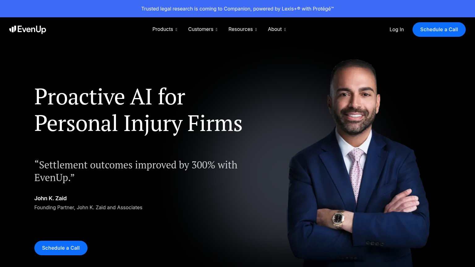
- Schedule a Call button — Primary CTA is clipped at the viewport edge and only half-width, so it isn't fully tappable without scrolling.
- Promo announcement banner — Wraps to three lines and eats the top of the fold, pushing the headline and CTA down.
- Attorney portrait image — Tall hero photo separates headline from quote and CTA, consuming a third of the fold without adding a tap target.
CTA
68FairCopy, size, verb, cost-feel — does the primary CTA earn the click?

Problems
- click feels like a time commitment
- no value promised for the call
- small footprint vs. hero headline
- sits at bottom edge of the fold
Trust
68FairProof that the product is real, competent, and safe to try.
How EvenUp compares
Trust read
Information hierarchy
78FairDoes the design help or inhibit what the page is trying to say?
What works
What to improve
Value props
78FairTitle, subtitle, hero — do they sell the product's true value?
EvenUp’s headline
Proactive AI for Personal Injury Firms
“Settlement outcomes improved by 300% with EvenUp.”
Working
Could improve