
Your landing page’s weakest score is Trust.
How Panoptive ranks
Trust
38PoorProof that the product is real, competent, and safe to try.


| Trust read | |
|---|---|
| Panoptive | No visible trust signal identified. |
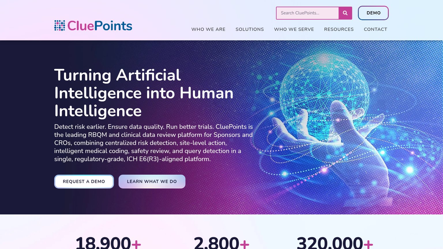
| Stats bar showing "18,900+", "2,800+", "320,000+" below the hero | |
| No visible trust signal identified. | |
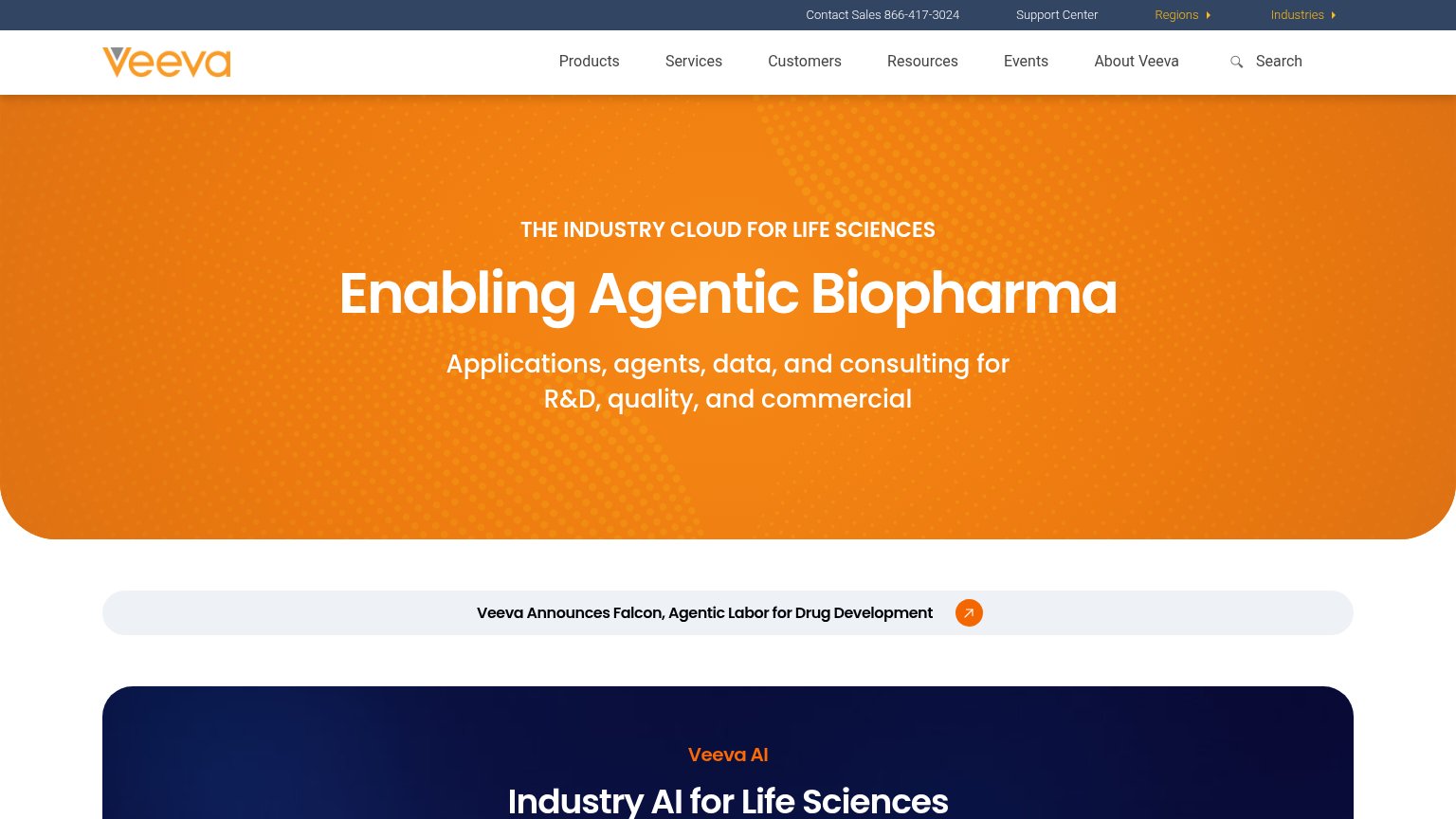
| "Saama Wins “AI-based Life Sciences Solution of the Year” Award in 2026 AI Breakthrough Awards" banner | |
| Webinar card citing "expert discussion with Worldwide Clinical Trials" (mobile) | |
| Announcement banner: "Veeva Announces Falcon, Agentic Labor for Drug Development" |
Mobile web
68FairThe phone experience as a first-class citizen.
 123
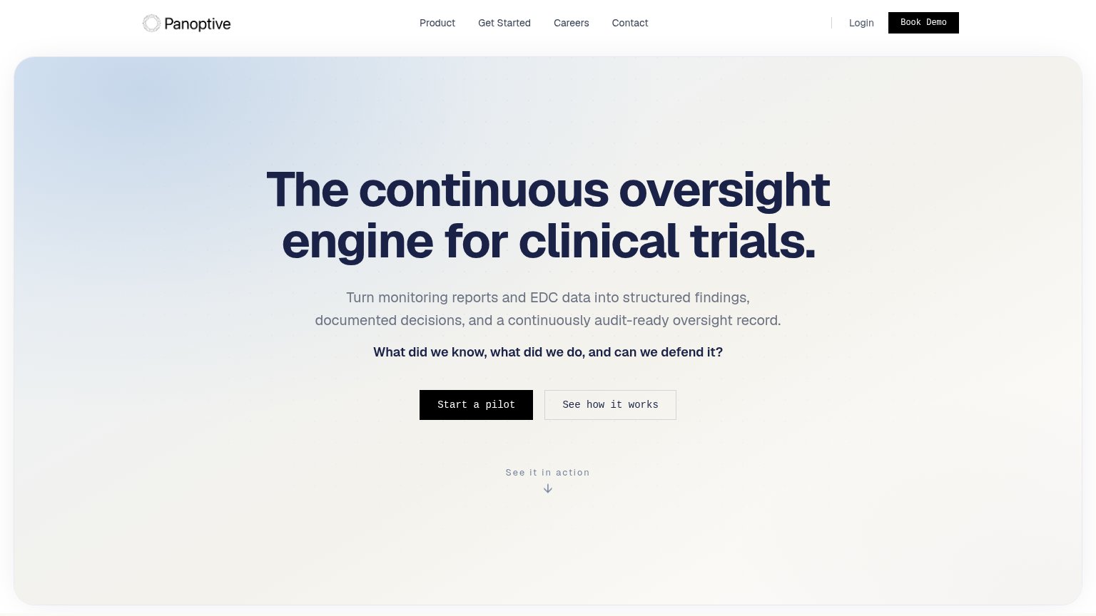
- Primary CTA below fold — "Start a pilot" sits ~1100px down the viewport, pushed near or past the first screen edge on shorter phones.
- Stacked hero messages — Headline, four-line subhead, and a bolded second tagline compete before the visitor reaches any action.
- Start a pilot button — Desktop-proportioned width instead of a full-bleed, thumb-friendly bar; twinned with an equal-weight "See how it works" below it.
CTA
72FairCopy, size, verb, cost-feel — does the primary CTA earn the click?
How Panoptive compares
Recommended rewrites
Value props
72FairTitle, subtitle, hero — do they sell the product's true value?
Panoptive’s headline
The continuous oversight engine for clinical trials.
Turn monitoring reports and EDC data into structured findings, documented decisions, and a continuously audit-ready oversight record.
Working
Could improve
Information hierarchy
76FairDoes the design help or inhibit what the page is trying to say?
What works
What to improve