
Your landing page’s weakest score is Trust.
How Paige ranks
Trust
42PoorProof that the product is real, competent, and safe to try.

| Trust read | |
|---|---|
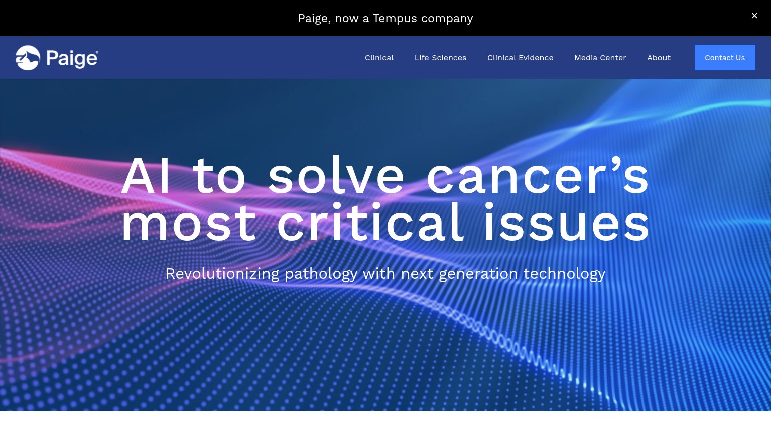
| Paige | "Paige, now a Tempus company" banner |
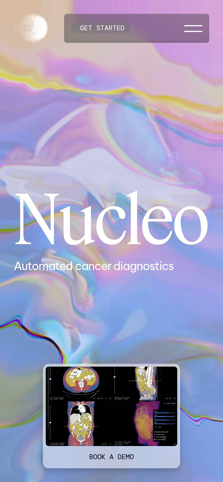
| Product screenshot of CT-scan segmentation UI above the "BOOK A DEMO" button | |
| Real Ibex diagnostic UI screenshot with slide heatmap analysis in the mobile hero | |
| No visible trust signal identified. | |
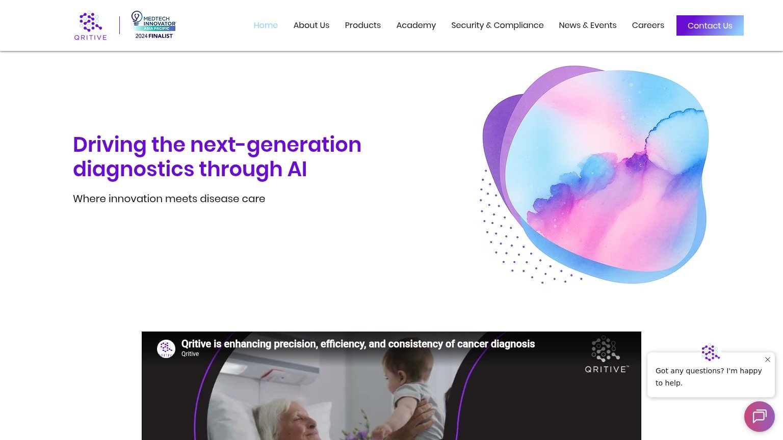
| MedTech Innovator Asia Pacific 2024 Finalist badge in the header | |
| Banner: "Unilabs Advances Digital Pathology Across Europe with Proscia, Shaping the Future of Precision Medicine" |
Mobile web
48PoorThe phone experience as a first-class citizen.
 12
- Oversized hero headline — Headline barely scaled down from desktop and wraps into six cramped lines, consuming most of the viewport.
- Tempus announcement bar — Black promo bar with no conversion CTA sits above the header, stealing first-viewport height.
Value props
52FairTitle, subtitle, hero — do they sell the product's true value?
Paige’s headline
AI to solve cancer's most critical issues
Revolutionizing pathology with next generation technology
Working
Could improve
CTA
58FairCopy, size, verb, cost-feel — does the primary CTA earn the click?
How Paige compares
Recommended rewrites
Information hierarchy
68FairDoes the design help or inhibit what the page is trying to say?
What works
What to improve