
Your landing page’s weakest score is Mobile web.
How Pabau ranks
Mobile web
62FairThe phone experience as a first-class citizen.
 1234
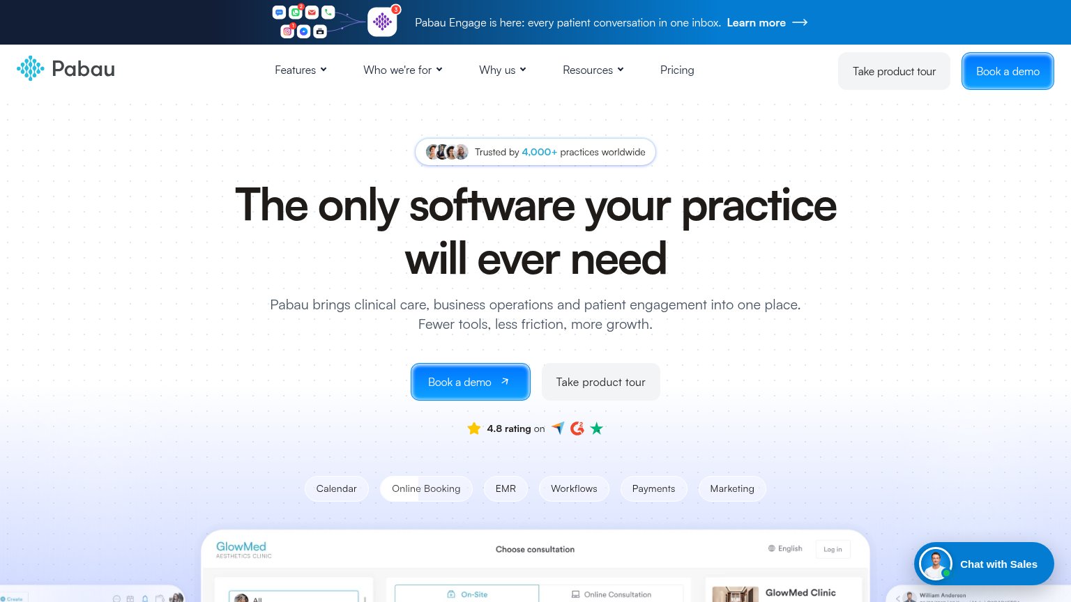
- Book a demo CTA — Pushed to roughly two viewports down by the long headline and paragraph stack — not tappable in the first fold.
- Chat with Sales bubble — Oversized chat pill covers the product screenshot and hugs the thumb zone, adding a dead blocker near the CTA row.
- Pabau Engage promo bar — Sticky announcement strip with icon clutter eats the top of the fold and pulls attention from the hero.
- Hero headline — Desktop-scaled type wraps to three tall lines and consumes most of the first viewport before any body copy.
CTA
72FairCopy, size, verb, cost-feel — does the primary CTA earn the click?
Problems
- demo booking feels committal
- sales-gated, no self-serve entry
- click delivers a calendar, not value
Value props
72FairTitle, subtitle, hero — do they sell the product's true value?
Pabau’s headline
The only software your practice will ever need
Pabau brings clinical care, business operations and patient engagement into one place. Fewer tools, less friction, more growth.
Working
Could improve
Information hierarchy
76FairDoes the design help or inhibit what the page is trying to say?
What works
What to improve
Trust
78FairProof that the product is real, competent, and safe to try.
How Pabau compares
Trust read