
Your landing page’s weakest score is Trust.
How Orthogonal ranks
- 1.
Composio78
- 2.
Arcade75
- 3.
Toolhouse70
- 4.
Orthogonal68
- 5.
Pica68
Trust
58FairProof that the product is real, competent, and safe to try.
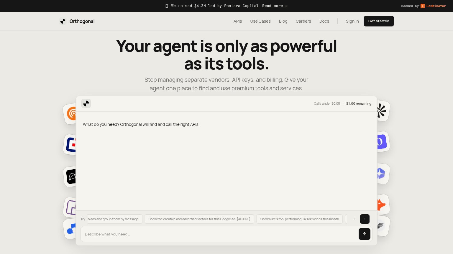
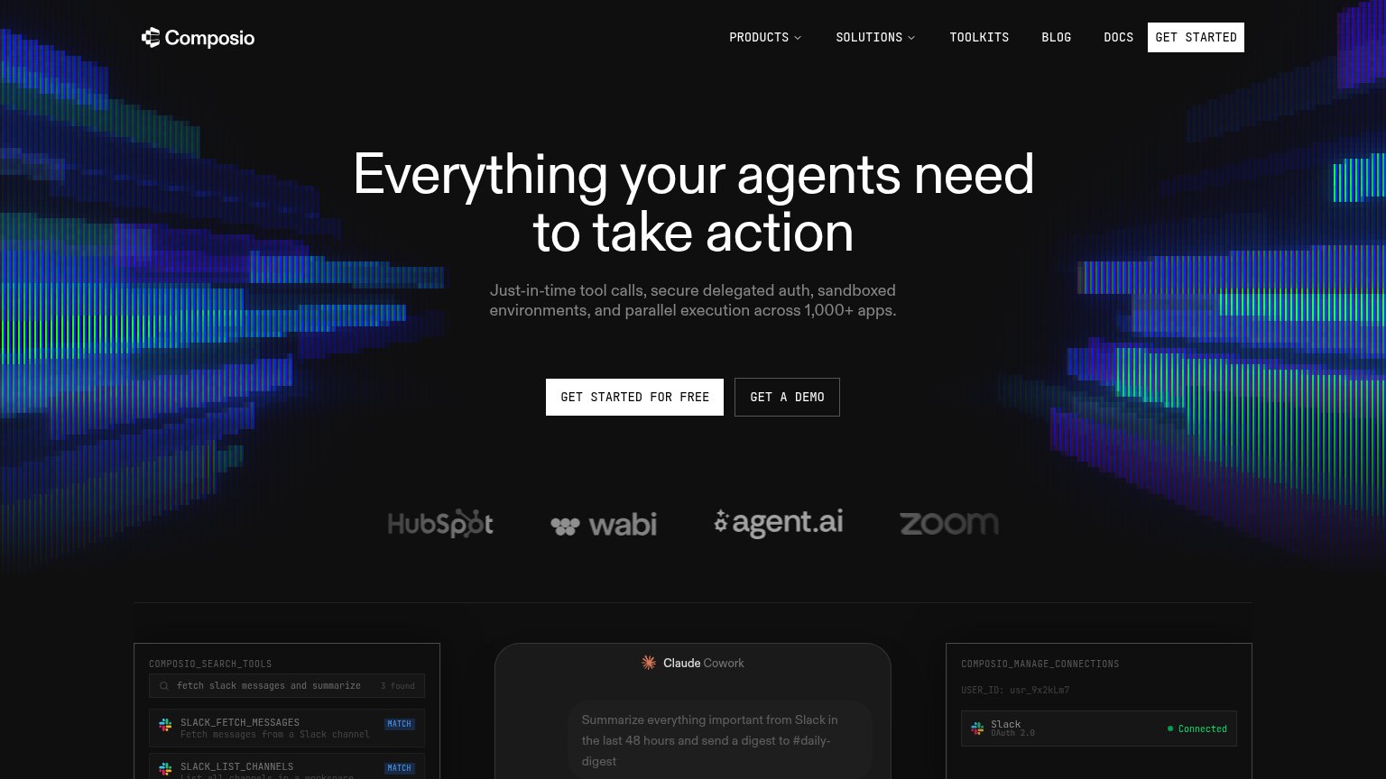
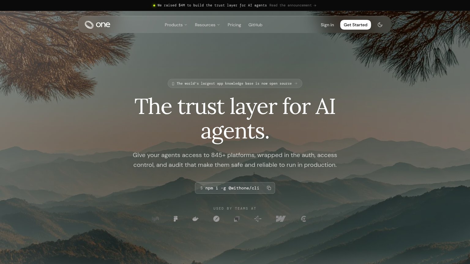
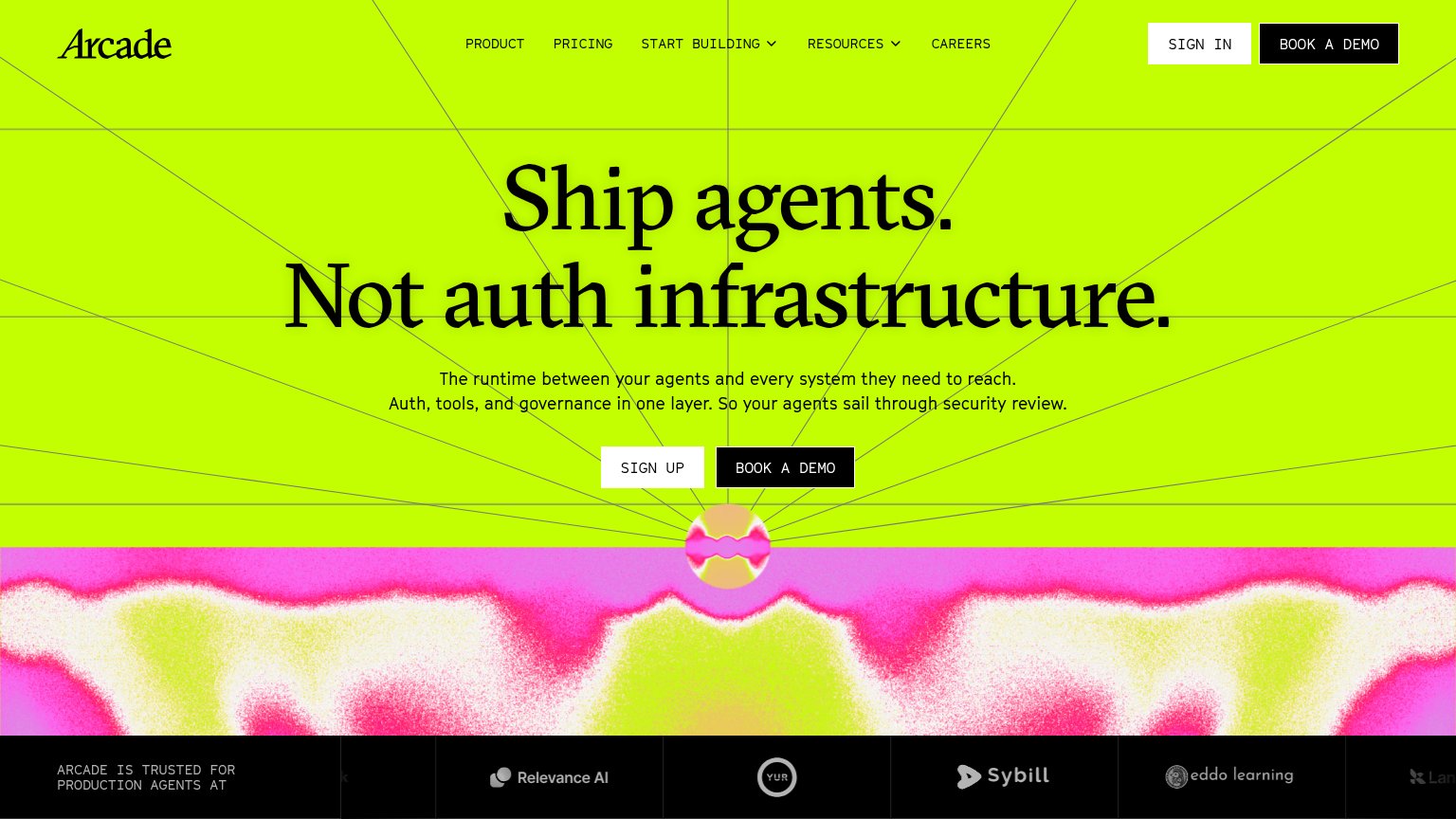
| Trust read | |
|---|---|
| Orthogonal | "We raised $4.3M led by Pantera Capital" / "Backed by Y Combinator" banner |
| Customer logo strip: HubSpot, wabi, agent.ai, Zoom | |
| Product demo UI showing an AI worker returning a redlined "Master Services Agreement" with tracked changes, captioned "R | |
| "ARCADE IS TRUSTED FOR PRODUCTION AGENTS AT" logo strip with Relevance AI, YUR, Sybill, eddo learning | |
| "USED BY TEAMS AT" logo strip showing Cisco, Dropbox, Lyft, Figma, and Docker |
Mobile web
62FairThe phone experience as a first-class citizen.
 123
- Announcement banner — The Pantera/YC banner stacks three lines and consumes roughly a fifth of the first viewport before the logo appears.
- Truncated try chip — The suggestion chip is clipped mid-word ('kedIn ads...'), reading as broken and undermining the demo prompt.
- Headline height — The three-line headline plus four-line subhead push the interactive demo mostly below the fold.
Information hierarchy
72FairDoes the design help or inhibit what the page is trying to say?
What works
What to improve
Value props
72FairTitle, subtitle, hero — do they sell the product's true value?
Orthogonal’s headline
Your agent is only as powerful as its tools.
Stop managing separate vendors, API keys, and billing. Give your agent one place to find and use premium tools and services.
Working
Could improve
CTA
78FairCopy, size, verb, cost-feel — does the primary CTA earn the click?
How Orthogonal compares
Recommended rewrites