
Your landing page’s weakest score is Information hierarchy.
How Orange Slice ranks
- 1.
Octave74
- 2.
Bardeen73
- 3.
Orange Slice70
- 4.
Cargo69
- 5.
Clay66
- 6.
Persana AI57
70Growth scoreupdated
category scores
category scoresShowHide
Information hierarchy
64FairDoes the design help or inhibit what the page is trying to say?
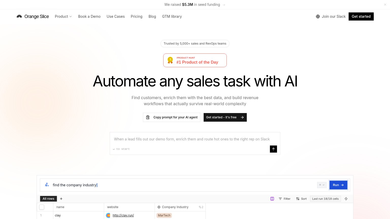 1234
- Dual hero CTAs — "Copy prompt for Orange Slice's AI agent" sits left of "Get started – it's free" at equal size, splitting the primary action.
- Product Hunt badge — The bordered #1 Product of the Day badge outranks the headline in the scan path, pushing the value prop lower.
- Full nav bar — Seven nav destinations plus "Join our Slack" create ten-plus exit paths before the hero CTA.
- Seed funding banner — "We raised $5.3M" is the first line visitors read and is investor news, not a buyer message.
Mobile web
66FairThe phone experience as a first-class citizen.
 1234
- Get started CTA — Primary CTA sits well below the fold behind badge, headline, subhead, and a secondary button — most visitors never see it in viewport one.
- All rows tab — Toolbar control renders with clipped/overlapping text and a stray highlighted glyph — a broken responsive layout artifact.
- Product table overflow — Desktop-width spreadsheet clips URLs mid-string ('http://cla...') and overflows the phone column horizontally.
- Seed funding banner — Sticky promo bar with no conversion CTA eats top-of-fold space and pushes the hero down.
Value props
72FairTitle, subtitle, hero — do they sell the product's true value?
Orange Slice’s headline
Automate any sales task with AI
Find customers, enrich them with the best data, and build revenue workflows that actually survive real-world complexity
Working
Could improve
Trust
72FairProof that the product is real, competent, and safe to try.
How Orange Slice compares
Trust read
CTA
78FairCopy, size, verb, cost-feel — does the primary CTA earn the click?
How Orange Slice compares
Recommended rewrites