
Your landing page’s weakest score is Trust.
How Odoo ranks
74Growth scoreupdated
category scores
category scoresShowHide
Trust
52FairProof that the product is real, competent, and safe to try.


| Trust read | |
|---|---|
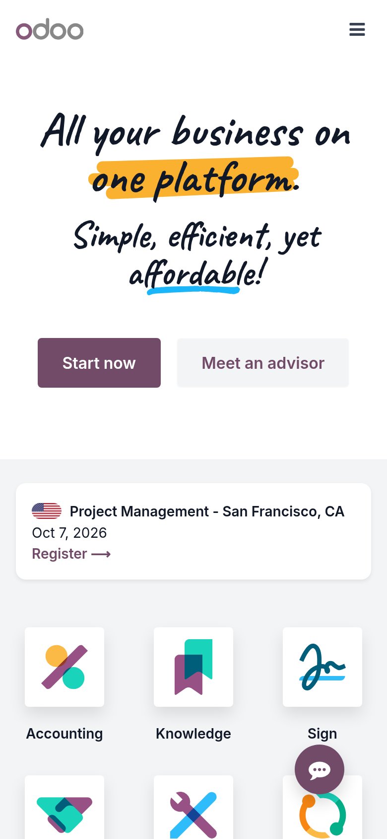
| Odoo | "US$ 24.90 / month for ALL apps" price annotation next to the CTA, paired with the dated event card "Accounting Academy |
| Customer logo strip featuring Chevrolet, OXXO, Pemex, Toyota, Chapur, and Gutza | |
| See the latest updates to DOSS in our H1 Product Recap | |
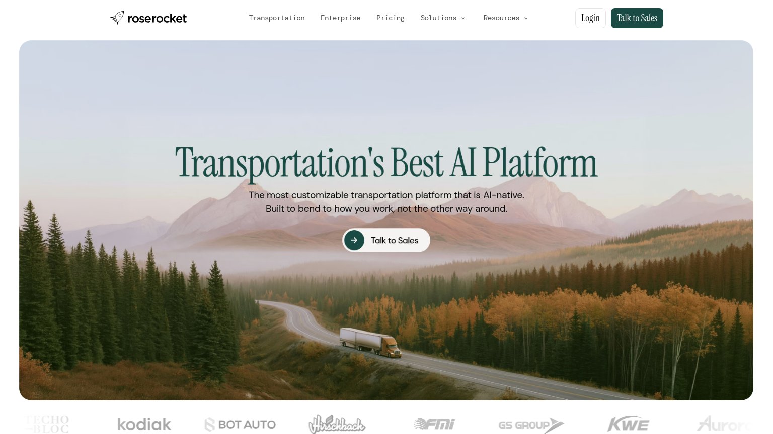
| Logo strip with Kodiak, Bot Auto, Hirschbach, FMI, GS Group, KWE, Aurora | |
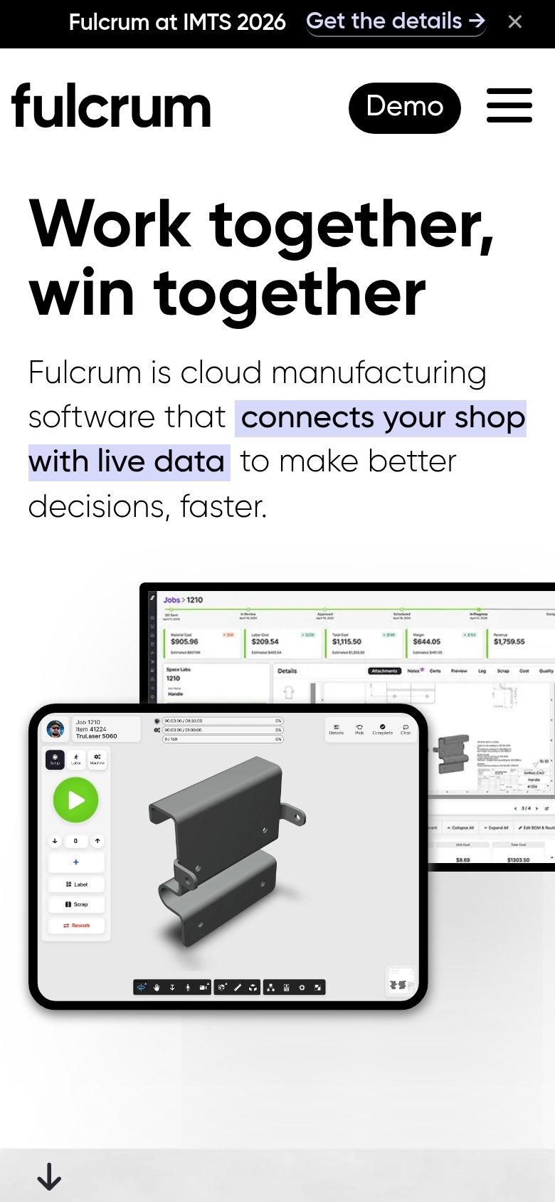
| Detailed real product UI: jobs dashboard with live cost data ($905.96 Material Cost, $644.05 Margin) and shop-floor tabl | |
| No visible trust signal identified. |
Information hierarchy
78FairDoes the design help or inhibit what the page is trying to say?
1234- Event register banner — Mid-fold card with its own Register link pulls attention to an unrelated event before the primary CTA.
- Try it free button — Second primary-styled CTA duplicates 'Start now' with different copy, splitting the one action into two.
- App icon grid — Twelve equal-weight tiles start a feature index in the fold, competing with the single-platform argument.
- Meet an advisor button — Sits at near-equal size beside 'Start now', diluting which action the fold wants first.
Value props
78FairTitle, subtitle, hero — do they sell the product's true value?
Odoo’s headline
All your business on one platform.
Simple, efficient, yet affordable!
Working
Could improve
Mobile web
80StrongThe phone experience as a first-class citizen.
What works
What to improve
CTA
82StrongCopy, size, verb, cost-feel — does the primary CTA earn the click?
How Odoo compares
Recommended rewrites