
Your landing page’s weakest score is CTA.
How No Barrier ranks
76Growth scoreupdated
category scores
category scoresShowHide
CTA
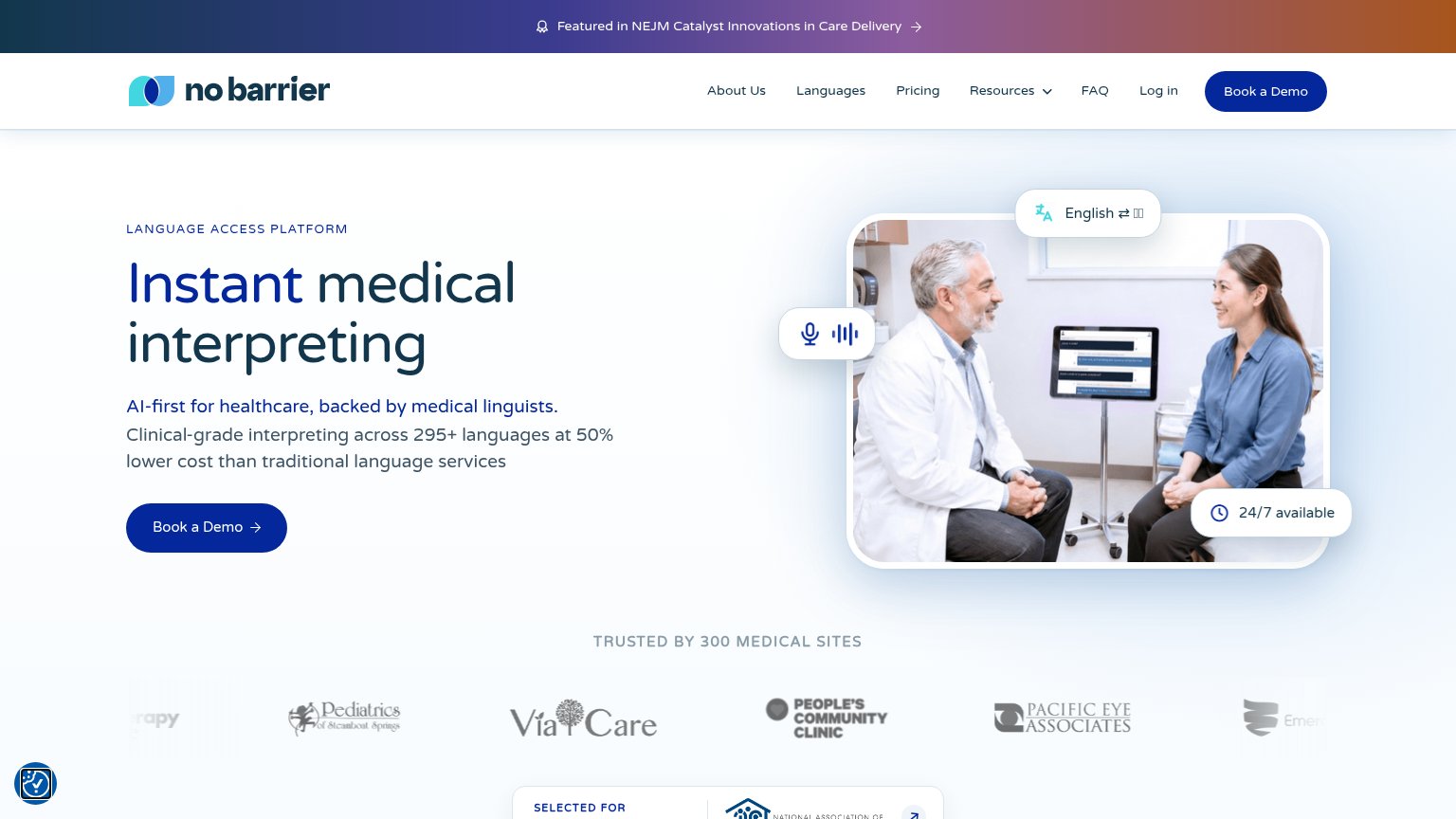
68FairCopy, size, verb, cost-feel — does the primary CTA earn the click?
Problems
- 'Book' feels like a sales-call cost
- no value payoff in the label
- contradicts 'Instant' headline promise
Information hierarchy
72FairDoes the design help or inhibit what the page is trying to say?
1234- Duplicate Book a Demo — Nav's dark-pill 'Book a Demo' matches the hero CTA's weight, splitting attention between two identical buttons.
- NEJM banner arrow link — The topmost element is a clickable outbound banner that pulls first attention off the page before the headline.
- Seven-item nav row — About Us, Languages, Pricing, Resources, FAQ, Log in offer six exits before the visitor reads the value prop.
- Faded left/right logos — Cropped, half-visible logos at the strip's edges read as rendering glitches rather than an intentional carousel.
Trust
76FairProof that the product is real, competent, and safe to try.
How No Barrier compares
Trust read
Mobile web
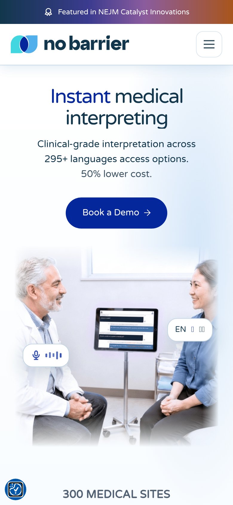
78FairThe phone experience as a first-class citizen.
What works
What to improve
Value props
84StrongTitle, subtitle, hero — do they sell the product's true value?
No Barrier’s headline
Instant medical interpreting
AI-first for healthcare, backed by medical linguists. Clinical-grade interpreting across 295+ languages at 50% lower cost than traditional language services
Working
Could improve