
Your landing page’s weakest score is CTA.
How Neuphonic ranks
CTA
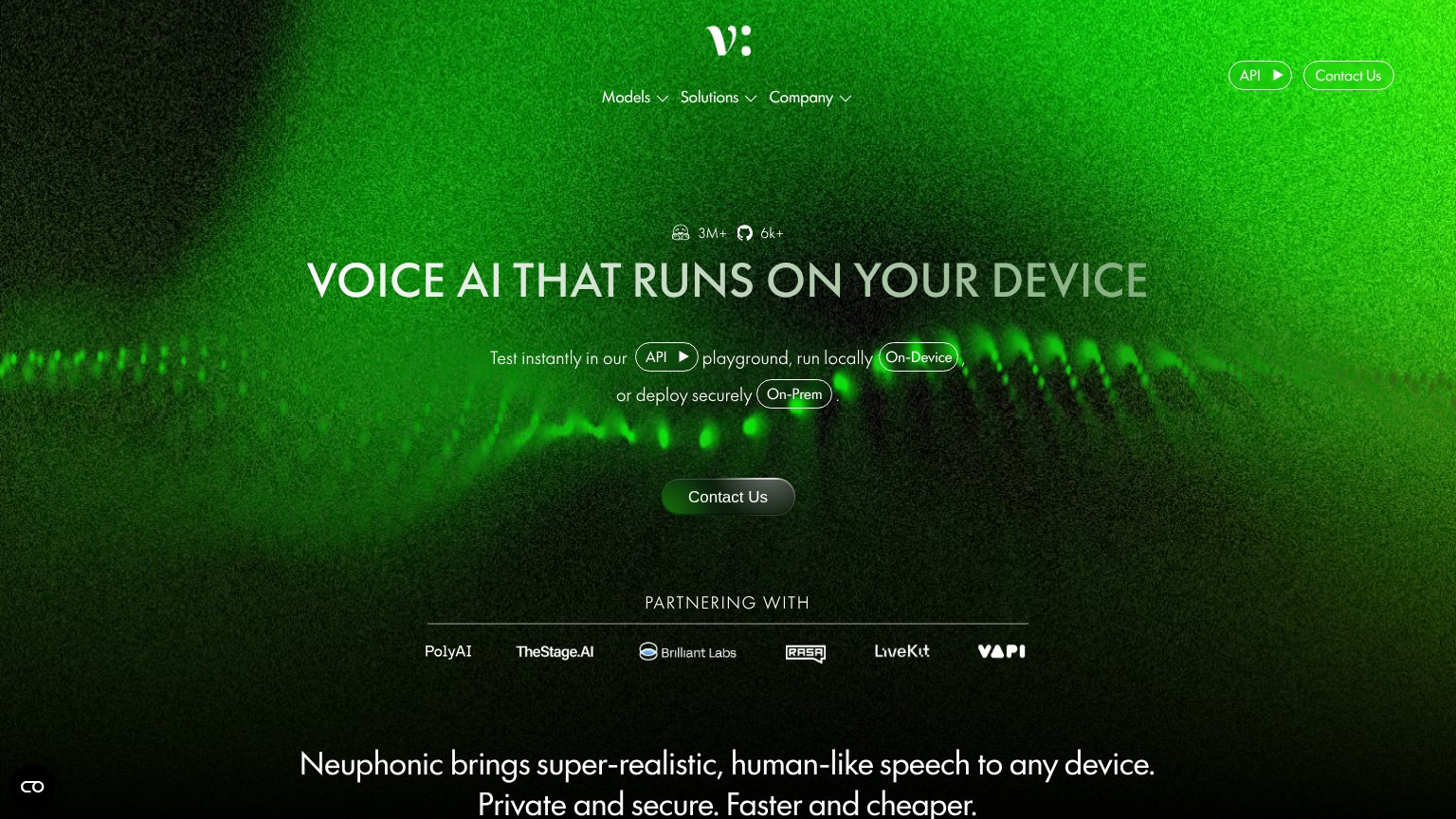
52FairCopy, size, verb, cost-feel — does the primary CTA earn the click?

Problems
- high-cost sales-contact click
- contradicts 'Test instantly' copy
- playground buried as small nav pill
- no action verb toward product value
Mobile web
62FairThe phone experience as a first-class citizen.
 1234
- Uncollapsed nav row — Full desktop link row "Models / Solutions / Company" sits below the header instead of a hamburger, forming a double-decker header that eats the top of the fold.
- Contact Us button — Primary CTA keeps desktop proportions — a narrow pill floating in the phone column instead of a near-full-width thumb target.
- Header CTA pair — "API" and "Contact Us" pills in the header compete with the hero's identical "Contact Us" and "API" pills, giving four tappable actions before the fold.
- Inline pill sentence — The "Test instantly…" sentence embeds three button-styled pills (API, On-Device, On-Prem) mid-copy, so tap targets and reading flow collide.
Information hierarchy
72FairDoes the design help or inhibit what the page is trying to say?
What works
What to improve
Value props
72FairTitle, subtitle, hero — do they sell the product's true value?
Neuphonic’s headline
VOICE AI THAT RUNS ON YOUR DEVICE
Test instantly in our API playground, run locally On-Device, or deploy securely On-Prem.
Working
Could improve
Trust
72FairProof that the product is real, competent, and safe to try.
How Neuphonic compares
Trust read