
Your landing page’s weakest score is Mobile web.
How Neo Agent ranks
- 1.
MSPilot72
- 2.
Rewst69
- 3.
Thread68
- 4.
CloudRadial66
- 5.
Neo Agent49
Mobile web
34PoorThe phone experience as a first-class citizen.
 1234
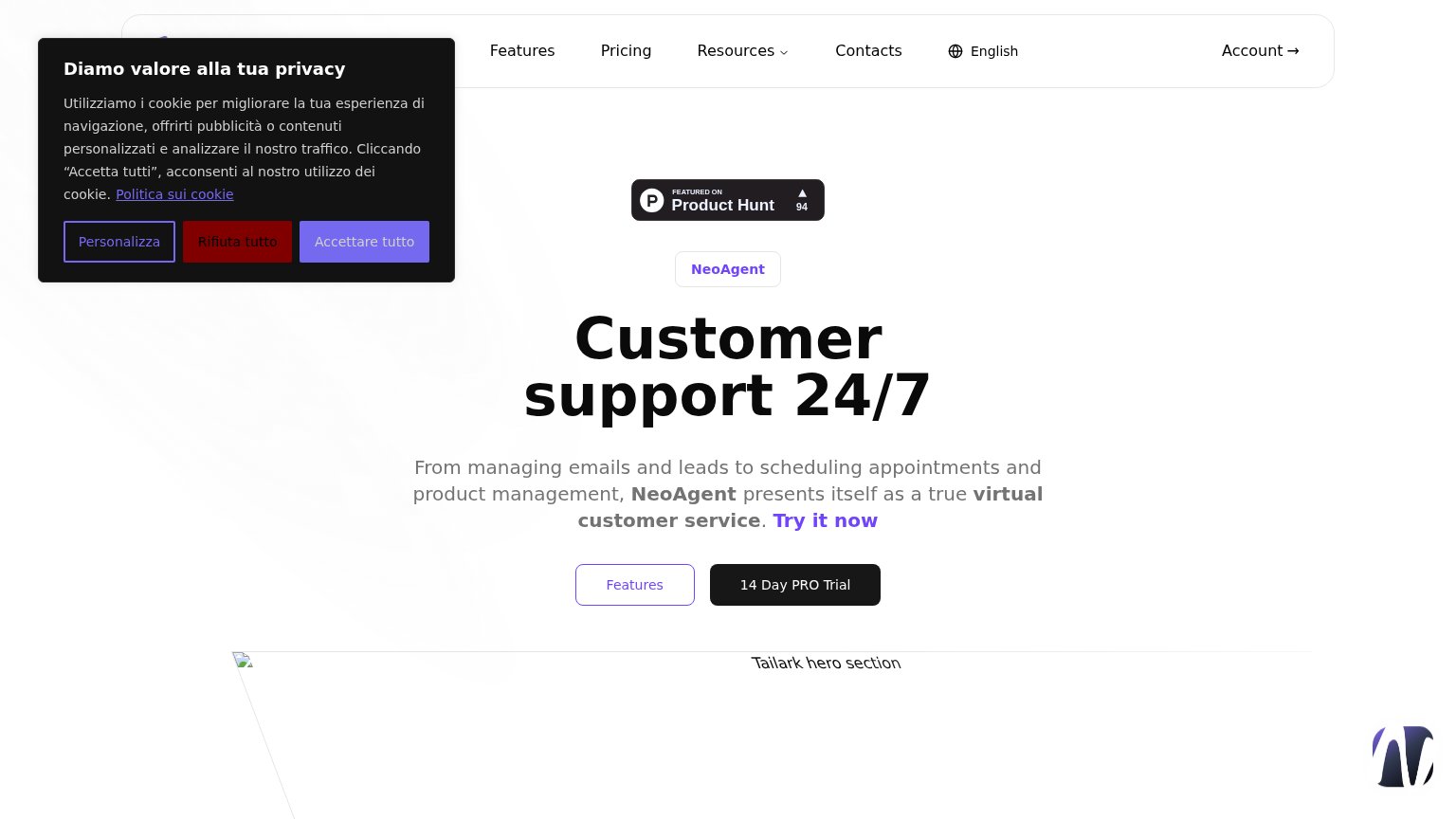
- Cookie consent wall — Dark consent modal consumes the top ~45% of the first mobile viewport before any product content, and its CTA does no conversion work.
- Headline missing on mobile — The "Customer support 24/7" headline and NeoAgent badge are pushed out of the first viewport, so the fold opens with body copy instead of a value statement.
- Rifiuta tutto button — Dark-red full-width reject button visually competes with Accettare tutto and adds a third choice inside an already oversized consent stack.
- 14 Day PRO Trial button — Primary CTA keeps desktop proportions — narrow and centered instead of thumb-friendly full-bleed — and sits below a secondary Features button.
Trust
38PoorProof that the product is real, competent, and safe to try.



| Trust read | |
|---|---|
| Neo Agent | "Featured on Product Hunt" badge with 94 upvotes above the hero headline |
| Detailed product UI screenshot showing the Agent Authoring Canvas and tenant deployment dashboard | |
| No visible trust signal identified. | |
| "750+ MSPs trust ... processing 173 million tickets, returning over half a million hours to technicians, and earning 97% | |
| "Trusted by over 1,000 MSPs — integrates with your go-to PSA" (mobile fold) |
CTA
55FairCopy, size, verb, cost-feel — does the primary CTA earn the click?
How Neo Agent compares
Recommended rewrites
Information hierarchy
58FairDoes the design help or inhibit what the page is trying to say?
What works
What to improve
Value props
58FairTitle, subtitle, hero — do they sell the product's true value?
Neo Agent’s headline
Customer support 24/7
From managing emails and leads to scheduling appointments and product management, NeoAgent presents itself as a true virtual customer service. Try it now
Working
Could improve