
Your landing page’s weakest score is Mobile web.
How Thread ranks
Mobile web
54FairThe phone experience as a first-class citizen.
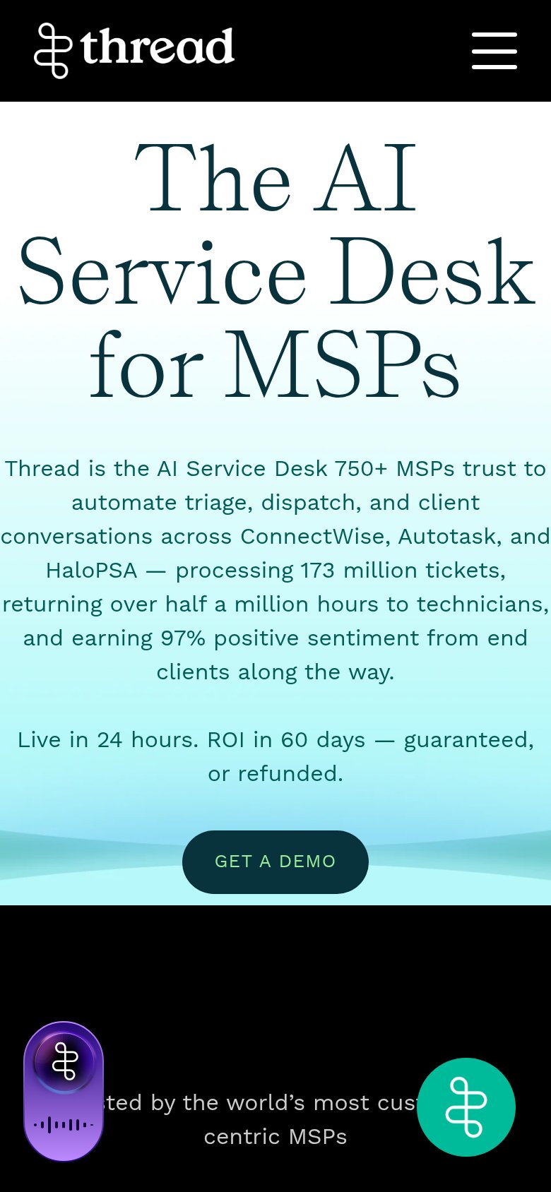 1234
- Eleven-line subhead paragraph — Desktop-length copy crammed into the phone column; text overflows the viewport edges on both sides.
- Purple assistant widget — Oversized floating bubble covers the social-proof line; the duplicate teal chat bubble crowds the same row.
- GET A DEMO button — Modest pill instead of a full-width thumb-friendly button, pushed to the very bottom of the fold.
- Oversized serif headline — Headline barely scaled down, wrapping into three huge lines that eat a third of the viewport.
Trust
64FairProof that the product is real, competent, and safe to try.
| Trust read | |
|---|---|
| Thread | "750+ MSPs trust ... processing 173 million tickets, returning over half a million hours to technicians, and earning 97% |
| Detailed product UI screenshot showing the Agent Authoring Canvas and tenant deployment dashboard | |
| No visible trust signal identified. | |
| "Featured on Product Hunt" badge with 94 upvotes above the hero headline | |
| "Trusted by over 1,000 MSPs — integrates with your go-to PSA" (mobile fold) |
Information hierarchy
72FairDoes the design help or inhibit what the page is trying to say?
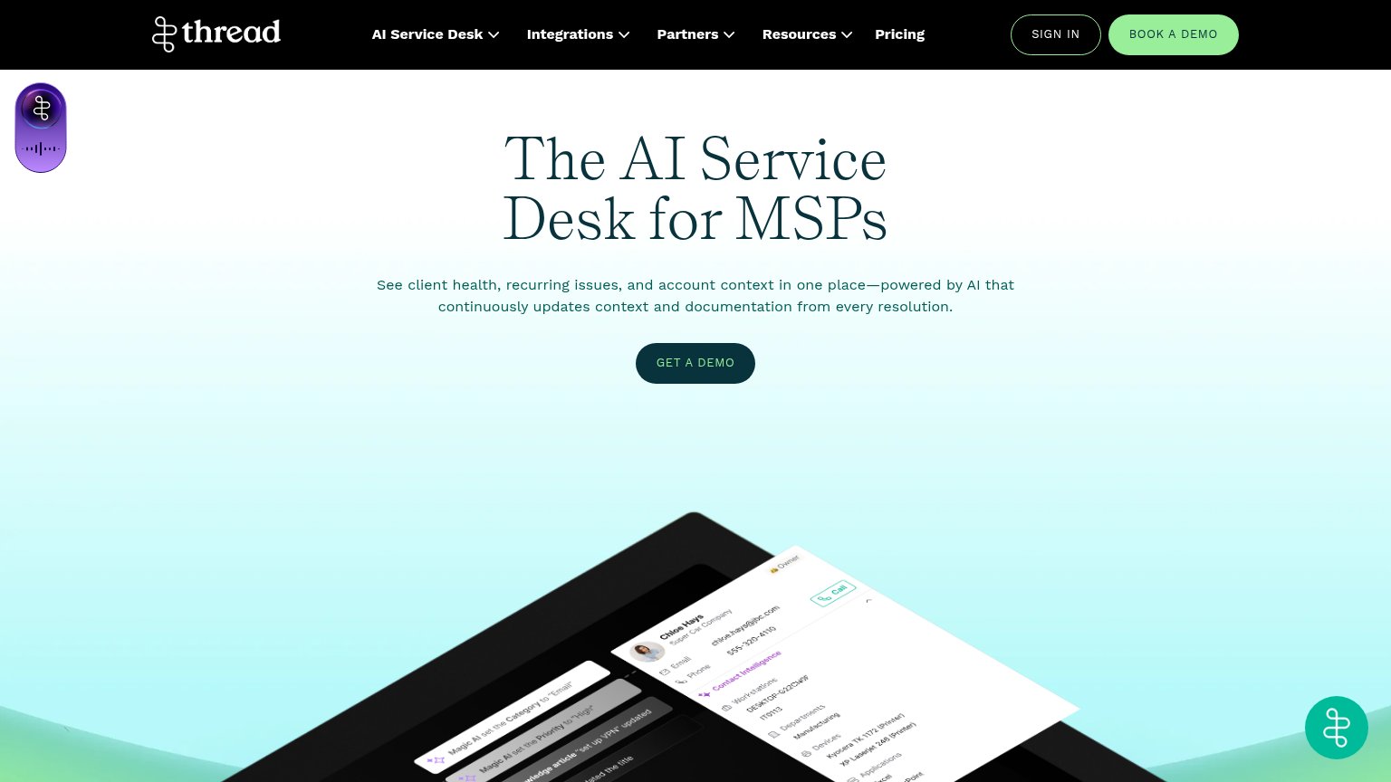
What works
What to improve
CTA
72FairCopy, size, verb, cost-feel — does the primary CTA earn the click?
How Thread compares
Recommended rewrites
Value props
78FairTitle, subtitle, hero — do they sell the product's true value?
Thread’s headline
The AI Service Desk for MSPs
See client health, recurring issues, and account context in one place—powered by AI that continuously updates context and documentation from every resolution.
Working
Could improve