
Your landing page’s weakest score is Trust.
How MyCase ranks
Trust
54FairProof that the product is real, competent, and safe to try.


| Trust read | |
|---|---|
| MyCase | implicit context MyCase may benefit from pre-existing familiarity among its target audience. |
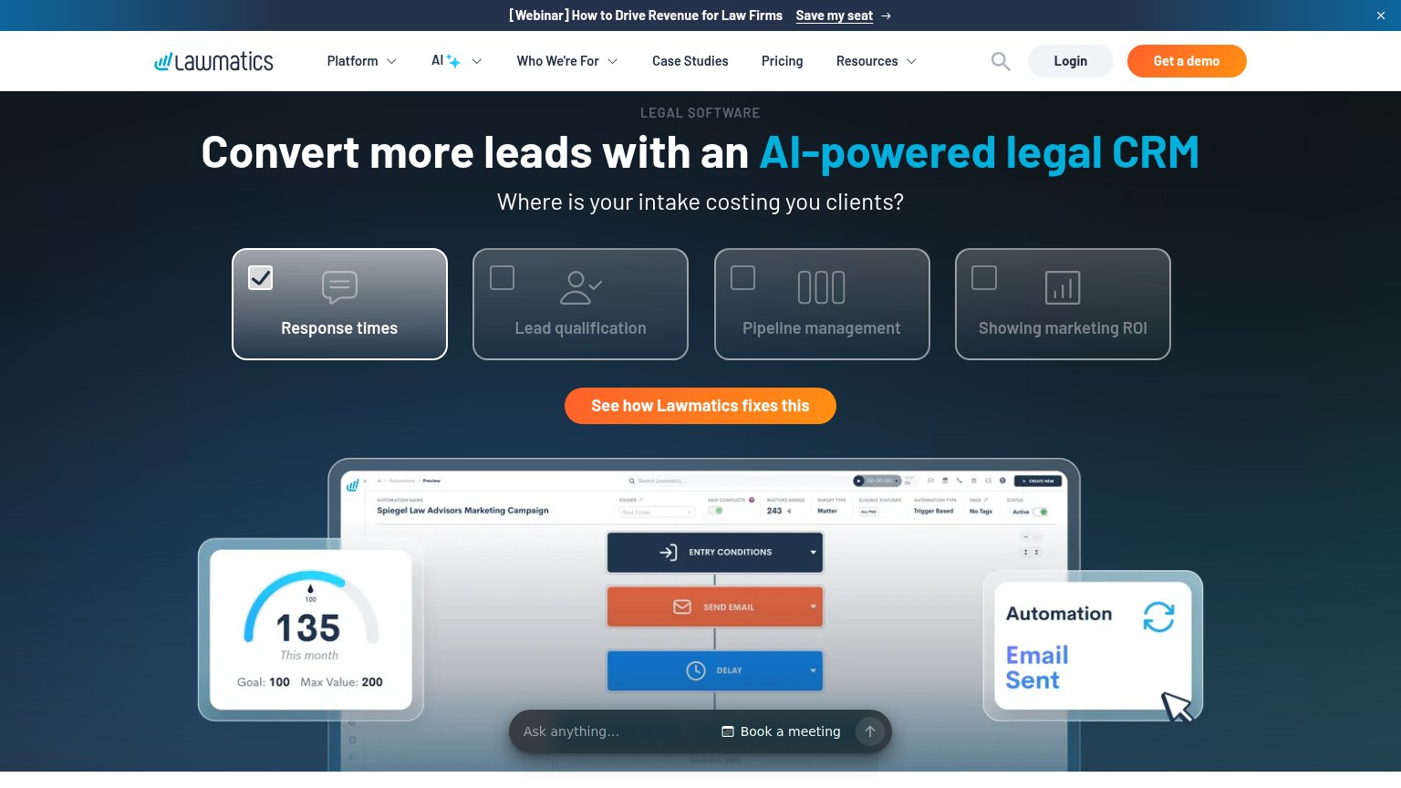
| "TRUSTED BY" logo strip of named law firms (TrustCounsel, Erskine & Erskine, Stephen A. Thomas, Esq.) | |
| No visible trust signal identified. | |
| 4.8 (3,308) star rating with G2, Capterra, GetApp and Software Advice 2026 award badges | |
| Real product screenshot of the automation builder showing "Spiegel Law Advisors Marketing Campaign" with Entry Condition |
Mobile web
70FairThe phone experience as a first-class citizen.
 123
- Get Started button — Primary CTA is clipped at the bottom edge of the first viewport, so most visitors must scroll to tap it.
- Chat bubble — Chat widget overlaps the right end of the Get Started button, risking mis-taps on the primary CTA.
- Checkmark bullet stack — Four multi-line bullets consume most of the fold and push the email form and CTA out of easy reach.
Information hierarchy
72FairDoes the design help or inhibit what the page is trying to say?
What works
What to improve
Value props
76FairTitle, subtitle, hero — do they sell the product's true value?
MyCase’s headline
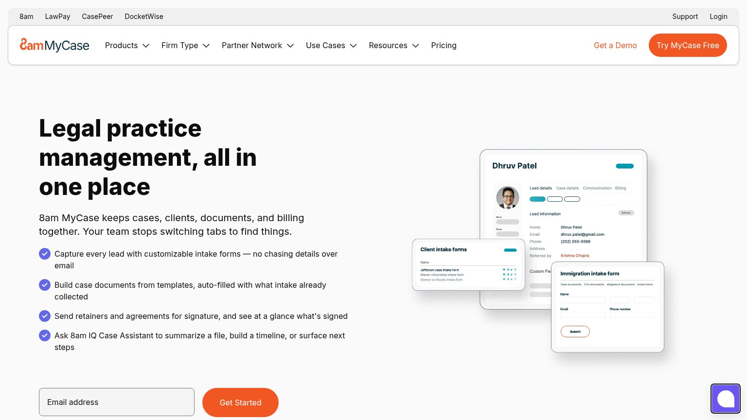
Legal practice management, all in one place
8am MyCase keeps cases, clients, documents, and billing together. Your team stops switching tabs to find things.
Working
Could improve
CTA
78FairCopy, size, verb, cost-feel — does the primary CTA earn the click?
How MyCase compares
Recommended rewrites