
Your landing page’s weakest score is Mobile web.
How MRI Certification on Demand ranks
- 1.
Tire Swing68
- 2.
Pronto Housing68
- 3.
MRI Certification on Demand67
- 4.
ProLink Solutions (ProCert)58
- 5.
Zoro (Preferred Compliance Solutions)54
67Growth scoreupdated
category scores
category scoresShowHide
Mobile web
58FairThe phone experience as a first-class citizen.
 1234
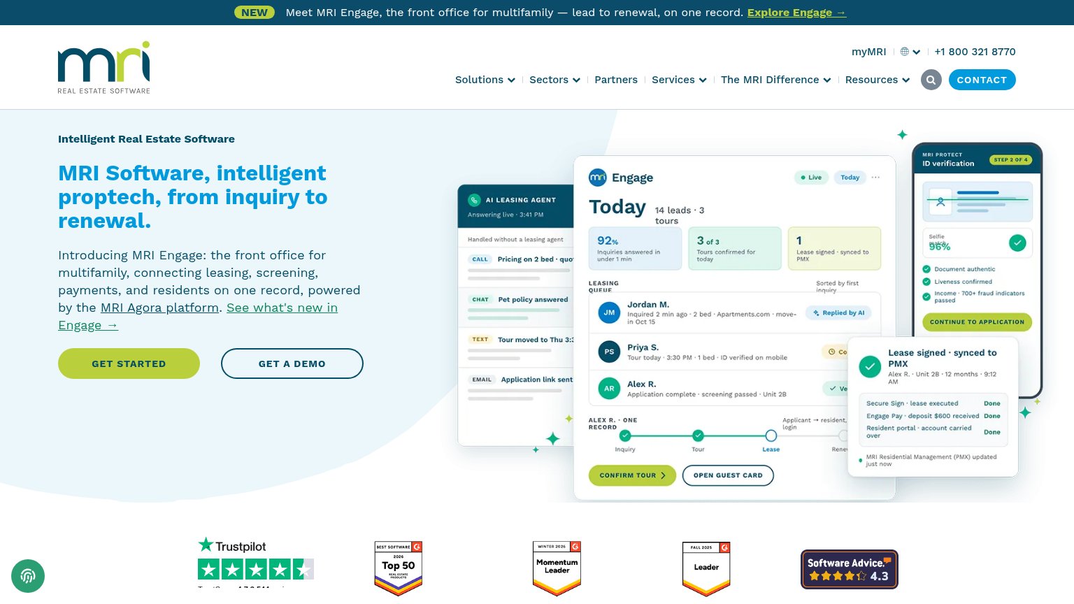
- Hero screenshot collage — Full-width desktop collage eats the first viewport and pushes both CTAs below the fold.
- Oversized wrapping headline — Headline scales down too little, wrapping into four huge lines that delay the CTA.
- GET STARTED button — Primary CTA sits far below the fold and is not full-width, splitting the column with GET A DEMO.
- Award badge strip — Trustpilot widget overlaps the chat bubble and badges render too small to read.
Value props
62FairTitle, subtitle, hero — do they sell the product's true value?
MRI Certification on Demand’s headline vague
MRI Software, intelligent proptech, from inquiry to renewal.
Introducing MRI Engage: the front office for multifamily, connecting leasing, screening, payments, and residents on one record, powered by the MRI Agora platform. See what's new in Engage →
Working
- Hero image demonstrates product in action
- Subhead names concrete workflows
- 'One record' is a sharp differentiator
Could improve
- 'Intelligent proptech' is buzzword filler
- No numbers in headline or subhead copy
- Zero emotional pull; states no pain solved
Information hierarchy
68FairDoes the design help or inhibit what the page is trying to say?
What works
What to improve
CTA
72FairCopy, size, verb, cost-feel — does the primary CTA earn the click?
How MRI Certification on Demand compares
Recommended rewrites
Trust
76FairProof that the product is real, competent, and safe to try.
How MRI Certification on Demand compares
Trust read