
Your landing page’s weakest score is CTA.
How Mini-Circuits ranks
58Growth scoreupdated
category scores
category scoresShowHide
CTA
48PoorCopy, size, verb, cost-feel — does the primary CTA earn the click?
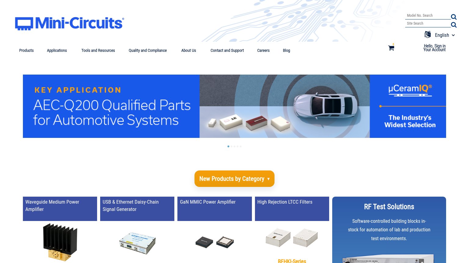
Problems
- no action verb — reads as a label
- dropdown, not a destination action
- hero banner carries no CTA at all
- search input buried at footnote size
Information hierarchy
54FairDoes the design help or inhibit what the page is trying to say?
1234- New Products dropdown — The fold's only button is a dropdown labeled 'New Products by Category' — a browsing control, not a conversion action, floating alone between carousel and cards.
- Rotating hero carousel — Five rotating slides mean the value proposition ('AEC-Q200 Qualified Parts') is only visible 20% of the time and competes with unrelated messages.
- Four equal product cards — Four same-weight blue cards plus the 'RF Test Solutions' panel shout at equal volume, so no single message wins the scan.
- Top navigation row — Eight nav items plus dual search boxes, cart, language, and sign-in create ~15 exit paths before any primary action appears.
Mobile web
58FairThe phone experience as a first-class citizen.
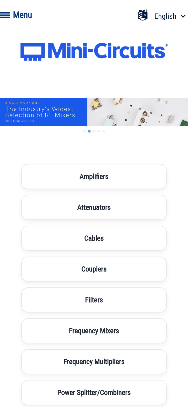
What works
What to improve
Value props
62FairTitle, subtitle, hero — do they sell the product's true value?
Mini-Circuits’s headline
AEC-Q200 Qualified Parts for Automotive Systems
The Industry's Widest Selection
Working
Could improve
Trust
68FairProof that the product is real, competent, and safe to try.
How Mini-Circuits compares
Trust read