
Your landing page’s weakest score is Trust.
How Mindgrasp ranks
Trust
68FairProof that the product is real, competent, and safe to try.
| Trust read | |
|---|---|
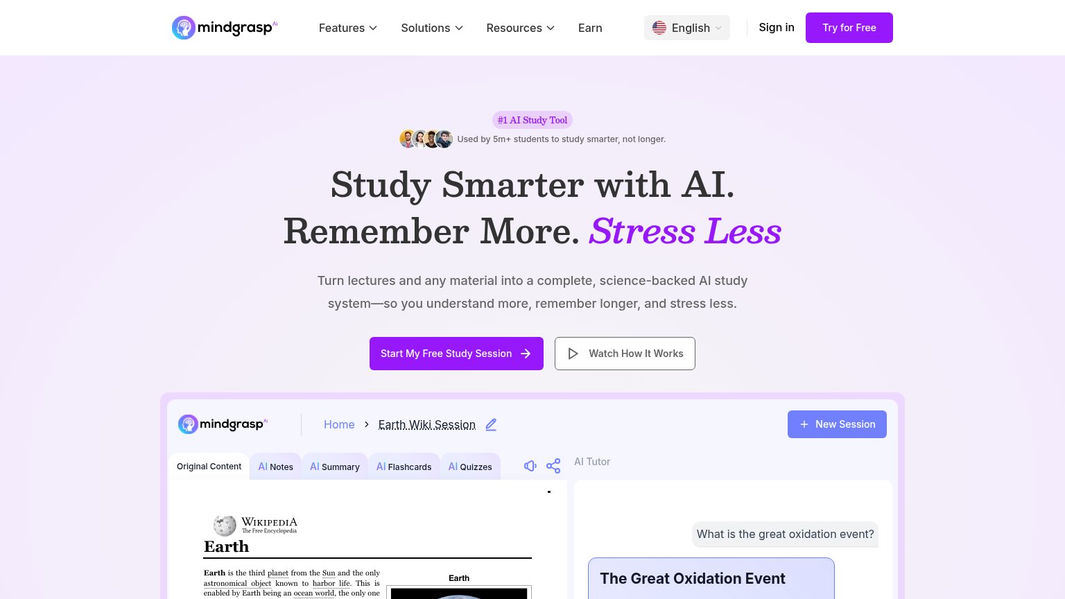
| Mindgrasp | "Used by 5m+ students to study smarter, not longer." with avatar row above the hero headline |
| No visible trust signal identified. | |
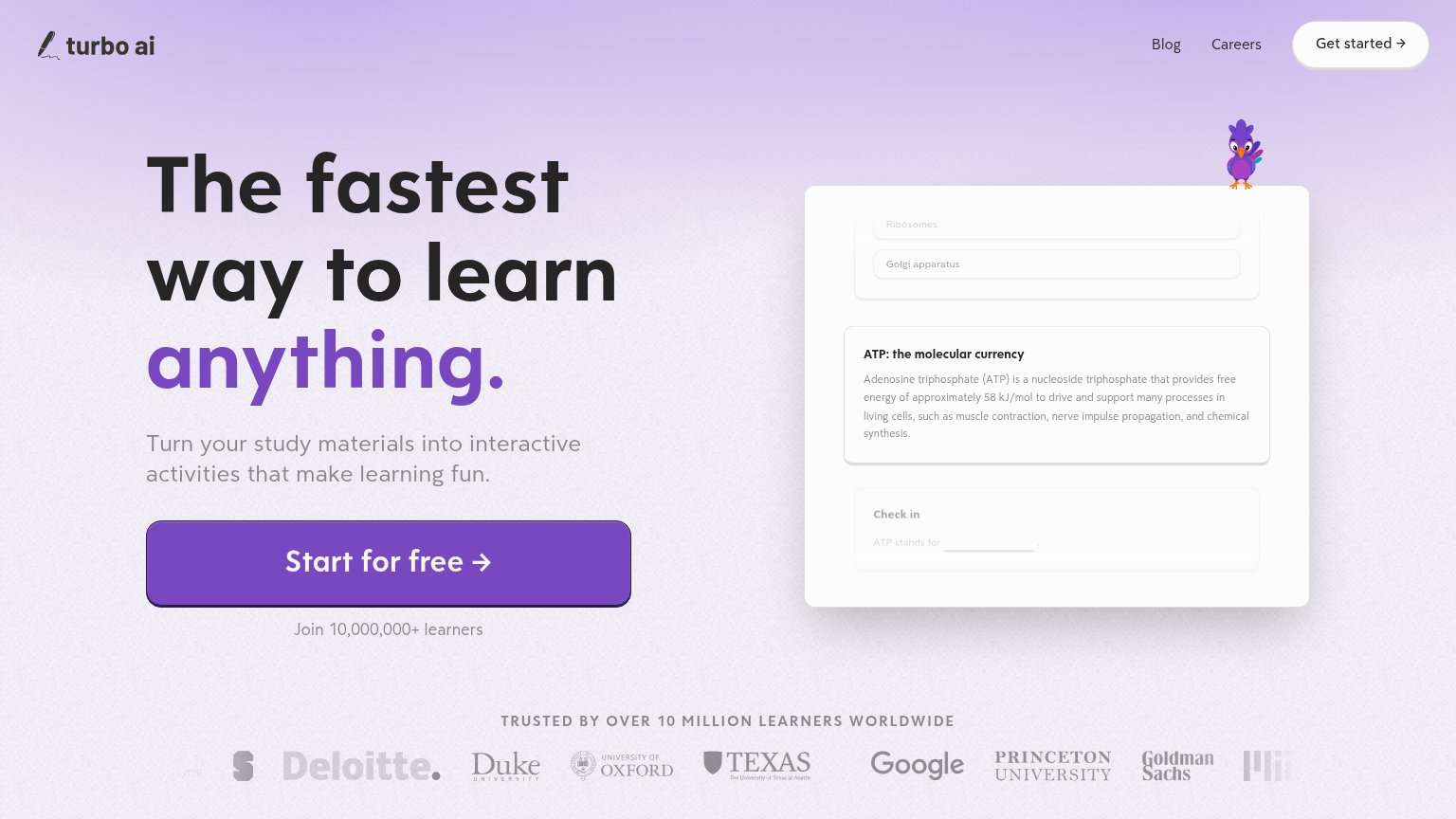
| "TRUSTED BY OVER 10 MILLION LEARNERS WORLDWIDE" logo strip with Deloitte, Duke, Oxford, Texas, Google, Princeton, Goldma | |
| AI Lecture Summarizer app UI showing a real workflow (Title "American Revolution", Notes/Flashcards options, language an | |
| No visible trust signal identified. |
Mobile web
68FairThe phone experience as a first-class citizen.
 123
- Serif headline stack — Headline wraps into four tall lines plus a fifth italic line, pushing both CTAs out of the first viewport.
- Primary CTA position — "Start My Free Study Session" sits roughly 1200px down — below the first screen for most phones.
- Social proof row — Avatar cluster and two-line "Used by 5m+ students" caption misalign awkwardly, adding vertical bulk before the headline.
Information hierarchy
78FairDoes the design help or inhibit what the page is trying to say?
What works
What to improve
Value props
78FairTitle, subtitle, hero — do they sell the product's true value?
Mindgrasp’s headline
Study Smarter with AI. Remember More. Stress Less
Turn lectures and any material into a complete, science-backed AI study system—so you understand more, remember longer, and stress less.
Working
Could improve
CTA
82StrongCopy, size, verb, cost-feel — does the primary CTA earn the click?
How Mindgrasp compares
Recommended rewrites