
Your landing page’s weakest score is Trust.
How Knowt ranks
69Growth scoreupdated
category scores
category scoresShowHide
Trust
55FairProof that the product is real, competent, and safe to try.
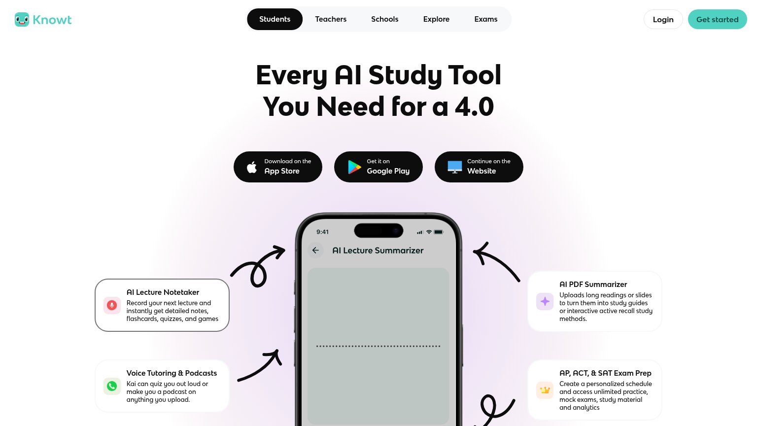
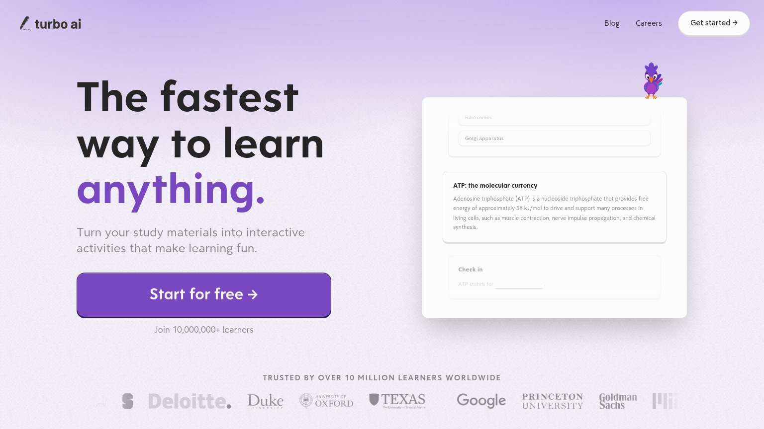
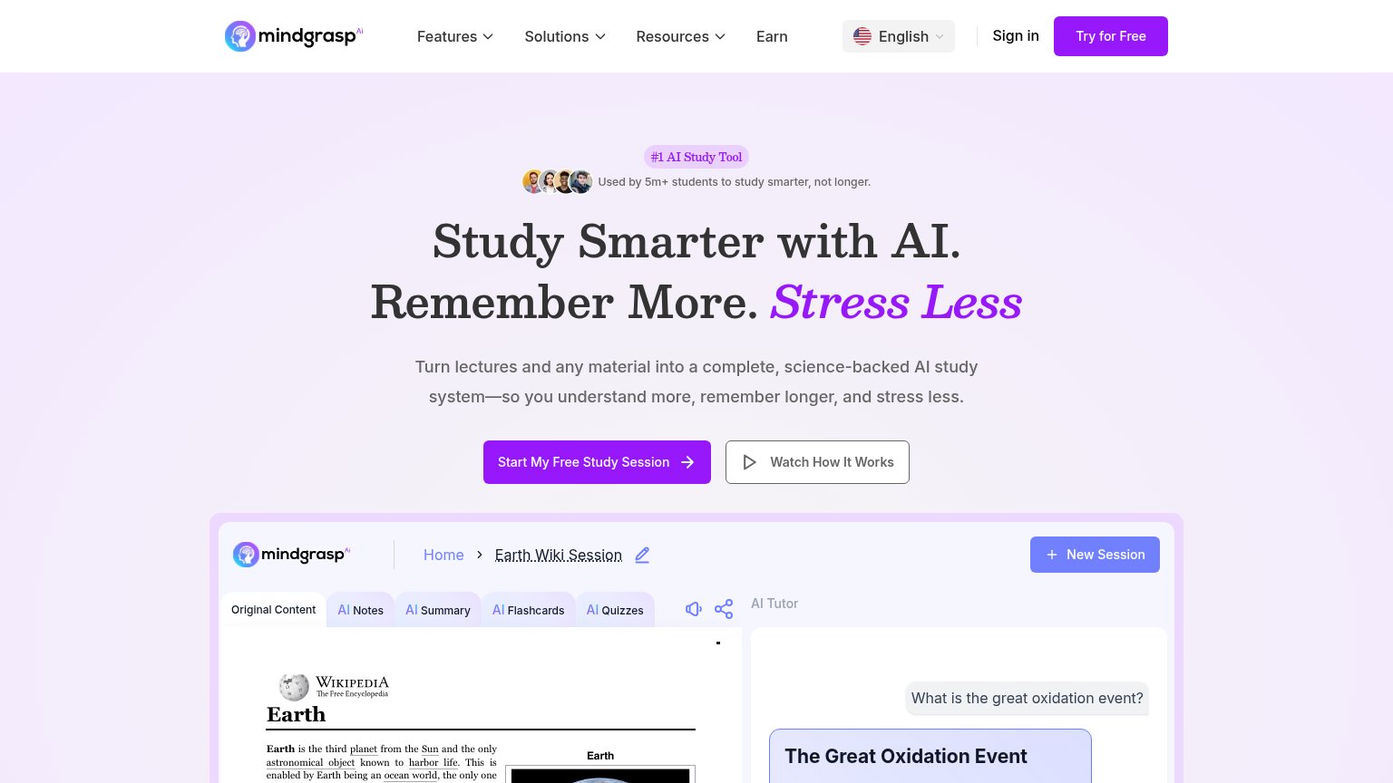
| Trust read | |
|---|---|
| Knowt | AI Lecture Summarizer app UI showing a real workflow (Title "American Revolution", Notes/Flashcards options, language an |
| No visible trust signal identified. | |
| "TRUSTED BY OVER 10 MILLION LEARNERS WORLDWIDE" logo strip with Deloitte, Duke, Oxford, Texas, Google, Princeton, Goldma | |
| "Used by 5m+ students to study smarter, not longer." with avatar row above the hero headline | |
| No visible trust signal identified. |
Information hierarchy
68FairDoes the design help or inhibit what the page is trying to say?
1234- Three download buttons — Three identical black buttons split the primary action; no single CTA wins the scan.
- Get started button — Pale mint fill barely contrasts the light header and loses to the darker buttons below.
- Five-tab audience nav — Students/Teachers/Schools/Explore/Exams offers five exits at equal weight before the CTA.
- Left feature callouts — Same-weight cards on both flanks pull the eye sideways instead of down toward action.
CTA
68FairCopy, size, verb, cost-feel — does the primary CTA earn the click?
How Knowt compares
Recommended rewrites
Value props
78FairTitle, subtitle, hero — do they sell the product's true value?
Knowt’s headline
Every AI Study Tool You Need for a 4.0
Working
Could improve
Mobile web
78FairThe phone experience as a first-class citizen.
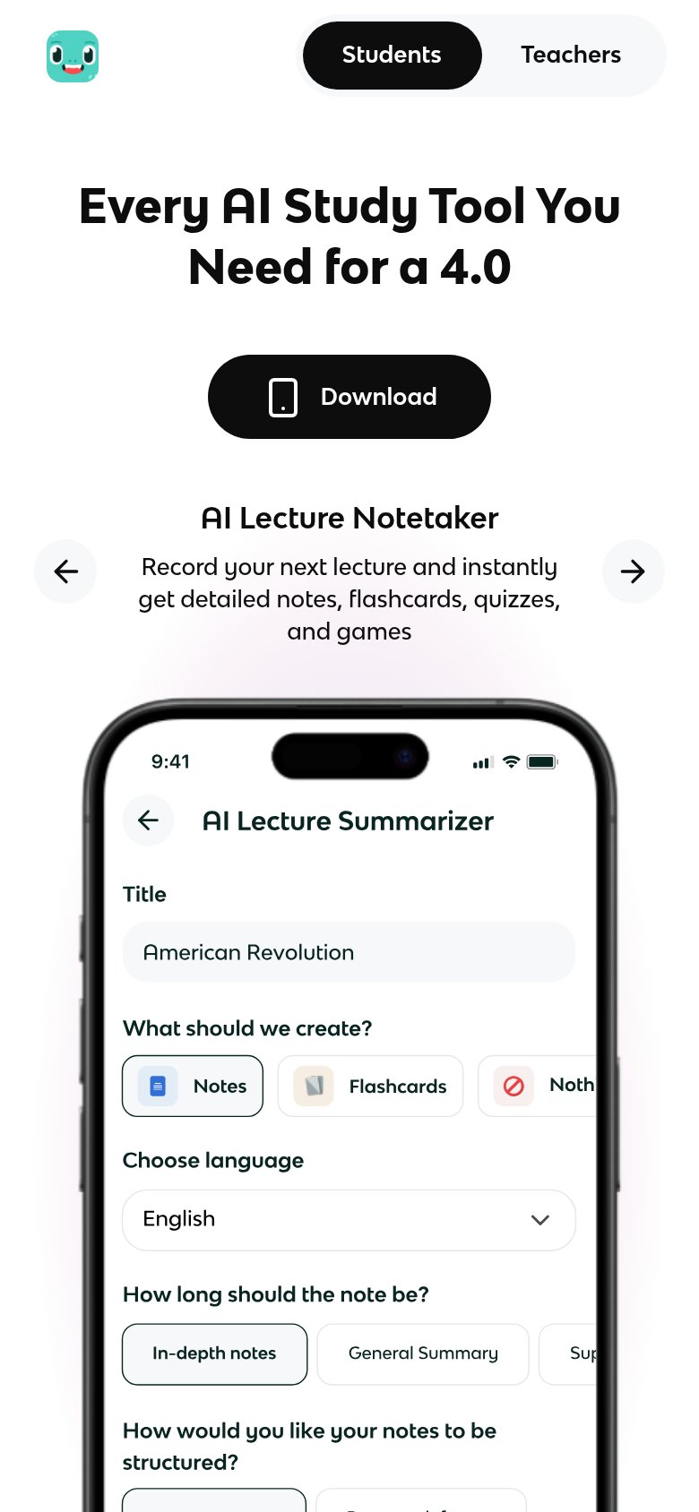
What works
What to improve