
Your landing page’s weakest score is Value props.
How River ranks
78Growth scoreupdated
category scores
category scoresShowHide
Value props
68FairTitle, subtitle, hero — do they sell the product's true value?
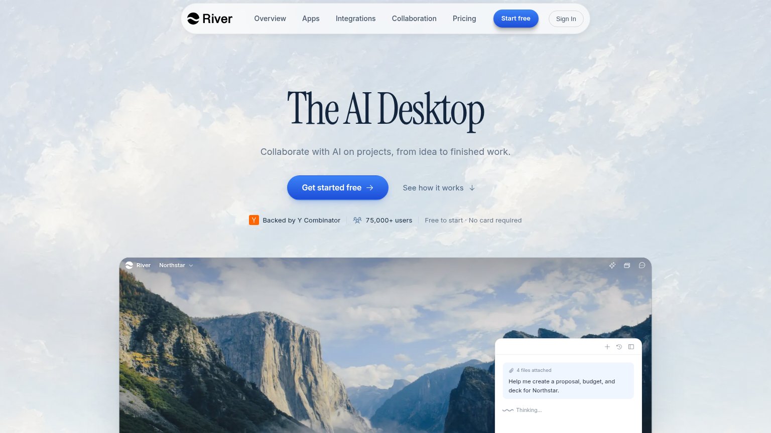
River’s headline vague
The AI Desktop
Collaborate with AI on projects, from idea to finished work.
Working
- Bold, ownable category claim
- "idea to finished work" names an outcome
- 75,000+ users and YC badge add proof
Could improve
- Headline unclear without prior context
- Subhead lacks concrete deliverables
- Desktop hero crops the product demo
Information hierarchy
76FairDoes the design help or inhibit what the page is trying to say?
 123
- Duplicate Start free button — Nav's 'Start free' pill competes at full weight with the hero's 'Get started free', splitting the primary action.
- Five-link nav row — Overview, Apps, Integrations, Collaboration, Pricing give five equal-weight exits before the visitor reaches the hero CTA.
- Product screenshot cropped — The demo window is cut off at the fold before showing the AI output, so the visual proof never resolves.
Trust
76FairProof that the product is real, competent, and safe to try.
How River compares
Trust read
Mobile web
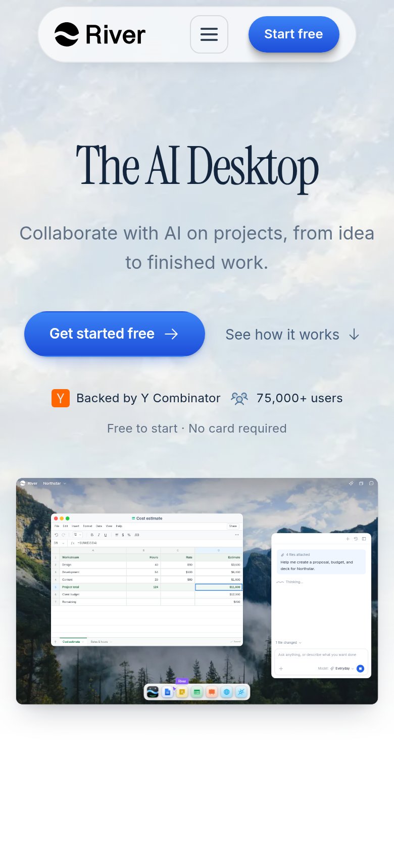
84StrongThe phone experience as a first-class citizen.
What works
What to improve
CTA
86StrongCopy, size, verb, cost-feel — does the primary CTA earn the click?
How River compares
Recommended rewrites