
Your landing page’s weakest score is CTA.
How Medallion ranks
CTA
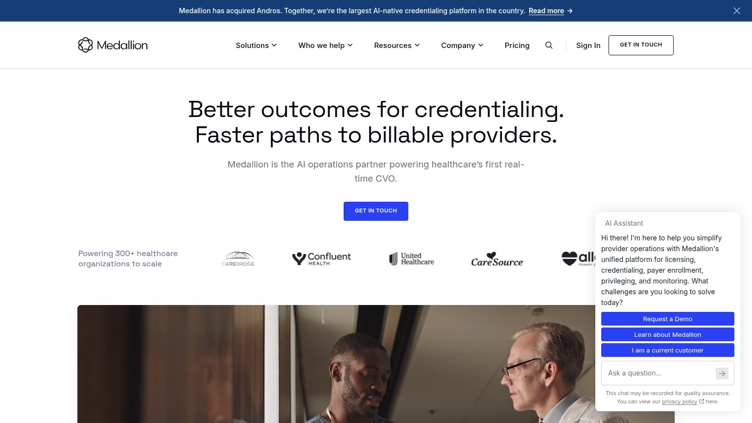
58FairCopy, size, verb, cost-feel — does the primary CTA earn the click?


Problems
- click feels like contacting sales
- no value or outcome in the label
- chat widget competes with 3 CTAs
- vague — what happens after click?
Mobile web
62FairThe phone experience as a first-class citizen.
 123
- Giant AI chat card — A screen-tall chat overlay with no conversion CTA hijacks the scroll and buries page content.
- GET IN TOUCH button — Desktop-proportioned button floats narrow in the column instead of a full-width thumb target.
- Cropped logo strip — Partner logos are clipped mid-glyph at both edges, looking broken rather than carouseled.
Information hierarchy
68FairDoes the design help or inhibit what the page is trying to say?
What works
What to improve
Value props
72FairTitle, subtitle, hero — do they sell the product's true value?
Medallion’s headline
Better outcomes for credentialing. Faster paths to billable providers.
Medallion is the AI operations partner powering healthcare's first real-time CVO.
Working
Could improve
Trust
72FairProof that the product is real, competent, and safe to try.
How Medallion compares
Trust read