
Your landing page’s weakest score is Mobile web.
How Pipedream MCP ranks
- 1.
Composio78
- 2.
Manufact76
- 3.
Glama76
- 4.
Pipedream MCP68
- 5.
Gram by Speakeasy66
- 6.
Smithery65
68Growth scoreupdated
category scores
category scoresShowHide
Mobile web
62FairThe phone experience as a first-class citizen.
 123
- Conduit promo banner — Three-line partner promo eats the top of the fold and routes taps away from Pipedream MCP's own funnel.
- Search apps field — The page's real action sits a full scroll down, pushed out of the first viewport by banner and long intro copy.
- Get help nav row — Header spends its only visible action on support instead of collapsing to a menu plus a conversion CTA.
Information hierarchy
64FairDoes the design help or inhibit what the page is trying to say?
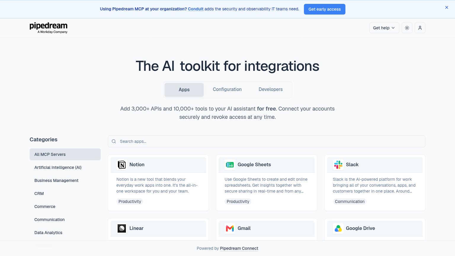 1234
- Get early access banner — The only saturated, button-styled CTA on the fold belongs to a Conduit promo, not the product itself — it outranks every native action.
- Apps/Configuration/Developers tabs — Three equal-weight tabs sit directly under the headline before the value prop is read, forcing a navigation decision before the pitch lands.
- Notion card description — App cards carry three-line vendor blurbs ('Notion is a new tool that blends...') that add reading load without helping the visitor pick an integration.
- Categories sidebar — An eight-plus item filter list competes with the search bar as a second, same-weight entry point into the catalog.
Trust
66FairProof that the product is real, competent, and safe to try.
How Pipedream MCP compares
Trust read
Value props
72FairTitle, subtitle, hero — do they sell the product's true value?
Pipedream MCP’s headline
The AI toolkit for integrations
Add 3,000+ APIs and 10,000+ tools to your AI assistant for free. Connect your accounts securely and revoke access at any time.
Working
Could improve
CTA
76FairCopy, size, verb, cost-feel — does the primary CTA earn the click?
How Pipedream MCP compares
Recommended rewrites