
Your landing page’s weakest score is Information hierarchy.
How Manufact ranks
76Growth scoreupdated
category scores
category scoresShowHide
Information hierarchy
68FairDoes the design help or inhibit what the page is trying to say?
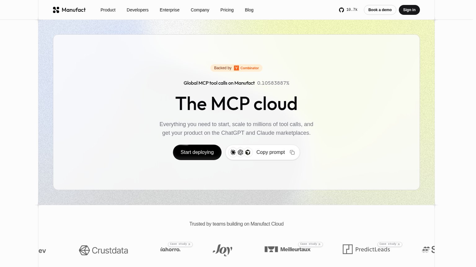 1234
- Six-link top nav — Product, Developers, Enterprise, Company, Pricing and Blog all sit at equal weight above the hero, plus GitHub, Book a demo and Sign in — nine exits competing with 'Start deploying'.
- Copy prompt button — Sits at nearly the same size and visual weight beside 'Start deploying', splitting the primary action into a two-way choice.
- Live percentage counter — 'Global MCP tool calls on Manufact 0.10583887%' is cryptic at a glance and pulls the eye above the headline without explaining itself.
- Cropped logo carousel — Marquee logos are cut off at both edges ('ev', 'S…'), reading as broken rather than a polished trust strip.
Value props
72FairTitle, subtitle, hero — do they sell the product's true value?
Manufact’s headline undersells
The MCP cloud
Everything you need to start, scale to millions of tool calls, and get your product on the ChatGPT and Claude marketplaces.
Working
- Subhead names a concrete outcome: marketplaces
- "Millions of tool calls" signals real scale
- YC badge + 10.7k stars build credibility fast
Could improve
- Headline is a category label, not a value claim
- Assumes visitor already knows MCP
- 0.10583887% stat is unexplained noise
Trust
76FairProof that the product is real, competent, and safe to try.
How Manufact compares
Trust read
CTA
78FairCopy, size, verb, cost-feel — does the primary CTA earn the click?
How Manufact compares
Recommended rewrites
Mobile web
84StrongThe phone experience as a first-class citizen.
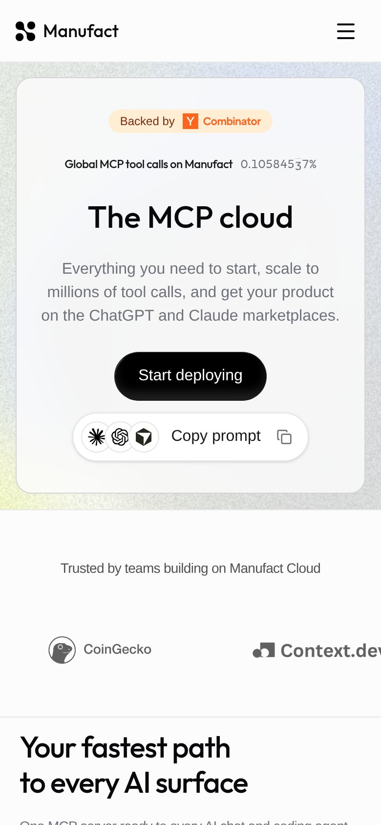
What works
What to improve