
Your landing page’s weakest score is Information hierarchy.
How Luzmo ranks
83Growth scoreupdated
category scores
category scoresShowHide
Information hierarchy
82StrongDoes the design help or inhibit what the page is trying to say?
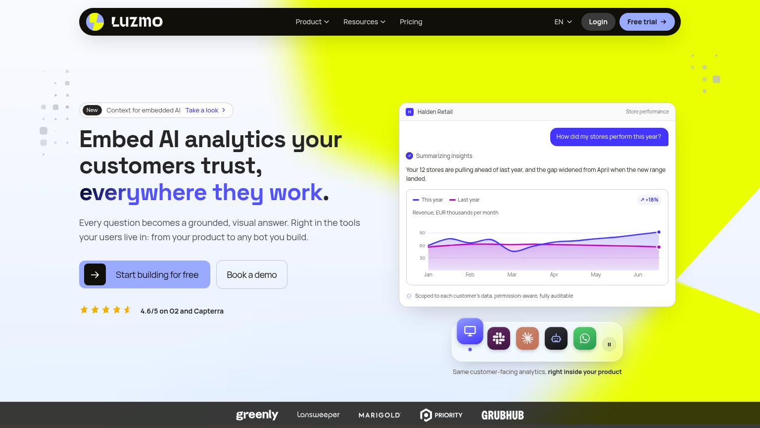 1234
- Free trial nav pill — Yellow high-contrast pill duplicates the hero CTA and pulls first clicks into the nav.
- Take a look banner — Announcement link sits directly above the headline and offers an exit before the value prop lands.
- Book a demo button — Same size and adjacent to the primary CTA, splitting the single desired action into two.
- Integration icon carousel — Five animated app icons compete with the demo panel without labeling what they represent.
Trust
82StrongProof that the product is real, competent, and safe to try.
| Trust read | |
|---|---|
| Luzmo | 4.6/5 on G2 and Capterra |
| Product demo video showing the "Sales Performance Dashboard" UI with 'Watch product demo' overlay | |
| Interactive product demo showing a real dashboard UI with Sales, Costs, and Latest Transactions data, tabbed as DASHBOAR | |
| SOC 2 Type II · Flat pricing · White-label · No iframes badges under the CTAs | |
| Workday and JPMorganChase customer logos at the bottom of the mobile fold | |
| "Capterra 4.8/5" and "GetApp 4.8/5" review badges below the mobile hero CTAs |
Mobile web
82StrongThe phone experience as a first-class citizen.
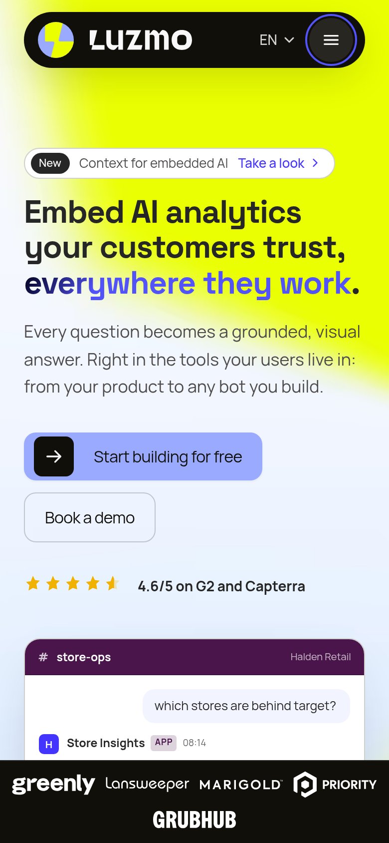
What works
What to improve
Value props
84StrongTitle, subtitle, hero — do they sell the product's true value?
Luzmo’s headline
Embed AI analytics your customers trust, everywhere they work.
Every question becomes a grounded, visual answer. Right in the tools your users live in: from your product to any bot you build.
Working
Could improve
CTA
86StrongCopy, size, verb, cost-feel — does the primary CTA earn the click?
How Luzmo compares
Recommended rewrites