
Your landing page’s weakest score is Trust.
How Gigacatalyst ranks
Trust
58FairProof that the product is real, competent, and safe to try.
| Trust read | |
|---|---|
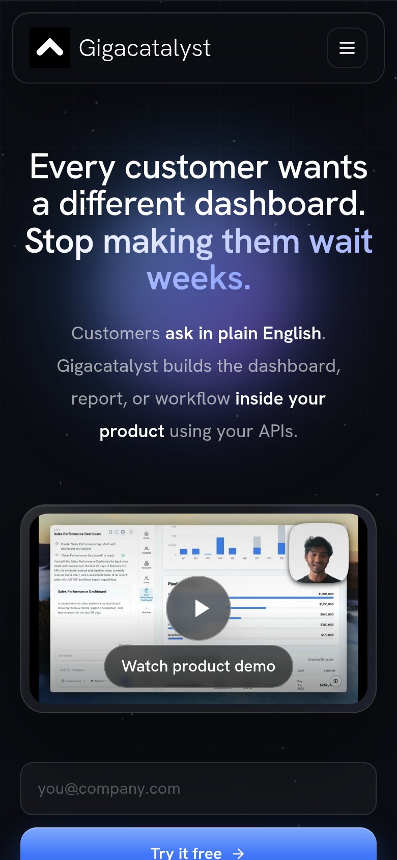
| Gigacatalyst | Product demo video showing the "Sales Performance Dashboard" UI with 'Watch product demo' overlay |
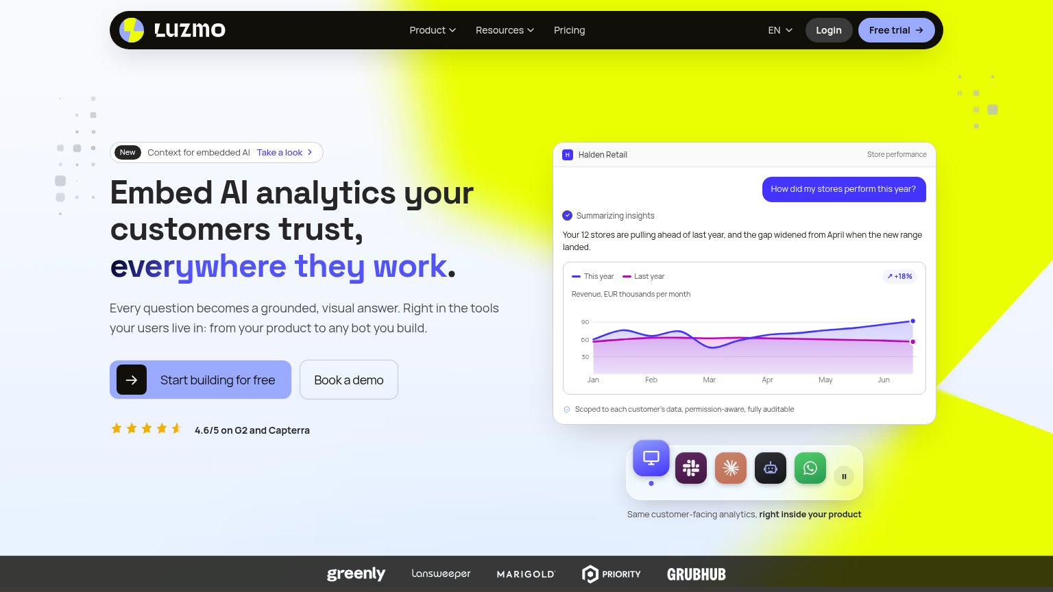
| 4.6/5 on G2 and Capterra | |
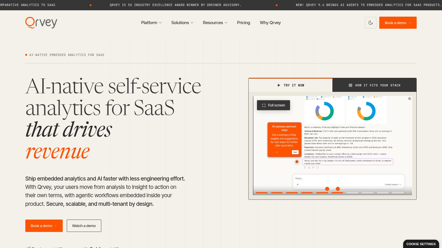
| Interactive product demo showing a real dashboard UI with Sales, Costs, and Latest Transactions data, tabbed as DASHBOAR | |
| SOC 2 Type II · Flat pricing · White-label · No iframes badges under the CTAs | |
| Workday and JPMorganChase customer logos at the bottom of the mobile fold | |
| "Capterra 4.8/5" and "GetApp 4.8/5" review badges below the mobile hero CTAs |
Mobile web
62FairThe phone experience as a first-class citizen.
123- Try it free button — Primary CTA is cut off at the fold's bottom edge, forcing a scroll before conversion.
- Demo video block — Tall embedded video occupies a third of the viewport and pushes the email capture and CTA below the fold.
- Subheadline paragraph — Four loosely spaced lines of body copy eat vertical space that the CTA needs.
Information hierarchy
68FairDoes the design help or inhibit what the page is trying to say?
What works
What to improve
Value props
78FairTitle, subtitle, hero — do they sell the product's true value?
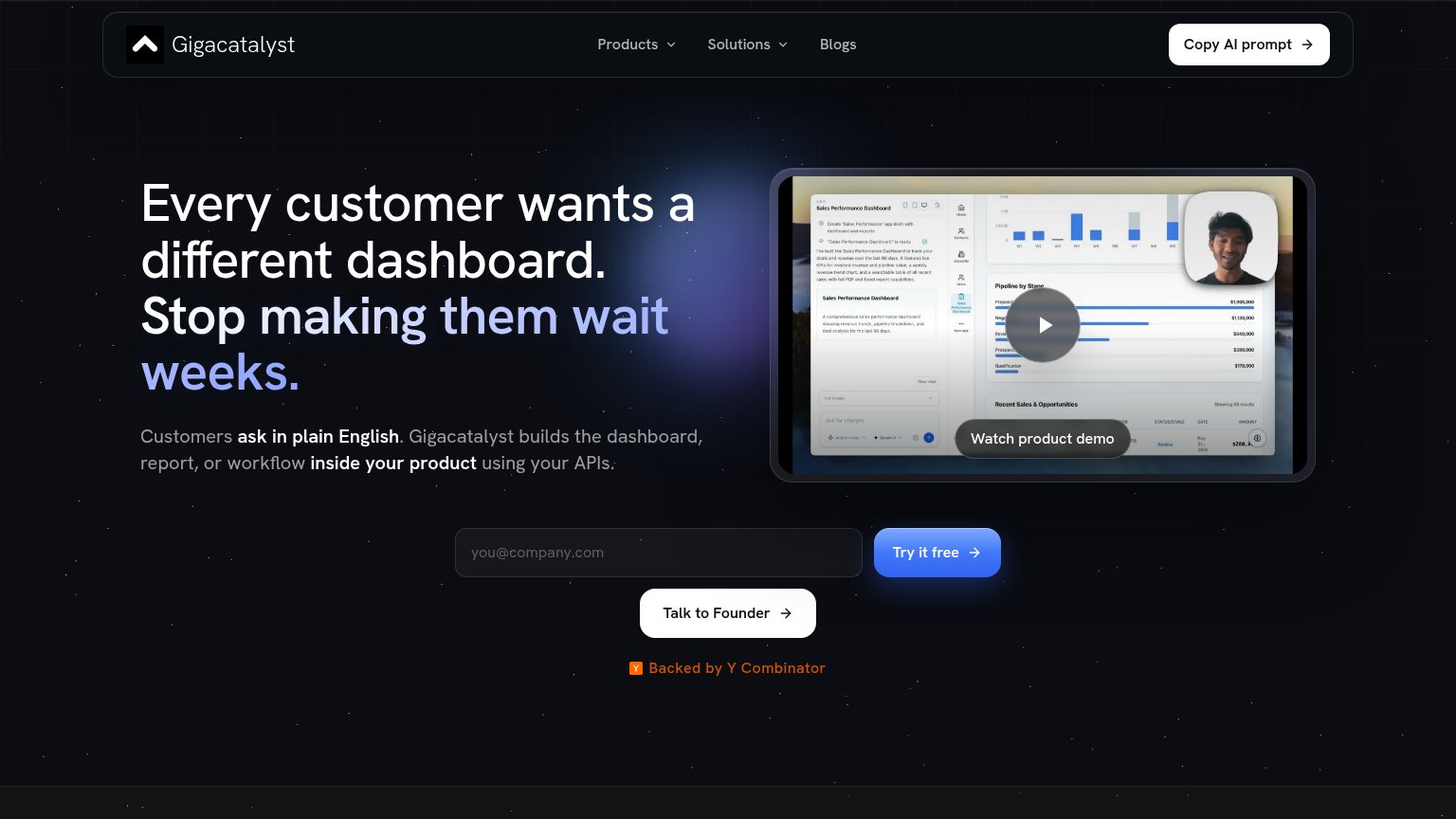
Gigacatalyst’s headline
Every customer wants a different dashboard. Stop making them wait weeks.
Customers ask in plain English. Gigacatalyst builds the dashboard, report, or workflow inside your product using your APIs.
Working
Could improve
CTA
82StrongCopy, size, verb, cost-feel — does the primary CTA earn the click?
How Gigacatalyst compares
Recommended rewrites