
Your landing page’s weakest score is Trust.
How Lutra AI ranks
70Growth scoreupdated
category scores
category scoresShowHide
Trust
44PoorProof that the product is real, competent, and safe to try.
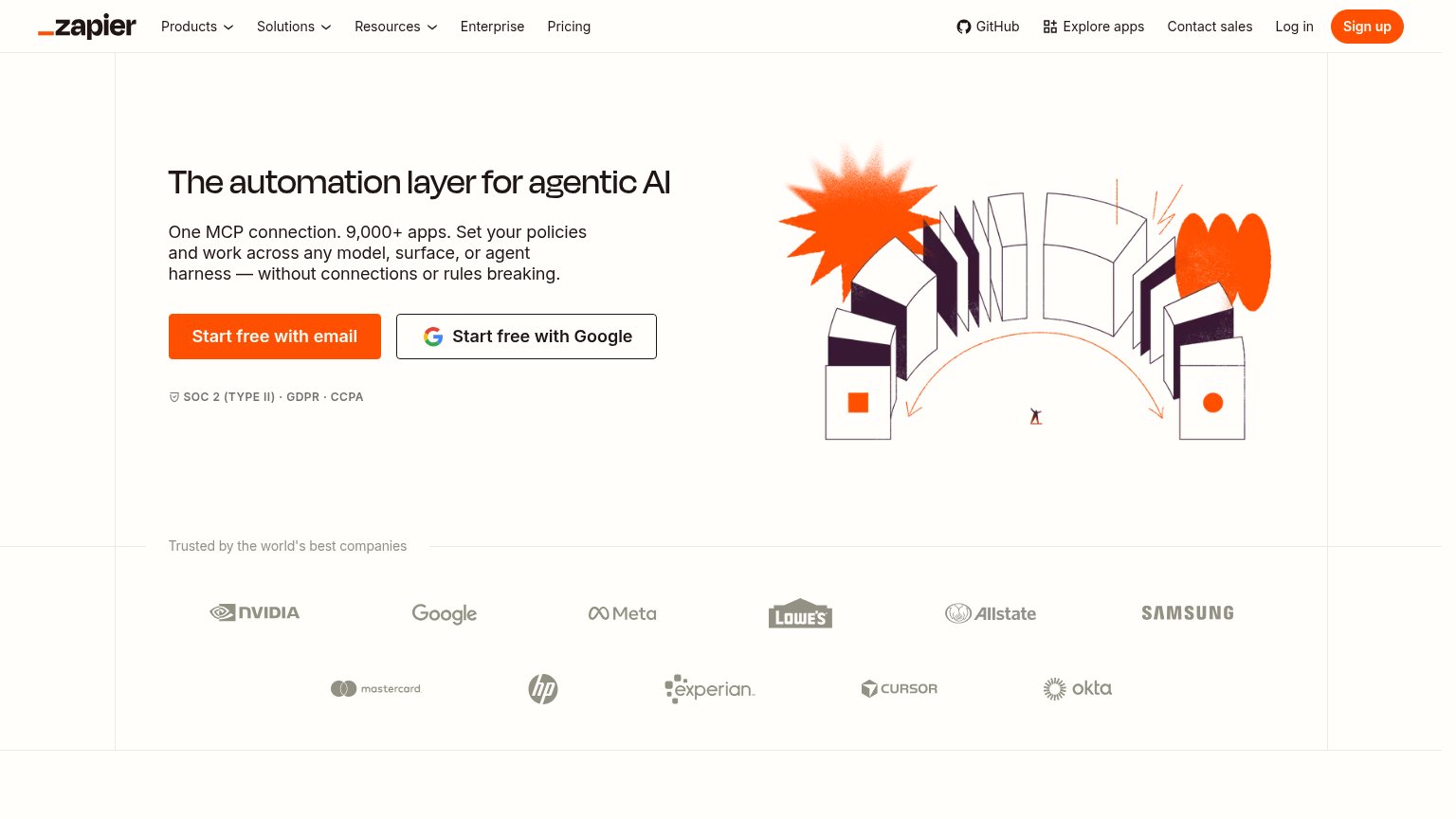
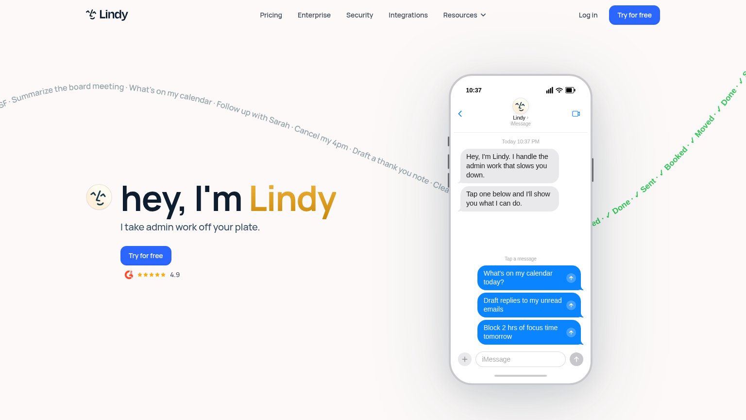
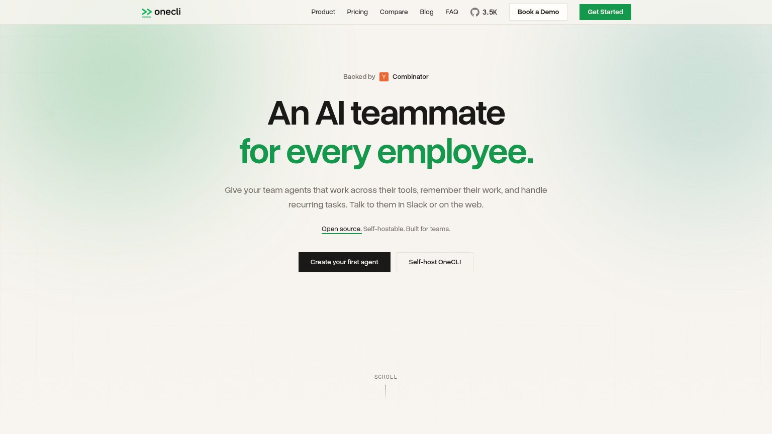
| Trust read | |
|---|---|
| Lutra AI | No visible trust signal identified. |
| "Backed by Y Combinator" badge above the headline | |
| G2 badge with 4.9 star rating below the "Try for free" CTA | |
| No visible trust signal identified. | |
| No visible trust signal identified. | |
| "Trusted by the world's best companies" logo wall (NVIDIA, Google, Meta, Lowe's, Allstate, Samsung, Mastercard, HP, Expe |
Information hierarchy
72FairDoes the design help or inhibit what the page is trying to say?
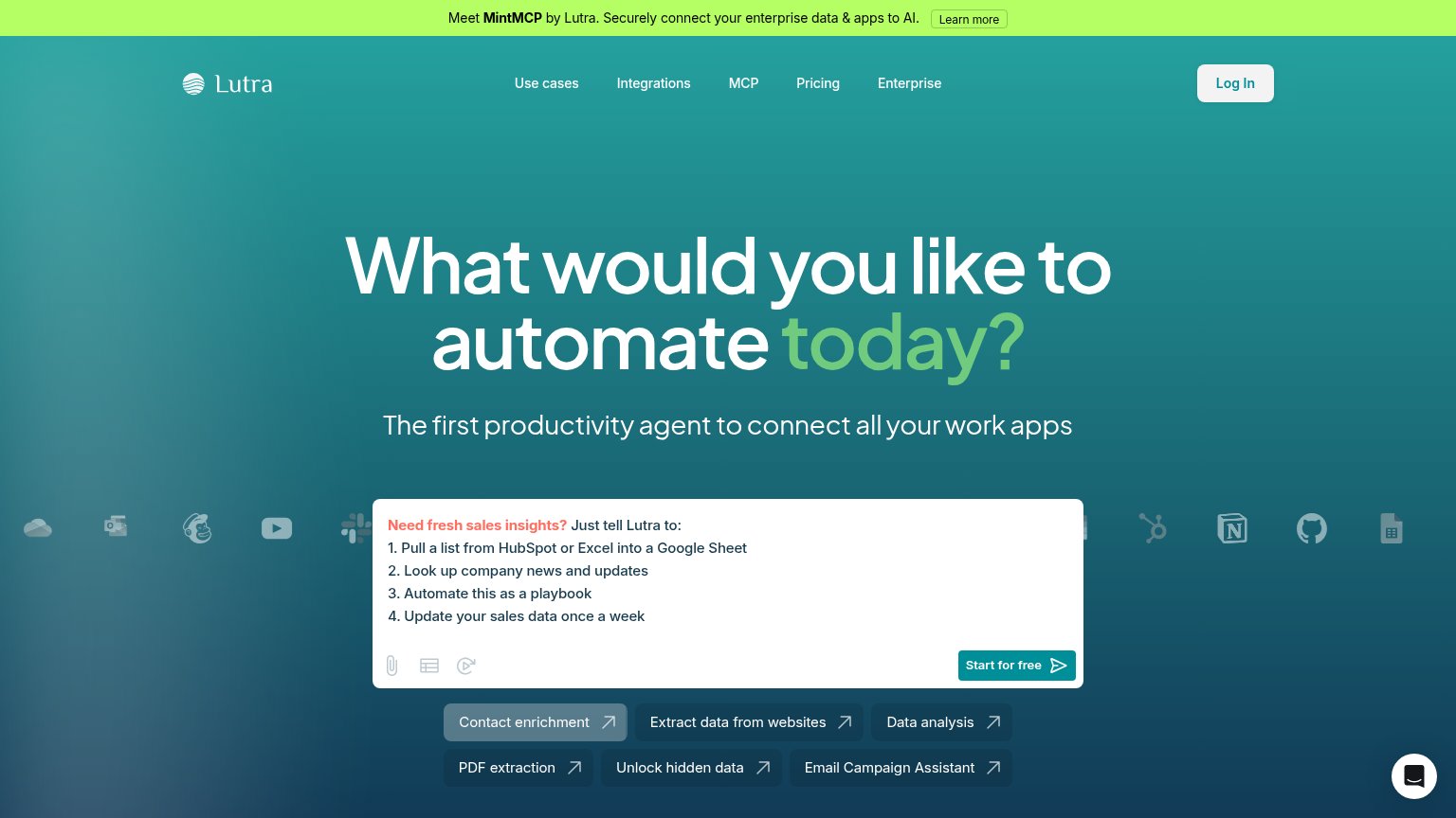 1234
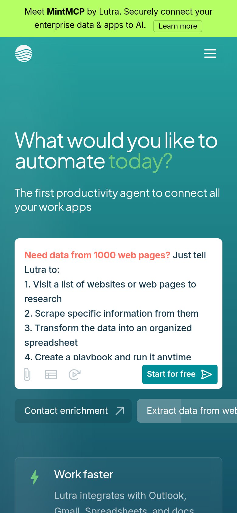
- MintMCP announcement banner — Bright green bar with its own 'Learn more' button outshouts the hero and exits visitors to a different product before the pitch lands.
- Use-case chip row — Six equal-weight buttons directly under the prompt card compete with 'Start for free' and split the single action into seven.
- Start for free button — The primary CTA is the smallest text in the card and teal-on-white at modest size — subordinate to the chips it must beat.
- Top navigation row — Five links plus a boxed 'Log In' at the same height as the logo add exits with no visual subordination to the conversion path.
Mobile web
72FairThe phone experience as a first-class citizen.
What works
What to improve
Value props
76FairTitle, subtitle, hero — do they sell the product's true value?
Lutra AI’s headline
What would you like to automate today?
The first productivity agent to connect all your work apps
Working
Could improve
CTA
84StrongCopy, size, verb, cost-feel — does the primary CTA earn the click?
How Lutra AI compares
Recommended rewrites