
Your landing page’s weakest score is Mobile web.
How Logseq ranks
Mobile web
32PoorThe phone experience as a first-class citizen.
 123
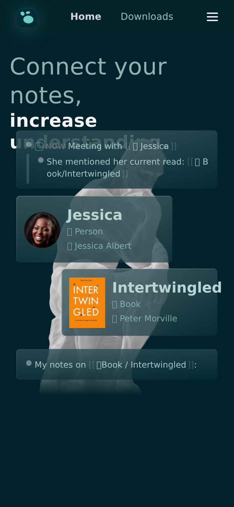
- Headline overlapped by card — The "Meeting with Jessica" card sits on top of "understanding", making the headline's second half unreadable.
- Broken icon glyphs — Card metadata shows empty tofu boxes (□) instead of icons next to Person, Book, and Peter Morville.
- Hamburger plus link row — Header keeps Home and Downloads links AND a hamburger, a redundant half-collapsed nav pattern.
Trust
48PoorProof that the product is real, competent, and safe to try.
| Trust read | |
|---|---|
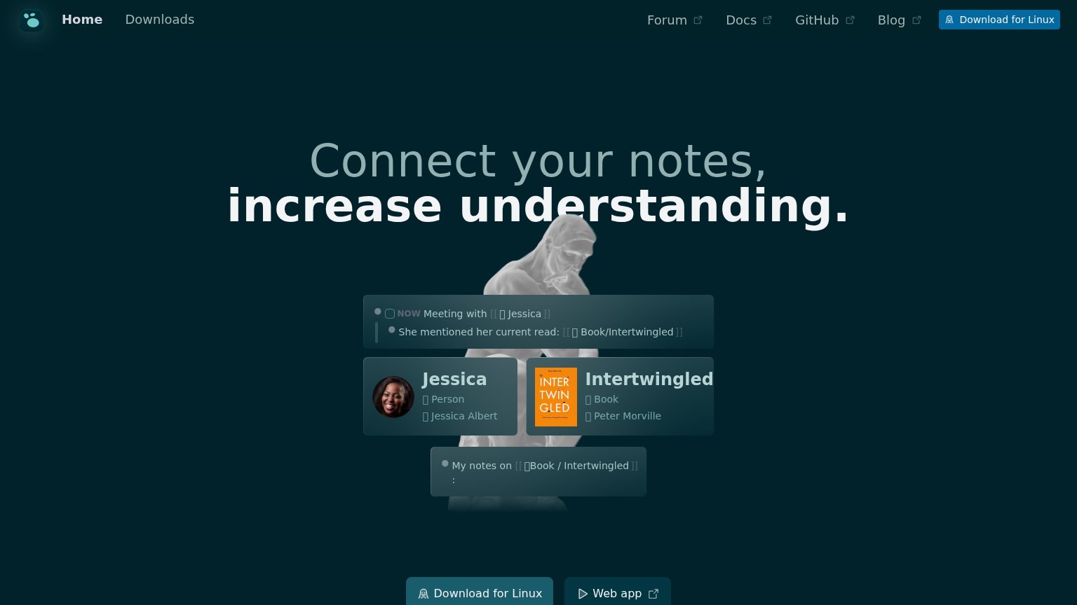
| Logseq | Product demo mockup showing linked notes: "Meeting with [[Jessica]]" referencing "Book/Intertwingled" |
| "100% open source" / "Plain text & SQLite" checkmark claims near the CTAs | |
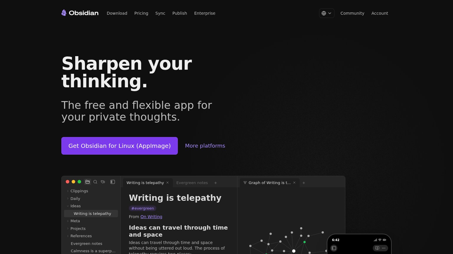
| Real product screenshot showing the "Writing is telepathy" note with file tree, tags, and graph view | |
| Nav banner: "Run your company on Anytype · Encrypted, Swiss-based, yours" | |
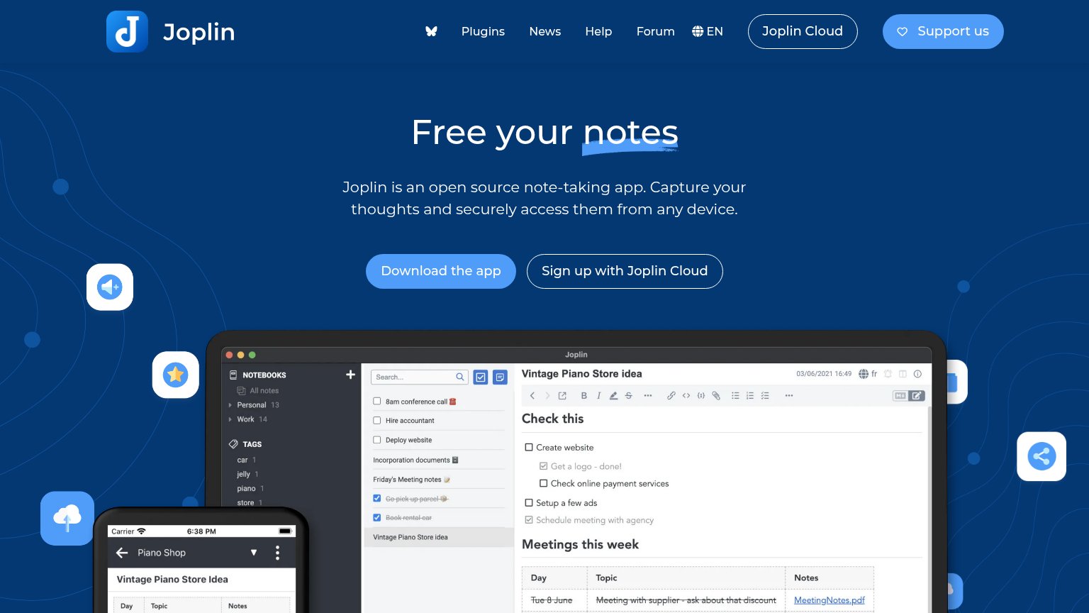
| Detailed real product screenshot showing the Joplin desktop app (notebooks, tags, markdown note 'Vintage Piano Store ide |
Information hierarchy
62FairDoes the design help or inhibit what the page is trying to say?
What works
What to improve
CTA
66FairCopy, size, verb, cost-feel — does the primary CTA earn the click?
How Logseq compares
Recommended rewrites
Value props
68FairTitle, subtitle, hero — do they sell the product's true value?
Logseq’s headline
Connect your notes, increase understanding.
Working
Could improve