
Your landing page’s weakest score is Trust.
How Compresr ranks
- 1.
Compresr74
- 2.
Not Diamond62
- 3.
LLMLingua (Microsoft)55
Trust
58FairProof that the product is real, competent, and safe to try.
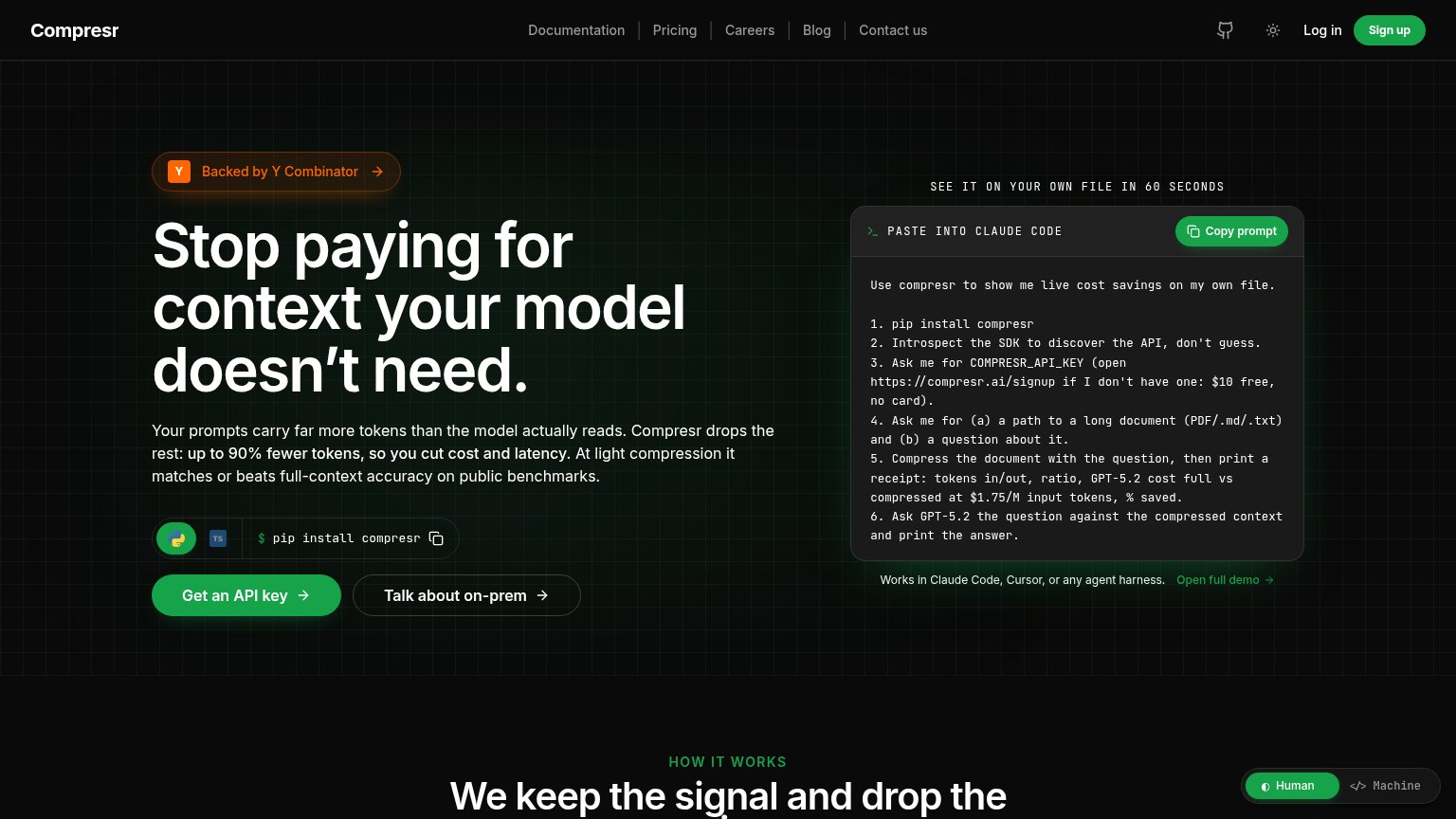
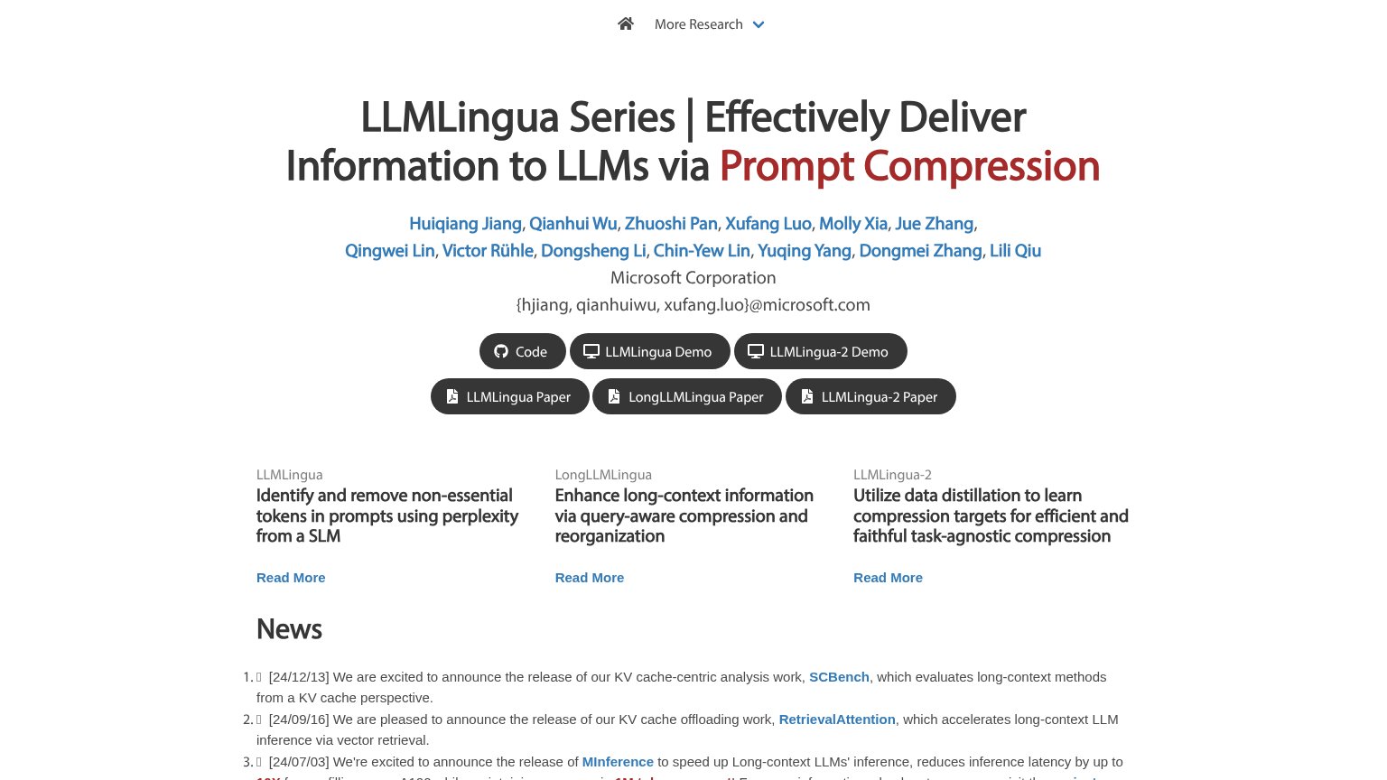
| Trust read | |
|---|---|
| Compresr | "Backed by Y Combinator" badge above the headline |
| Author list with "Microsoft Corporation" affiliation and {hjiang, qianhuiwu, xufang.luo}@microsoft.com emails plus linke | |
| 5%+ accuracy gains | 30%+ cost savings | 2x faster dev cycles |
Mobile web
72FairThe phone experience as a first-class citizen.
 123
- Six-line subheadline paragraph — Desktop-length body copy wraps into six lines and pushes the primary CTA below the first viewport.
- Wrapping Sign up pill — The header CTA breaks onto two lines, signalling the button was never sized for a phone.
- Human/Machine floating toggle — The toggle overlaps the code prompt text, obscuring content and inviting accidental taps.
Information hierarchy
76FairDoes the design help or inhibit what the page is trying to say?
What works
What to improve
CTA
76FairCopy, size, verb, cost-feel — does the primary CTA earn the click?
How Compresr compares
Recommended rewrites
Value props
86StrongTitle, subtitle, hero — do they sell the product's true value?
Compresr’s headline
Stop paying for context your model doesn't need.
Your prompts carry far more tokens than the model actually reads. Compresr drops the rest: up to 90% fewer tokens, so you cut cost and latency. At light compression it matches or beats full-context accuracy on public benchmarks.
Working
Could improve