
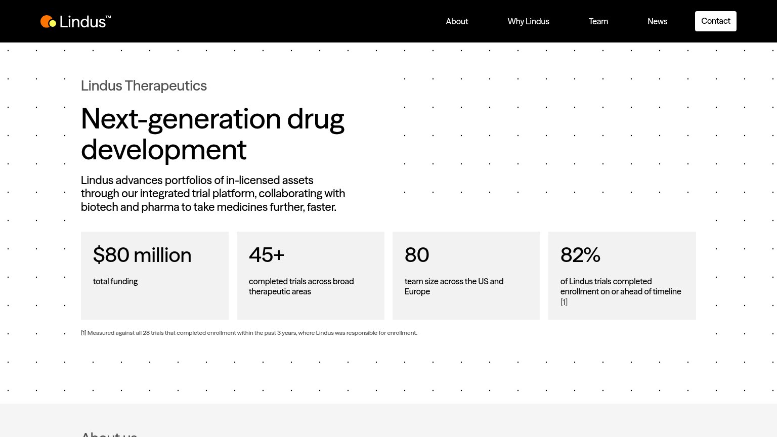
Your landing page’s weakest score is CTA.
How Lindus Health ranks
- 1.
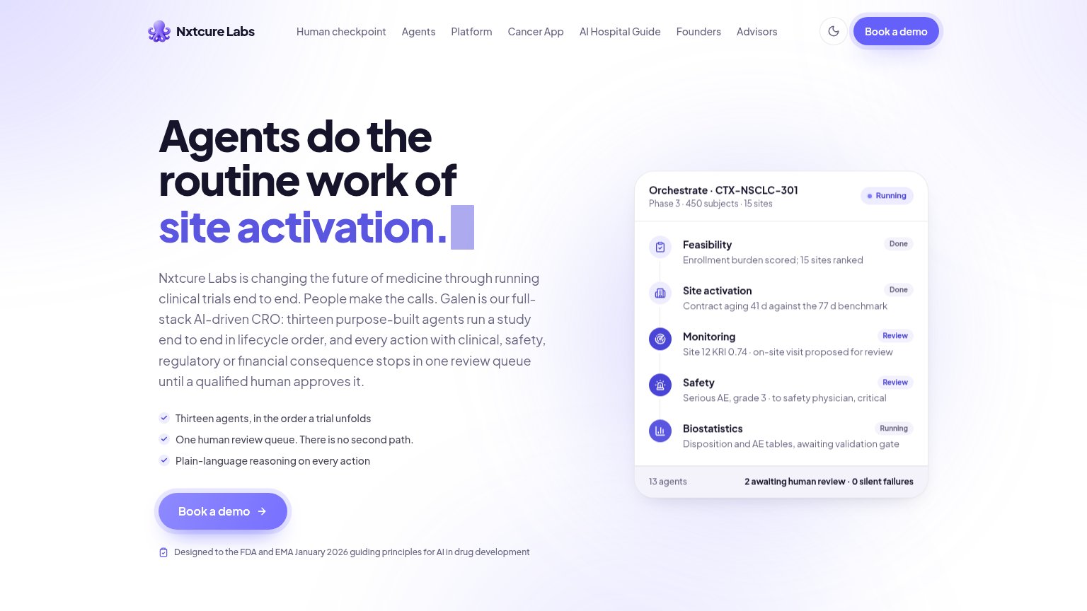
Nxtcure Labs69
- 2.
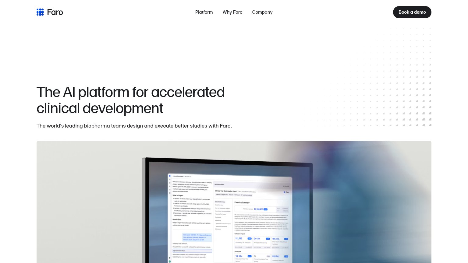
Faro Health65
- 3.
Lindus Health61
- 4.
Paradigm54
- 5.
Unlearn.AI40
CTA
55FairCopy, size, verb, cost-feel — does the primary CTA earn the click?
Problems
- no CTA in the hero itself
- no action verb — reads as a label
- small nav pill, weak footprint
- no payoff or value implied
Mobile web
58FairThe phone experience as a first-class citizen.
 1234
- $80 million stat — Card column is too narrow for the font size, breaking "million" into "millio / n" mid-word.
- Stats card row — Three-across desktop grid kept on phone, forcing one-word lines like "completed / trials / across" and an orphaned fourth card below.
- 82% card label — Caption wraps into seven cramped one-or-two-word lines, unreadable at arm's length.
- Contact header button — Only visible CTA is a small header pill, not a full-width thumb-friendly button in the hero.
Value props
62FairTitle, subtitle, hero — do they sell the product's true value?
Lindus Health’s headline
Next-generation drug development
Lindus advances portfolios of in-licensed assets through our integrated trial platform, collaborating with biotech and pharma to take medicines further, faster.
Working
Could improve
Trust
62FairProof that the product is real, competent, and safe to try.
How Lindus Health compares
Trust read
Information hierarchy
66FairDoes the design help or inhibit what the page is trying to say?
What works
What to improve