
Your landing page’s weakest score is Information hierarchy.
How Lightly ranks
46Growth scoreupdated
category scores
category scoresShowHide
Information hierarchy
38PoorDoes the design help or inhibit what the page is trying to say?
 1234
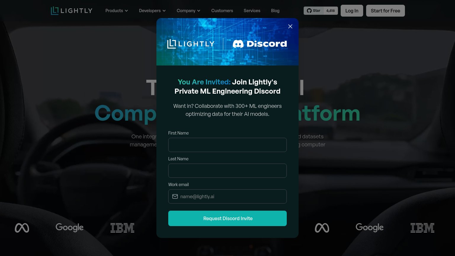
- Discord invite modal — Full-hero interrupt buries the headline and value prop before either is read, on desktop and mobile.
- Request Discord Invite — The only high-contrast button in the fold pushes a community signup, not the product conversion.
- Start for Free button — Actual primary CTA is muted grey, matching Log In, and loses to the modal's teal button.
- Six-link nav row — Products through Blog plus GitHub star widget offer eight exits before any conversion action.
Mobile web
38PoorThe phone experience as a first-class citizen.
 1
- Three-field modal form — First Name, Last Name and Work email demand desktop-level typing effort as the very first mobile interaction.
Value props
42PoorTitle, subtitle, hero — do they sell the product's true value?
Lightly’s headline
T…l Comp…tform (obscured by modal)
One integr…d datasets manageme…g computer (obscured by modal)
Working
Could improve
Trust
52FairProof that the product is real, competent, and safe to try.
How Lightly compares
Trust read
CTA
62FairCopy, size, verb, cost-feel — does the primary CTA earn the click?
How Lightly compares
Recommended rewrites