
Your landing page’s weakest score is CTA.
How Kuli ranks
74Growth scoreupdated
category scores
category scoresShowHide
CTA
68FairCopy, size, verb, cost-feel — does the primary CTA earn the click?
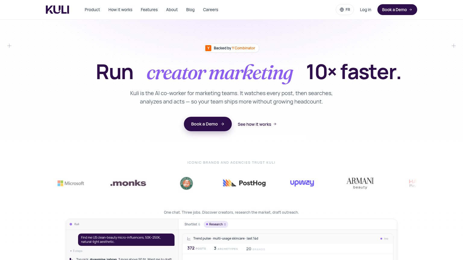

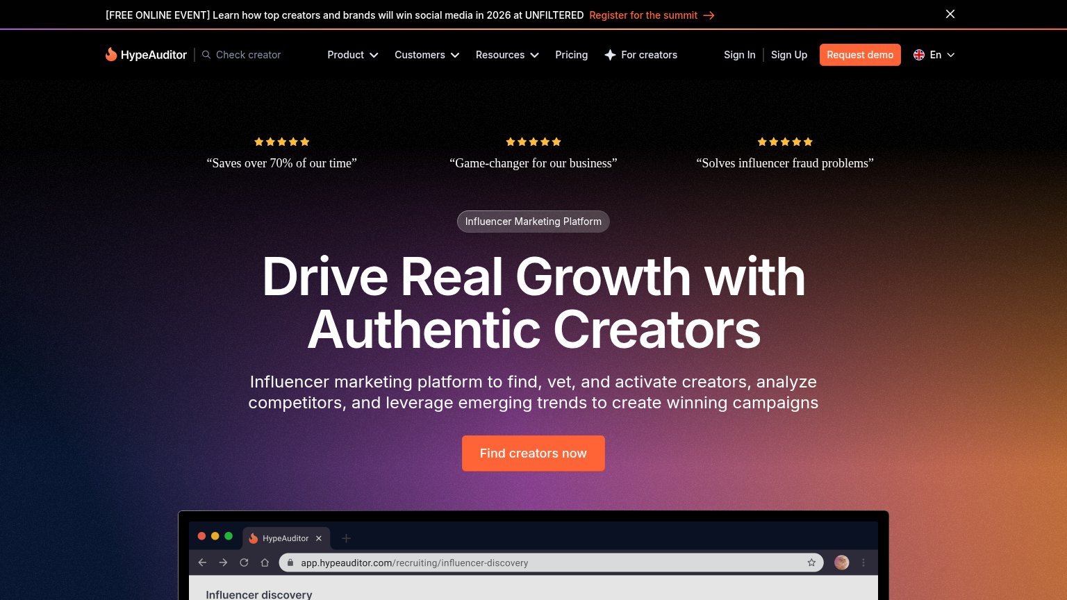
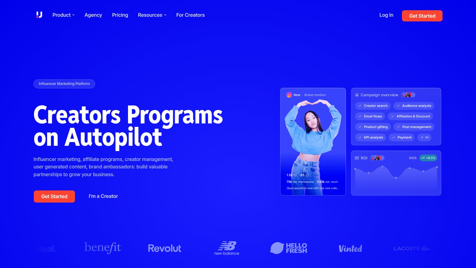
Problems
- click feels costly — schedules a call
- no self-serve or in-product path
- secondary CTA feels cheaper to click
Information hierarchy
76FairDoes the design help or inhibit what the page is trying to say?
123- Six-link nav row — Product, How it works, Features, About, Blog, Careers all sit at equal weight above the hero, offering seven exits (plus FR and Log in) before the visitor reaches 'Book a Demo'.
- Duplicate Book a Demo — The nav's dark 'Book a Demo' pill duplicates the hero CTA at identical styling and weight, splitting the click target instead of concentrating attention on one button.
- Rotating headline word — The italic purple phrase swaps between 'creator marketing' (desktop) and 'social media' (mobile), so the category promise changes per view and dilutes message clarity.
Value props
76FairTitle, subtitle, hero — do they sell the product's true value?
Kuli’s headline
Run creator marketing 10× faster.
Kuli is the AI co-worker for marketing teams. It watches every post, then searches, analyzes and acts — so your team ships more without growing headcount.
Working
Could improve
Trust
76FairProof that the product is real, competent, and safe to try.
How Kuli compares
Trust read
Mobile web
76FairThe phone experience as a first-class citizen.

What works
What to improve