
Your landing page’s weakest score is Value props.
How Kula ranks
66Growth scoreupdated
category scores
category scoresShowHide
Value props
58FairTitle, subtitle, hero — do they sell the product's true value?
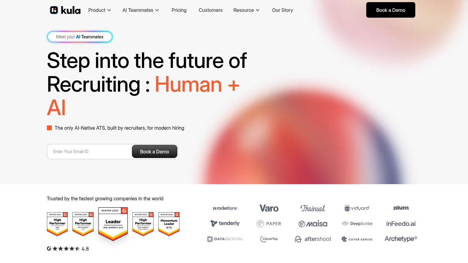
Kula’s headline vague
Step into the future of Recruiting : Human + AI
The only AI-Native ATS, built by recruiters, for modern hiring
Working
- Subhead names the category: AI-Native ATS
- "Built by recruiters" adds credibility
- G2 badges + 4.8 rating back the claim
Could improve
- Headline names no outcome or benefit
- "Future of Recruiting" is generic AI-speak
- Hero blur shows nothing of the product
Mobile web
58FairThe phone experience as a first-class citizen.
 123
- Oversized hero headline — Desktop-scale type wraps into six huge lines and eats the whole viewport.
- Cut-off demo button — Primary "Book a Demo" is clipped at the fold edge, forcing a scroll to tap.
- Gray bottom CTA — Dark-gray styling reads muted versus the orange header pill, weakening the primary action.
CTA
68FairCopy, size, verb, cost-feel — does the primary CTA earn the click?
How Kula compares
Recommended rewrites
Information hierarchy
72FairDoes the design help or inhibit what the page is trying to say?
What works
What to improve
Trust
72FairProof that the product is real, competent, and safe to try.
How Kula compares
Trust read