
Your landing page’s weakest score is Mobile web.
How Kruze Consulting ranks
Mobile web
54FairThe phone experience as a first-class citizen.
 1234
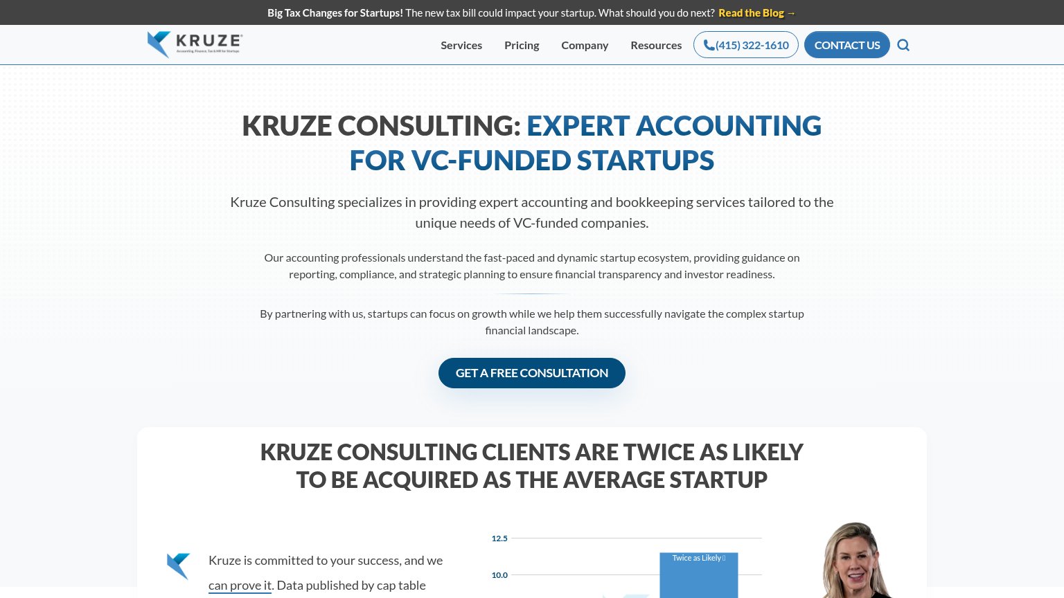
- GET A FREE CONSULTATION CTA — Primary CTA is pushed far below the first viewport by three stacked paragraphs of intro copy.
- Three intro paragraphs — Desktop-density copy blocks stack into a wall of text that a phone visitor must scroll through before any action.
- Four-line headline — Headline barely scaled down from desktop and wraps into six oversized lines, eating most of the first fold.
- Dual stacked CTAs — 'GET A FREE CONSULTATION' and 'TALK TO A LEADING STARTUP CPA' compete side by side with no clear hierarchy.
Trust
58FairProof that the product is real, competent, and safe to try.
| Trust read | |
|---|---|
| Kruze Consulting | "KRUZE CONSULTING CLIENTS ARE TWICE AS LIKELY TO BE ACQUIRED AS THE AVERAGE STARTUP" headline with supporting bar chart |
| Slack demo showing Palus Bot answering "Gross margin on the 16oz line drops from 41% to 37%" with an Automatic cash reba | |
| TRUSTED BY 3,500+ GROWTH-DRIVEN STARTUPS AND SMALL BUSINESSES | |
| G2 badge with ~4.5-star rating next to the "Get demo" CTA | |
| No visible trust signal identified. | |
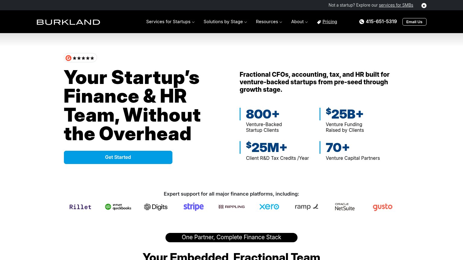
| "800+ Venture-Backed Startup Clients" and "$25B+ Venture Funding Raised by Clients" stat block beside the headline |
Information hierarchy
64FairDoes the design help or inhibit what the page is trying to say?
What works
What to improve
Value props
72FairTitle, subtitle, hero — do they sell the product's true value?
Kruze Consulting’s headline
KRUZE CONSULTING: EXPERT ACCOUNTING FOR VC-FUNDED STARTUPS
Kruze Consulting specializes in providing expert accounting and bookkeeping services tailored to the unique needs of VC-funded companies.
Working
Could improve
CTA
76FairCopy, size, verb, cost-feel — does the primary CTA earn the click?
How Kruze Consulting compares
Recommended rewrites