
Your landing page’s weakest score is Trust.
How Kiro ranks
69Growth scoreupdated
category scores
category scoresShowHide
Trust
58FairProof that the product is real, competent, and safe to try.
| Trust read | |
|---|---|
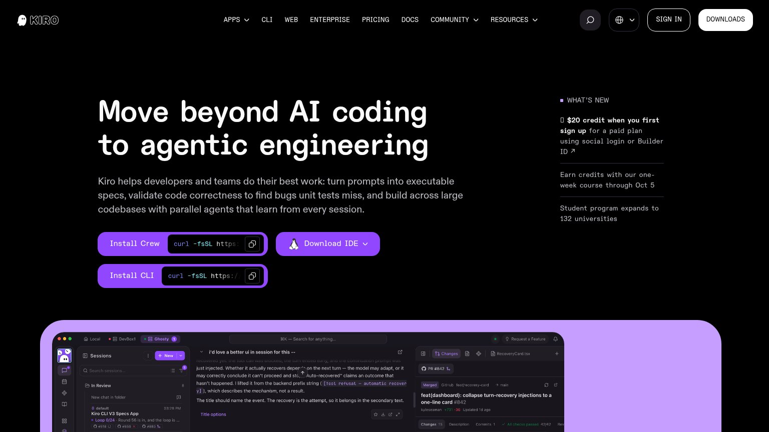
| Kiro | Real IDE screenshot with sessions list, PR pane "feat(dashboard): collapse turn-recovery injections" #842 and passing ch |
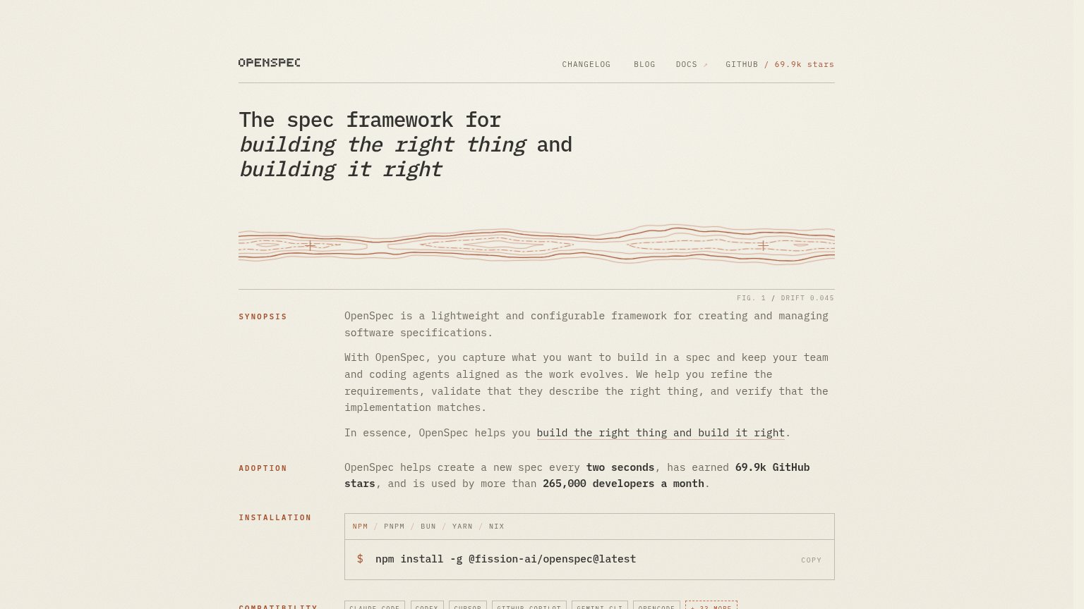
| "69.9k GitHub stars" and "265,000 developers a month" in the ADOPTION section | |
| Code editor screenshot with tabs "game.ts", "characters.module.css", "bonus-level.ts" | |
| Product UI panel "Improve skills from real usage" showing a code-review scorecard (Quality 89%, Impact 99%, Security Pas |
Information hierarchy
66FairDoes the design help or inhibit what the page is trying to say?
1234- Three install CTAs — "Install Crew", "Download IDE", and "Install CLI" share identical purple styling with no visual winner, forcing the visitor to choose a path before acting.
- Nav link row — Eight nav items plus Sign In and Downloads compete for attention above the headline, adding ten exit paths before the fold's own CTAs.
- What's New sidebar — Three promo items with a bolded "$20 credit" line sit at hero height and pull the scan path away from the headline and install buttons.
- Inline curl commands — Truncated terminal strings embedded in the buttons add technical noise and blur the button boundary for anyone not ready to copy-paste.
CTA
68FairCopy, size, verb, cost-feel — does the primary CTA earn the click?
How Kiro compares
Recommended rewrites
Value props
76FairTitle, subtitle, hero — do they sell the product's true value?
Kiro’s headline
Move beyond AI coding to agentic engineering
Kiro helps developers and teams do their best work: turn prompts into executable specs, validate code correctness to find bugs unit tests miss, and build across large codebases with parallel agents that learn from every session.
Working
Could improve
Mobile web
76FairThe phone experience as a first-class citizen.

What works
What to improve