
Your landing page’s weakest score is Mobile web.
How Kaelio ranks
72Growth scoreupdated
category scores
category scoresShowHide
Mobile web
64FairThe phone experience as a first-class citizen.
 1234
- Announcement bar — Two-line sticky benchmark banner eats the top of the mobile fold and duplicates the badge card lower on the page.
- Get started button — Primary CTA stops well short of full width and sits below the fold's edge instead of being an easy full-bleed thumb target.
- Backed by badge — Renders half-faded and clipped under the logo, looking broken rather than adding credibility.
- Benchmark badge card — Dark card repeats the announcement bar's exact copy, adding a third competing message between CTA and install command.
Information hierarchy
66FairDoes the design help or inhibit what the page is trying to say?
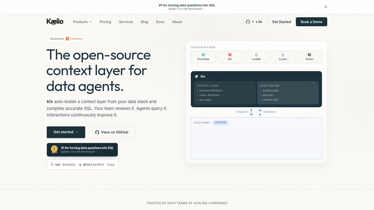 1234
- Book a Demo button — Styled at identical dark weight to 'Get started', splitting the primary action into two competing CTAs.
- Nav link row — Six nav items plus a Products dropdown and GitHub star count offer eight exit paths before the hero CTA.
- Benchmark banner — Top bar repeats the same Spider 2.0-Lite badge shown in the hero and adds a third clickable exit above the headline.
- Hero CTA cluster — 'Get started', 'View on GitHub', the benchmark badge, and the npm install snippet stack four same-region actions, diluting the primary path.
CTA
76FairCopy, size, verb, cost-feel — does the primary CTA earn the click?
How Kaelio compares
Recommended rewrites
Trust
76FairProof that the product is real, competent, and safe to try.
How Kaelio compares
Trust read
Value props
78FairTitle, subtitle, hero — do they sell the product's true value?
Kaelio’s headline
The open-source context layer for data agents.
ktx auto-builds a context layer from your data stack and compiles accurate SQL. Your team reviews it. Agents query it. Interactions continuously improve it.
Working
Could improve