
Your landing page’s weakest score is Trust.
How Mastodon ranks
Trust
44PoorProof that the product is real, competent, and safe to try.
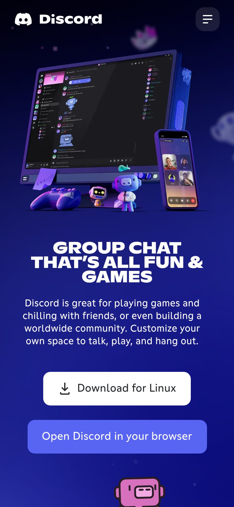
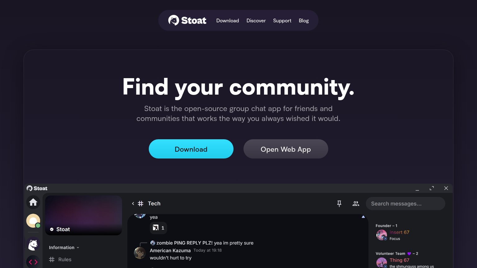
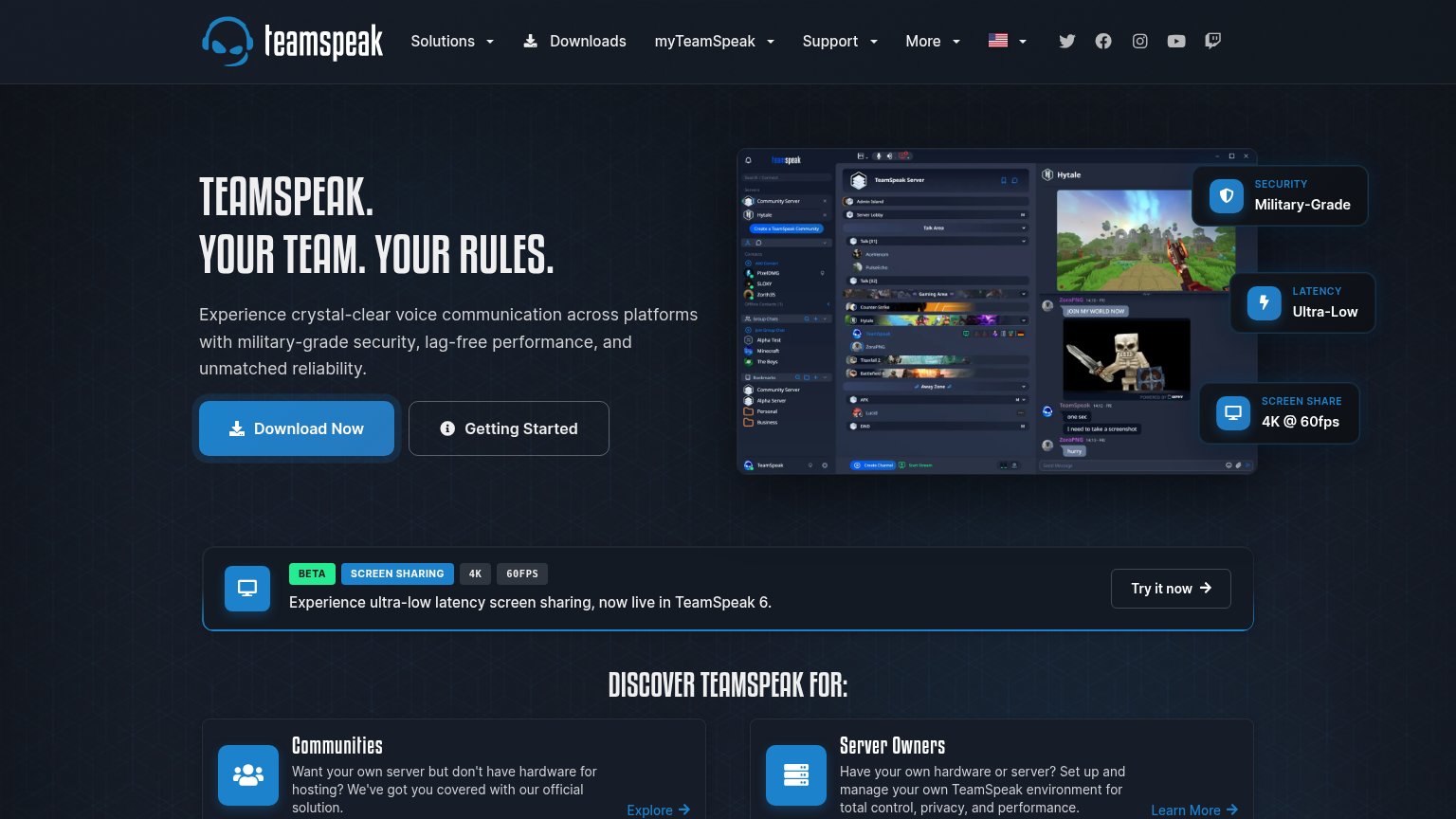
| Trust read | |
|---|---|
| Mastodon | implicit context Mastodon may benefit from pre-existing familiarity among its target audience. |
| Embedded product UI card showing a post by @mara in #art-dump with reaction counts | |
| Detailed product mockup showing Discord's real chat interface on a monitor plus a phone screen with a live group video c | |
| implicit context Guilded may benefit from pre-existing familiarity among its target audience. | |
| Embedded real product screenshot showing a live "Tech" channel with actual user messages and member sidebar | |
| Detailed real product screenshot showing server channels, contacts, and a live screen-share session |
Mobile web
58FairThe phone experience as a first-class citizen.
 1234
- Oversized hero headline — Barely-scaled desktop type wraps into four tall lines and pushes the CTA below the first viewport.
- Six-line body paragraph — Long intro copy stacks under the headline and helps shove the Join button out of the fold.
- Join mastodon.social button — Sits below the fold and is only two-thirds width instead of a full-bleed thumb target.
- Pick another server button — Secondary action stacked at near-equal weight directly under the primary CTA, splitting the tap decision.
CTA
68FairCopy, size, verb, cost-feel — does the primary CTA earn the click?
How Mastodon compares
Recommended rewrites
Information hierarchy
78FairDoes the design help or inhibit what the page is trying to say?
What works
What to improve
Value props
78FairTitle, subtitle, hero — do they sell the product's true value?
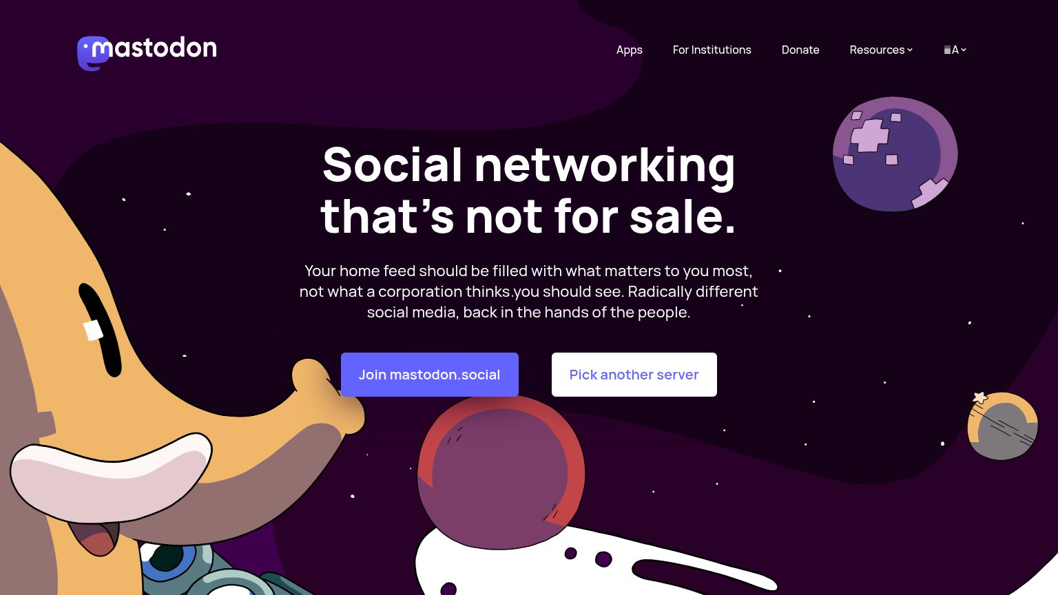
Mastodon’s headline
Social networking that's not for sale.
Your home feed should be filled with what matters to you most, not what a corporation thinks you should see. Radically different social media, back in the hands of the people.
Working
Could improve