
Your landing page’s weakest score is CTA.
How Integration App ranks
- 1.
Browser Use77
- 2.
Zatanna73
- 3.
Vooma72
- 4.
Happyrobot66
- 5.
Integration App52
CTA
42PoorCopy, size, verb, cost-feel — does the primary CTA earn the click?


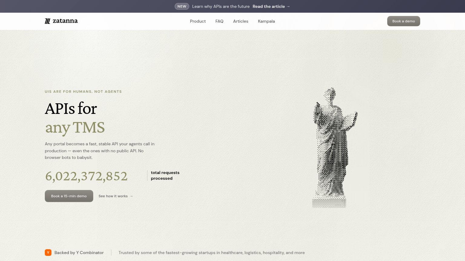
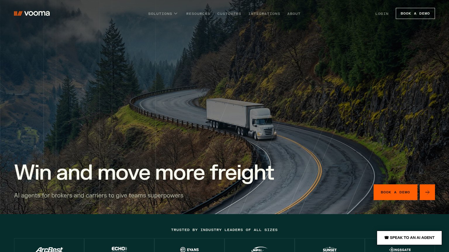
Problems
- no primary CTA in either fold
- only action is nav 'Login' pill
- hero dropdowns look clickable, aren't
- mobile fold also action-free
Trust
48PoorProof that the product is real, competent, and safe to try.
| Trust read | |
|---|---|
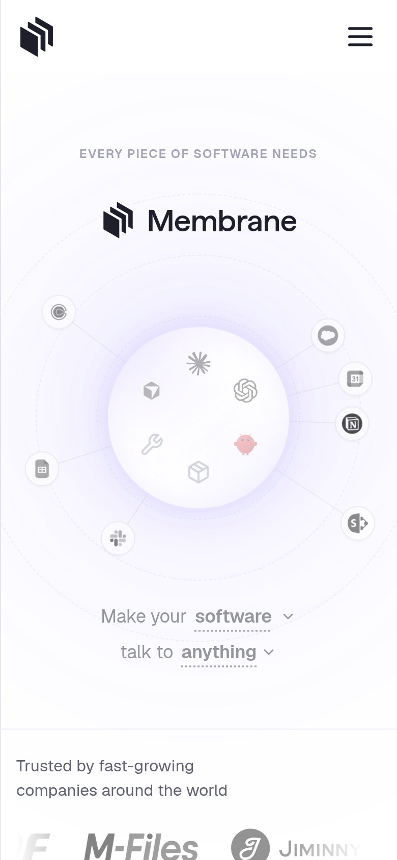
| Integration App | "Trusted by fast-growing companies around the world" logo strip with M-Files and Jiminny (mobile) |
| "6,022,372,852 total requests processed" live usage counter | |
| "HAPPYROBOT RAISES ITS SERIES C TO PUT AI WORKERS TO WORK ACROSS THE REAL ECONOMY" announcement banner | |
| "TRUSTED BY INDUSTRY LEADERS OF ALL SIZES" logo band with ArcBest, Echo, Evans, NFI, Sunset, and Kingsgate | |
| Logo wall with Anthropic, Apple, Datadog, DeepMind, DHL, FedEx, Flexport, Google |
Mobile web
52FairThe phone experience as a first-class citizen.
What works
What to improve
Information hierarchy
58FairDoes the design help or inhibit what the page is trying to say?
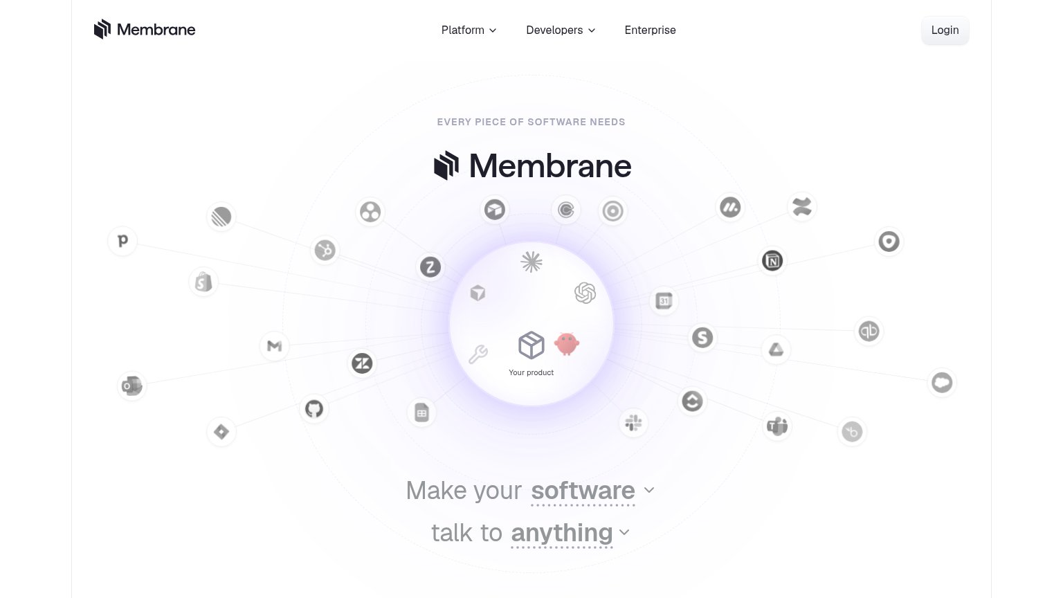
What works
What to improve
Value props
62FairTitle, subtitle, hero — do they sell the product's true value?
Integration App’s headline
EVERY PIECE OF SOFTWARE NEEDS Membrane
Make your software talk to anything
Working
Could improve