
Your landing page’s weakest score is Trust.
How Blue ranks
64Growth scoreupdated
category scores
category scoresShowHide
Trust
38PoorProof that the product is real, competent, and safe to try.
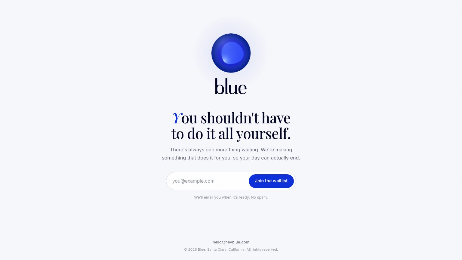

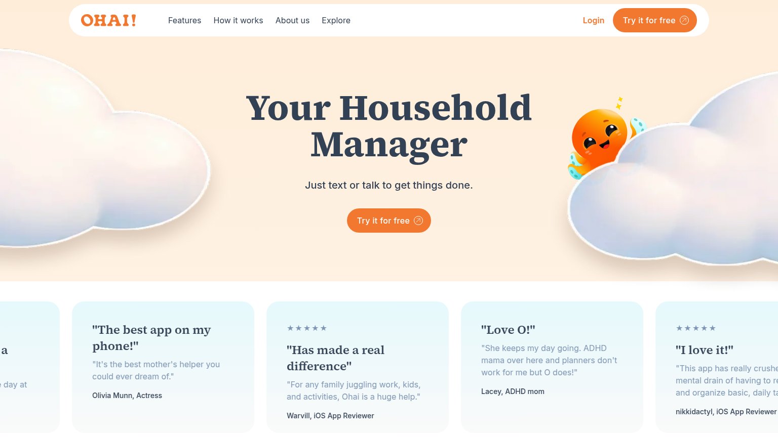
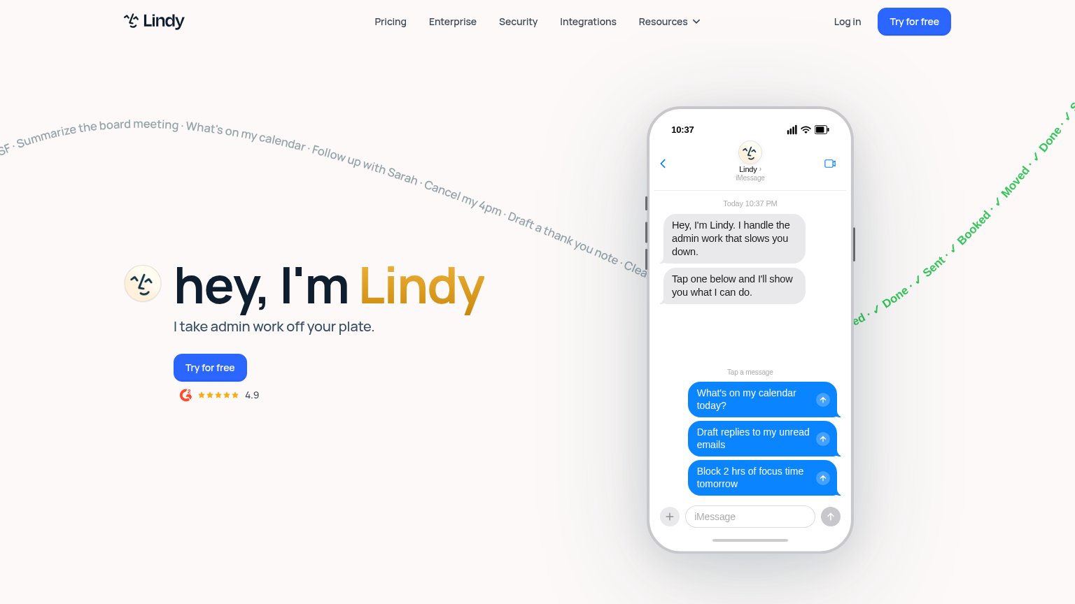
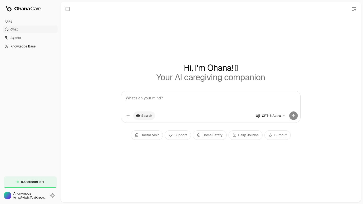
| Trust read | |
|---|---|
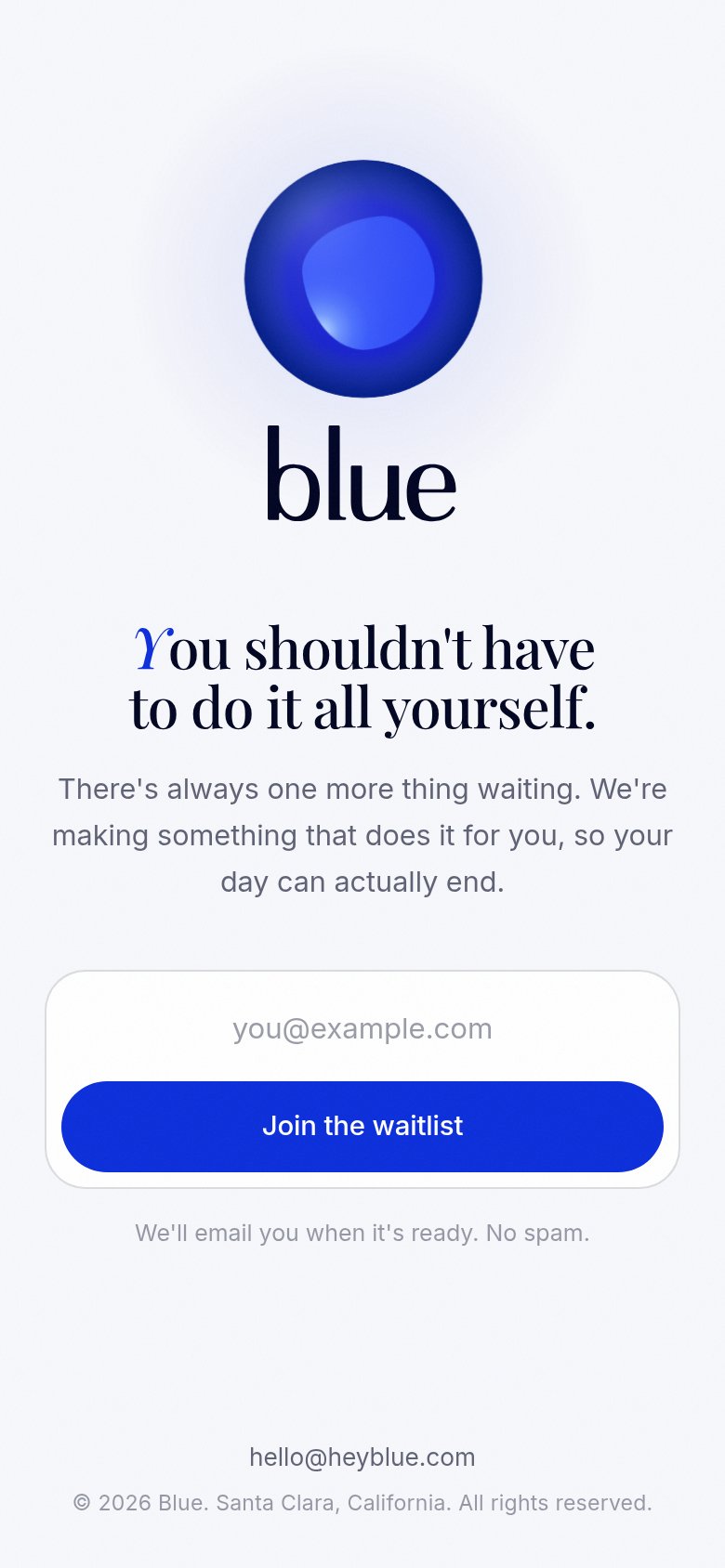
| Blue | "We'll email you when it's ready. No spam." reassurance under the waitlist form |
| Product Hunt "#1 Product of the Day" badge above the headline | |
| No visible trust signal identified. | |
| Five-star testimonial card: "The best app on my phone!" — Olivia Munn, Actress | |
| Live chat interface with "What's on your mind?" input, prompt chips (Doctor Visit, Home Safety, Burnout), and GPT-6 Astr | |
| G2 badge with 4.9 star rating below the "Try for free" CTA |
Value props
48PoorTitle, subtitle, hero — do they sell the product's true value?
Blue’s headline vague
You shouldn't have to do it all yourself.
There's always one more thing waiting. We're making something that does it for you, so your day can actually end.
Working
- Emotionally resonant pain framing
- Outcome hinted: "Blue's day can actually end"
- Clean, human, non-buzzword tone
Could improve
- Never says what the product is
- "Something that does it" is placeholder-vague
- Orb hero shows nothing about the product
CTA
72FairCopy, size, verb, cost-feel — does the primary CTA earn the click?
How Blue compares
Recommended rewrites
Mobile web
76FairThe phone experience as a first-class citizen.
What works
What to improve
Information hierarchy
88StrongDoes the design help or inhibit what the page is trying to say?
What works
What to improve