
Your landing page’s weakest score is Information hierarchy.
How Guesty ranks
76Growth scoreupdated
category scores
category scoresShowHide
Information hierarchy
64FairDoes the design help or inhibit what the page is trying to say?
 1234
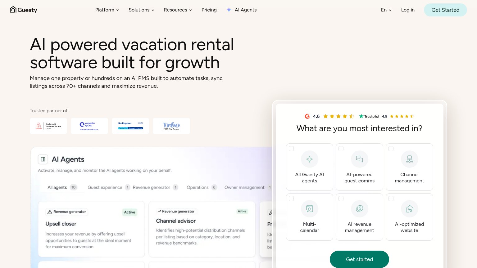
- Interest picker widget — Six same-weight checkbox cards ask the visitor to make a decision before the value prop lands, and the 'Get started' button inside it is cut by the fold.
- Duplicate green CTAs — Nav 'Get Started' and widget 'Get started' share identical styling and weight, splitting the primary action into two competing targets.
- Nav menu row — Five nav items plus language, Log in, and AI Agents links stack eight exit paths ahead of the conversion action.
- AI Agents dashboard screenshot — Dense product UI with tabs and three text-heavy cards competes with the interest picker for the fold's visual focus.
CTA
76FairCopy, size, verb, cost-feel — does the primary CTA earn the click?
Problems
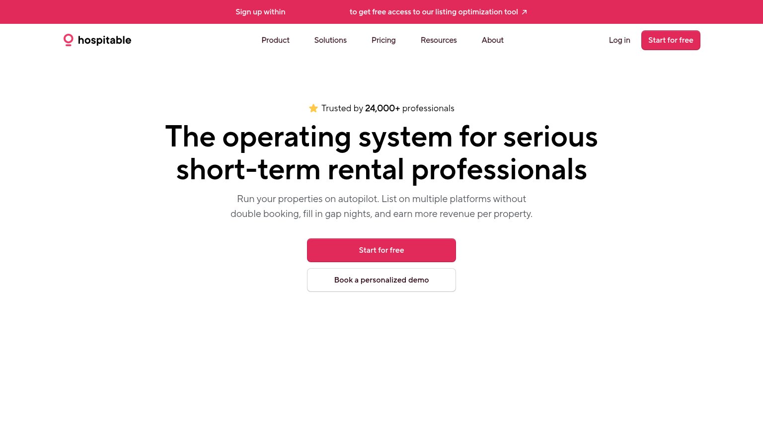
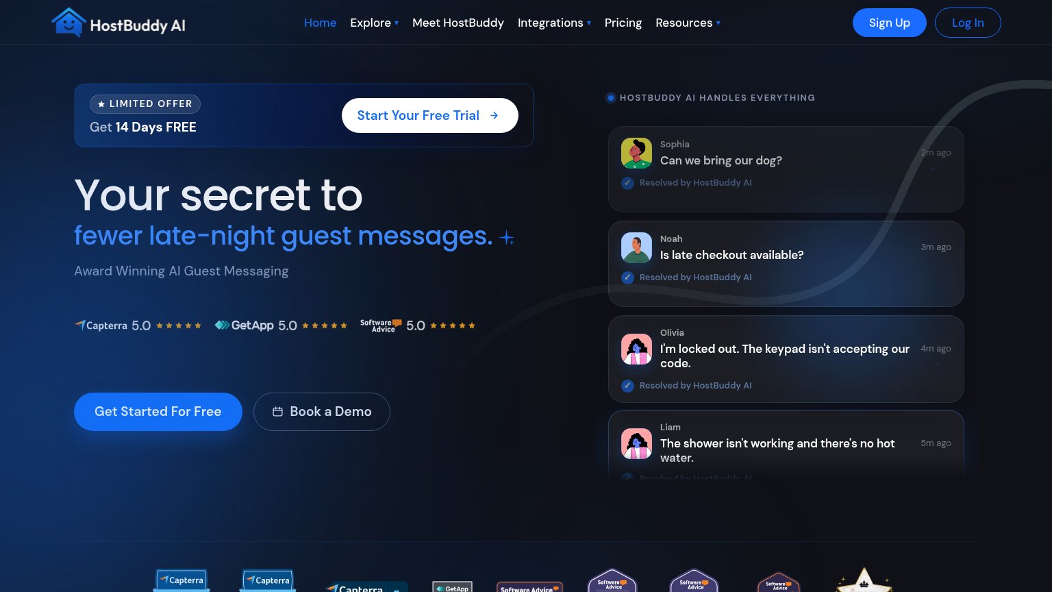
- no CTA beside desktop headline
- label casing inconsistent
- generic label, no payoff
Value props
78FairTitle, subtitle, hero — do they sell the product's true value?
Guesty’s headline
AI powered vacation rental software built for growth
Manage one property or hundreds on an AI PMS built to automate tasks, sync listings across 70+ channels and maximize revenue.
Working
Could improve
Mobile web
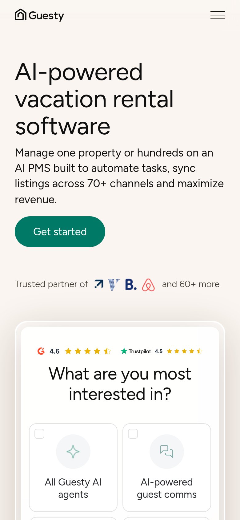
78FairThe phone experience as a first-class citizen.
What works
What to improve
Trust
82StrongProof that the product is real, competent, and safe to try.
How Guesty compares
Trust read