
Your landing page’s weakest score is Information hierarchy.
How Graphify Labs ranks
- 1.
Neo4j76
- 2.
Memgraph76
- 3.
Graphify Labs70
- 4.
ArangoDB62
- 5.
TigerGraph58
70Growth scoreupdated
category scores
category scoresShowHide
Information hierarchy
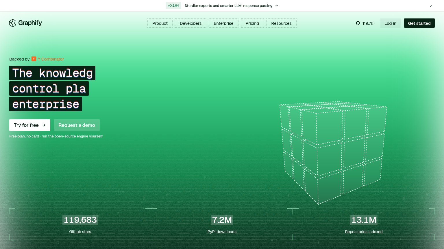
58FairDoes the design help or inhibit what the page is trying to say?
 1234
- Clipped hero headline — Highlight boxes truncate every line mid-word ('The knowledg', 'control pla'), making the value prop unreadable on desktop.
- Dual hero CTAs — 'Try for free' and 'Request a demo' sit at near-equal weight, and a third 'Get started' in the nav splits the primary action further.
- Version release banner — Changelog strip with arrow link is the first element in the scan path and exits visitors before the pitch.
- GitHub star counter — Nav-level 119.7k GitHub link invites developers off-site before they reach the CTA.
Value props
62FairTitle, subtitle, hero — do they sell the product's true value?
Graphify Labs’s headline undersells
The knowledge graph control plane for enterprise software.
Working
- Heavy proof: 119k stars, 7.2M downloads
- Names buyer: enterprise software teams
- Free plan + open-source lowers risk
Could improve
- No subhead explaining the outcome
- "Control plane" is insider jargon
- Desktop headline clips mid-word
Trust
68FairProof that the product is real, competent, and safe to try.
How Graphify Labs compares
Trust read
Mobile web
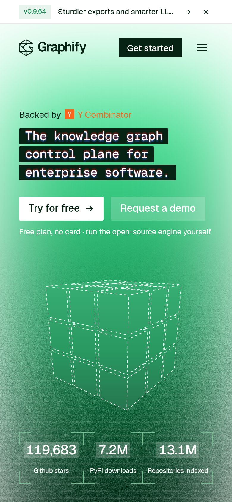
78FairThe phone experience as a first-class citizen.
What works
What to improve
CTA
86StrongCopy, size, verb, cost-feel — does the primary CTA earn the click?
How Graphify Labs compares
Recommended rewrites