
Your landing page’s weakest score is CTA.
How iGUIDE (Planitar) ranks
- 1.
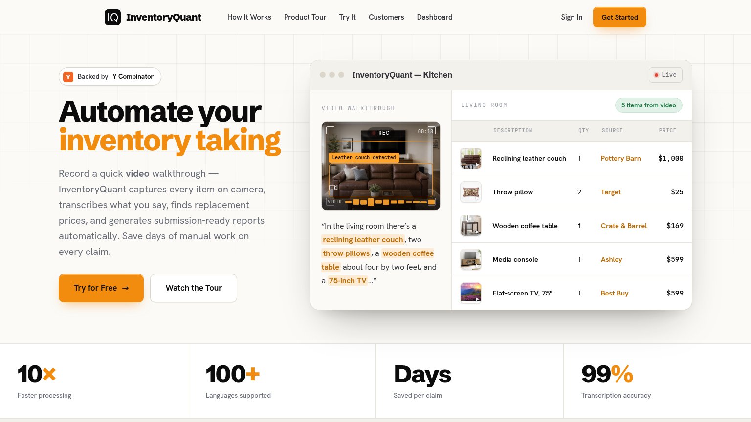
InventoryQuant75
- 2.
iGUIDE (Planitar)71
- 3.
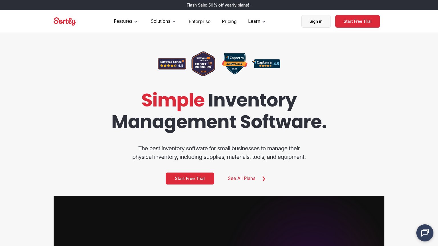
Sortly70
- 4.
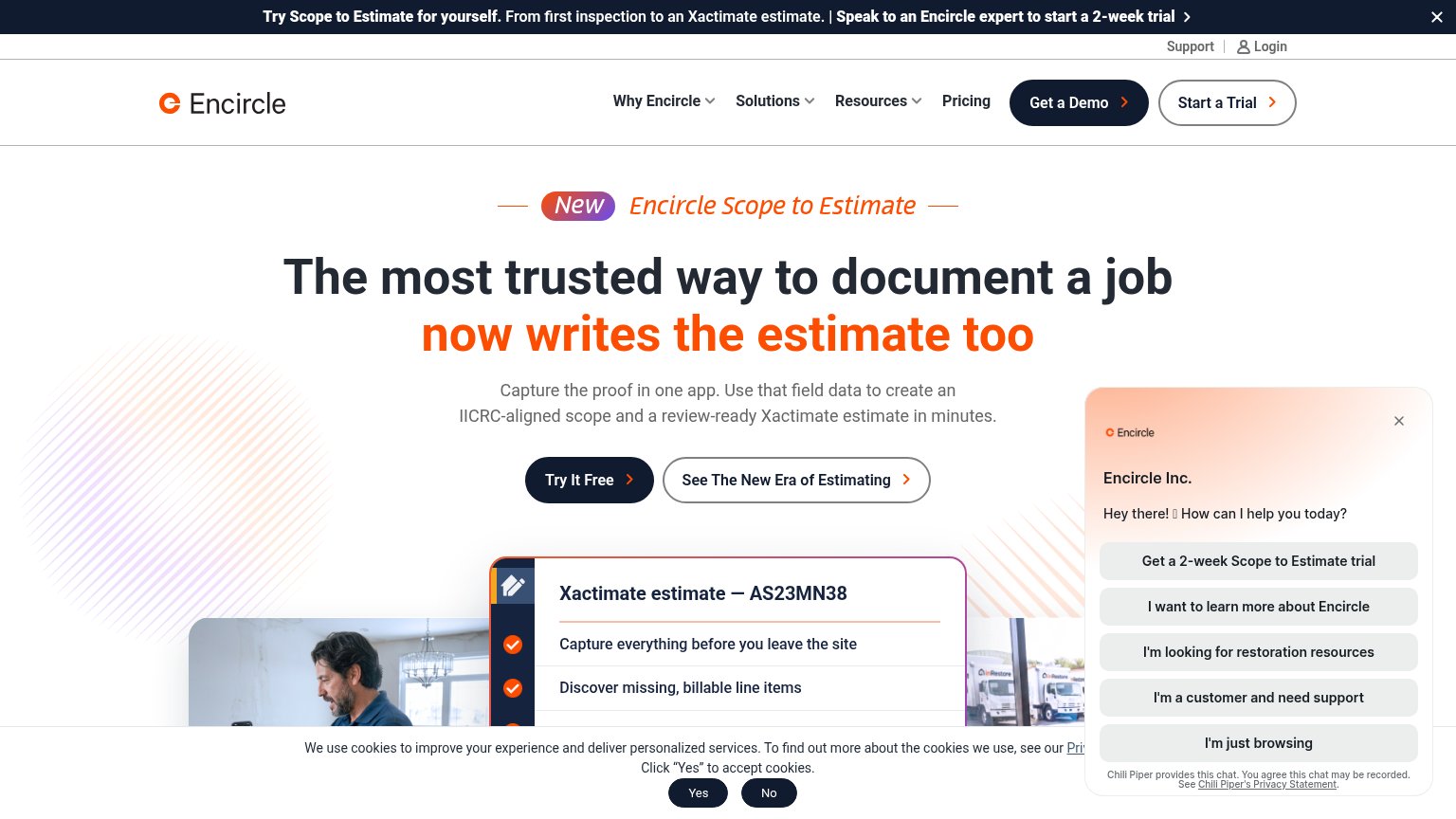
Encircle66
- 5.
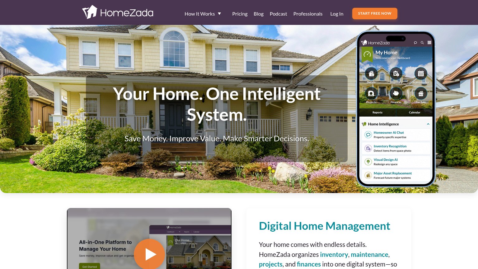
HomeZada60
71Growth scoreupdated
category scores
category scoresShowHide
CTA
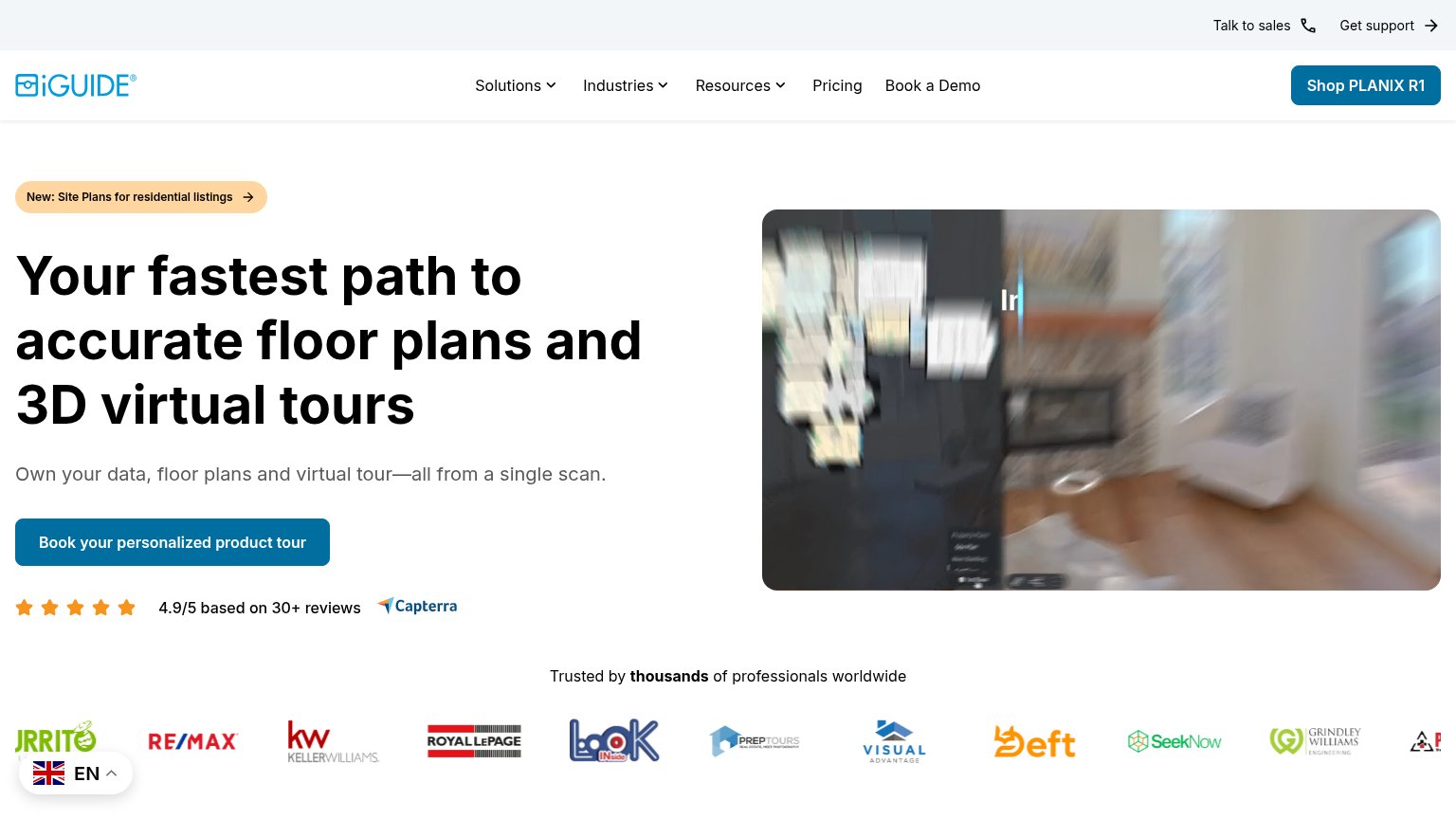
58FairCopy, size, verb, cost-feel — does the primary CTA earn the click?
Problems
- 5 words — too long to scan
- click feels like a sales meeting
- nav says 'Book a Demo' — label split
- 'Shop PLANIX R1' competes in header
Information hierarchy
68FairDoes the design help or inhibit what the page is trying to say?
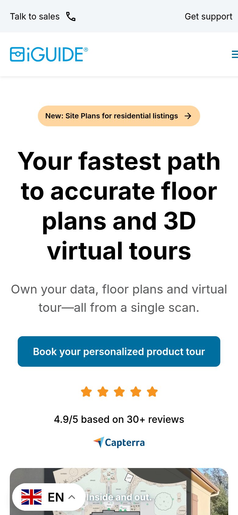
1234- Blurred hero video — Motion-blurred visual communicates nothing legible, outranking the value prop with visual noise instead of showing the floor plan/tour outcome.
- Shop PLANIX R1 button — Solid-fill button in the header competes at equal or greater weight with the primary 'Book iGUIDE (Planitar)'s personalized product tour' CTA.
- Full nav row — Six nav items plus 'Talk to sales' and 'Get support' create nine-plus exit paths before the visitor reaches the primary action.
- Language picker overlay — Floating EN selector overlaps the trusted-by logo strip, obscuring the leftmost partner logo.
Mobile web
72FairThe phone experience as a first-class citizen.
What works
What to improve
Value props
78FairTitle, subtitle, hero — do they sell the product's true value?
iGUIDE (Planitar)’s headline
Your fastest path to accurate floor plans and 3D virtual tours
Own your data, floor plans and virtual tour—all from a single scan.
Working
Could improve
Trust
78FairProof that the product is real, competent, and safe to try.
How iGUIDE (Planitar) compares
Trust read