
Your landing page’s weakest score is CTA.
How Nectar AI Keyboard (SnapEdit-style AI keyboards aside, closest is) ranks
- 1.
Nectar AI Keyboard (SnapEdit-style AI keyboards aside, closest is)69
- 2.
Text.ai66
- 3.
placeholder38
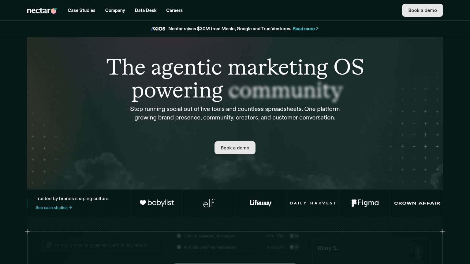
CTA
64FairCopy, size, verb, cost-feel — does the primary CTA earn the click?
Problems
- high-commitment sales-call ask
- no low-friction alternative path
- muted gray button on dark hero
Mobile web
64FairThe phone experience as a first-class citizen.
 1234
- Primary CTA position — The 'Book a demo' button sits at the very bottom of the fold, pushed down by the six-line headline and five-line subhead.
- Headline wraps six lines — 'The agentic marketing OS powering community' barely scaled down, wrapping into six tall serif lines that eat over a third of the viewport.
- Axios press banner — The two-line Axios funding banner is a double-decker header that pushes the hero content down before it starts.
- Book a demo width — The CTA keeps its desktop proportions instead of going near-full-bleed, leaving a smaller thumb target than the column allows.
Information hierarchy
68FairDoes the design help or inhibit what the page is trying to say?
What works
What to improve
Value props
72FairTitle, subtitle, hero — do they sell the product's true value?
Nectar AI Keyboard (SnapEdit-style AI keyboards aside, closest is)’s headline
The agentic marketing OS powering community
Stop running social out of five tools and countless spreadsheets. One platform growing brand presence, community, creators, and customer conversation.
Working
Could improve
Trust
78FairProof that the product is real, competent, and safe to try.
How Nectar AI Keyboard (SnapEdit-style AI keyboards aside, closest is) compares
Trust read